From Sugary Sodas to Functional Fizz: The Rise of Gut-Friendly Drinks
The UK’s relationship with fizzy drinks is changing. For decades, the category was dominated by high-sugar colas and artificially flavoured sodas, built around indulgence with very little consideration for what was actually inside the can. But in recent years, a shift has been bubbling up.
Consumers are becoming more ingredient-conscious. The UK Soft Drinks Industry Levy has helped drive reformulation across the category, with average sugar levels in soft drinks falling by over 30% between its introduction in 2016 to 2018. At the same time, low and no-sugar drinks now account for more than half of all soft drink sales in the UK, showing just how quickly behaviour has evolved.
Gut health has also become a major driver of change. The UK functional drinks market, including kombucha, prebiotic sodas and wellness-led carbonated drinks, is now valued at over £400 million and continues to grow as consumers prioritise digestive health, energy and everyday wellbeing.
But with that shift comes a new challenge.
A lot of these “better for you” drinks look worthy. Muted palettes. Minimalist packaging. Soft, almost apologetic branding. They signal health, but often at the expense of excitement. The result is a category that, while growing, can feel visually repetitive and emotionally flat.
That’s where Heaven Soda comes in.
Inspired by the gut-friendly soda boom in the US, the ambition was to bring something equivalent to the UK market. Not just another functional drink, but a soda that could genuinely compete with the big names on taste, energy and presence, while delivering added benefits like prebiotic fibre, magnesium, apple cider vinegar and low sugar.
Our role was to help bring that vision to life, from the ground up.
Starting with a simple idea
From the outset, the brief went far beyond packaging. We were tasked with naming the brand, shaping its strategy, and building its identity from scratch. The product needed to taste like a classic soda, while delivering functional benefits your body would thank you for.
To cut through, we needed a clear and memorable idea that could hold everything together.
The strategy centred around a single, slightly mischievous tension:
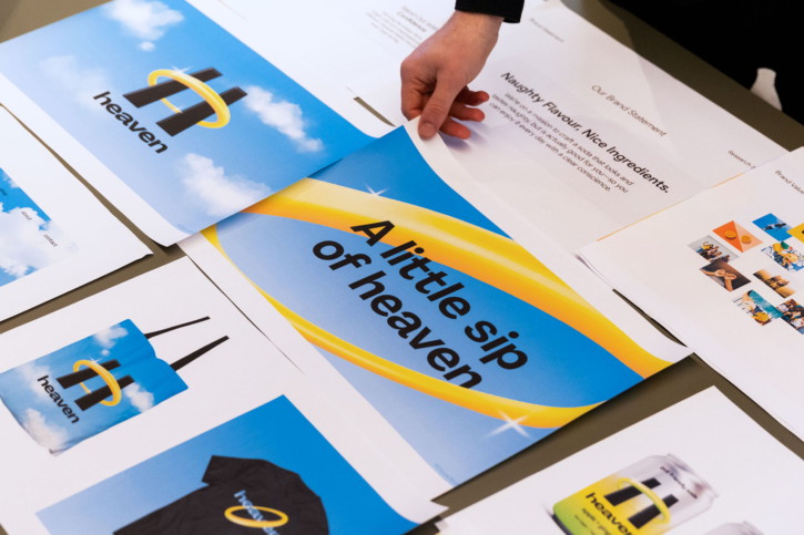
Naughty flavour. Nice ingredients.
That line became the foundation for everything that followed.
It captures the contradiction at the heart of the product. On one hand, this is a soda that feels indulgent, bold flavours, vibrant colours, full sensory appeal. On the other, it’s made with ingredients designed to support gut health and overall wellbeing.
Too often, brands in this space lean too far in one direction. Either they focus entirely on function and lose any sense of fun, or they overpromise on indulgence without backing it up nutritionally.
Heaven sits right in the middle.
It looks like the drink you shouldn’t have. But it’s actually one you can enjoy every day, with a clear conscience.
Naming something that feels bigger
The name “Heaven” does a lot of heavy lifting.
It immediately evokes a sense of elevation, reward, and escapism, all the things we associate with treating ourselves. But it also subtly reinforces the idea of feeling good, both physically and emotionally.
There’s a duality to it. Heaven as indulgence. Heaven as wellbeing.
That dual meaning allowed us to build a brand world that feels expansive rather than restrictive. It’s not about denying yourself. It’s about upgrading the experience.
Building a world, not just a logo
From a visual perspective, we wanted the brand to hold its own against established soda brands, while challenging expectations of what a “better-for-you” drink could look and feel like.
Too often, healthy means safe. Muted. Forgettable. We pushed in the opposite direction.
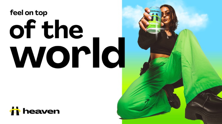
The result is a bold, hyperreal brand world that feels more like entertainment than wellness.
Taking inspiration from Y2K aesthetics, virtual environments, and gaming culture, we developed a graphic language that feels immersive, glossy, and slightly surreal. It’s a world where everything is dialled up, colours are richer, forms are smoother, and the overall experience feels just a little bit otherworldly.
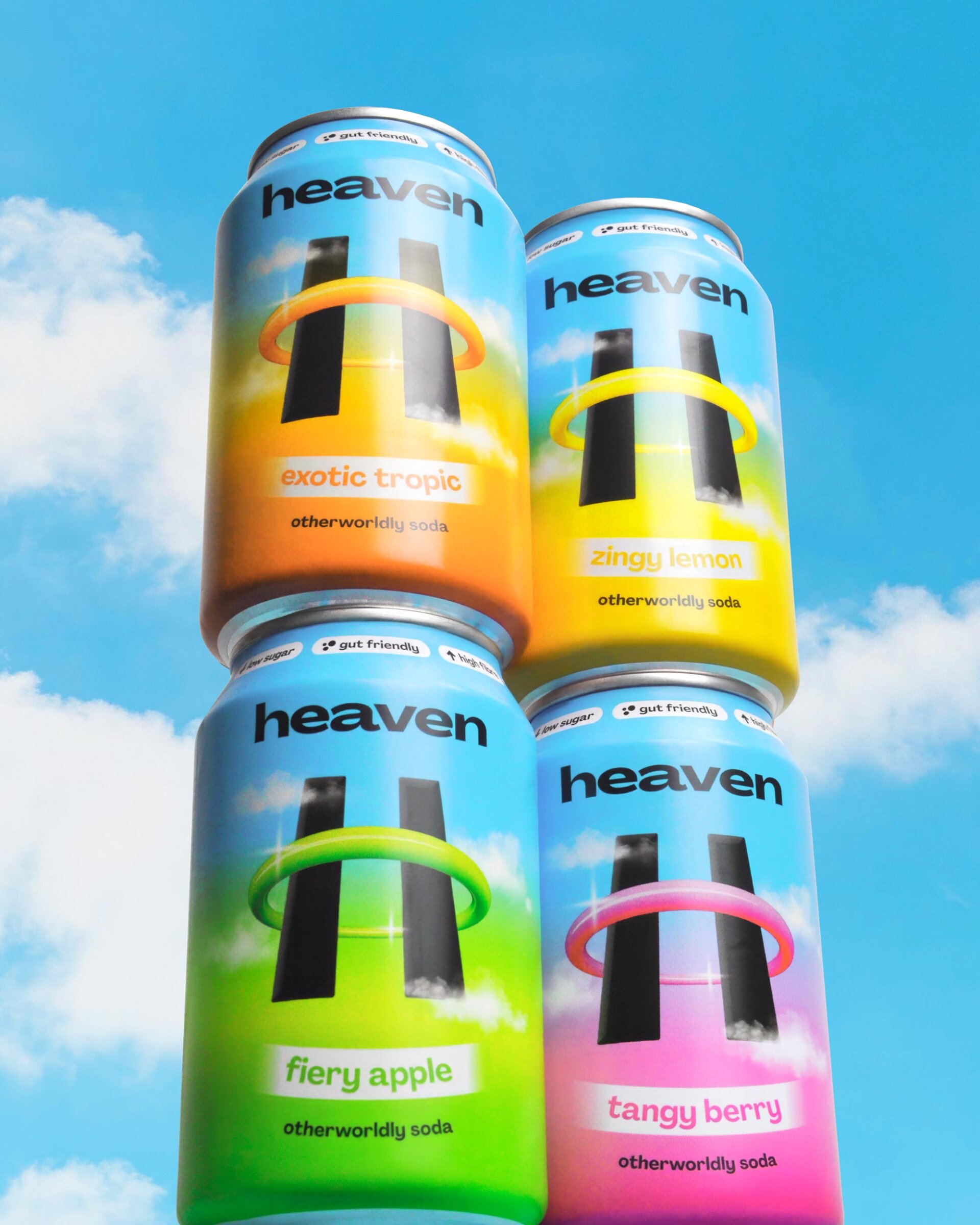
At the centre of it all sits the halo-bound “H” logo.
It’s simple, but distinctive. The halo becomes a key visual device, representing that sense of elevation and “better for you” goodness, while also giving the brand a strong, ownable silhouette. It’s a mark that works just as well at small sizes on pack as it does across larger brand moments.
Around that, we built a system of sleek, glossy fruit visuals that feel almost too perfect to be real. They sit somewhere between photography and digital rendering, reinforcing that hyperreal aesthetic and helping the flavours feel as bold as they taste.
Typography plays its part too. Type bends, curves, and flexes, often wrapping around forms or echoing the circular shape of the halo. It adds movement and energy, making the brand feel alive rather than fixed.
Even the photography direction was carefully considered. Shot from dramatic low angles, it mirrors the upward perspective of the logo and reinforces that idea of lifting and elevation.
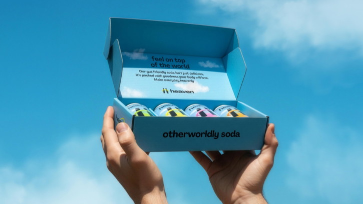
Designing packaging that demands attention
In a crowded retail environment, packaging has one job above all else. Get noticed.
For Heaven, that meant being unapologetically bold.
The logo sits front and centre on the can, large, confident, and impossible to miss. There’s no hesitation, no hiding behind patterns or overly complex layouts. It’s a statement.
The decision to use stubby metal cans was equally deliberate. We wanted the product to feel like a classic soda, rather than a slim can often associated with healthier drinks. It reinforces the idea that this is a treat, not a compromise, which sits at the heart of the brand.
Beyond that initial impact, the system needed to work across multiple flavours while still feeling cohesive.
We created a flexible colour system where the halo and the sky background interchange across variants. This allows each flavour to have its own distinct presence, while still clearly belonging to the same family. The result is a shelf presence that feels vibrant, energetic, and instantly recognisable.
Functionally, the packaging also needed to communicate the product’s benefits without overwhelming the design.
Key benefit callouts are anchored around the shoulder of the can in a 360º band, creating a consistent and ownable space for this information. On the back, there’s room to go deeper into flavour profiles and ingredients.
Achieving the final result wasn’t without its challenges. Getting the print finish exactly right took multiple rounds of testing. The colours needed to be as bold and punchy as possible, and anything less would have diluted the impact. Through close collaboration with the printer, we refined and pushed the output until it matched the original creative intent.
Bringing the brand to life everywhere
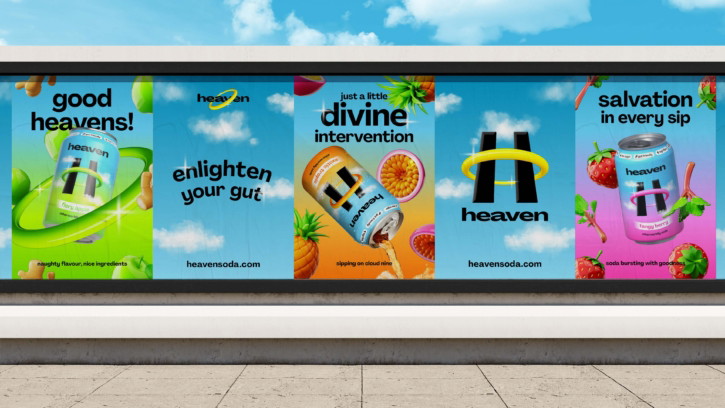
A brand doesn’t live in isolation. It exists across dozens of touchpoints, from social feeds to physical retail to motion and beyond.
For Heaven, consistency was key, but so was energy.
Every application of the brand needed to feel bright, bold, and just a little bit cheeky. Whether it’s a digital ad, a piece of printed collateral, or an animated asset, the same principles apply. High impact visuals, playful use of typography, and a tone that never takes itself too seriously.
Motion design plays a particularly important role here. The fluidity of the halo, the way type can move and wrap, the glossiness of the fruit, all of these elements lend themselves naturally to animation, helping the brand feel dynamic and contemporary.
But just as important as how it looks is how it speaks.
A tone of voice that lifts, not lectures
In the world of functional drinks, it’s easy to fall into the trap of over-explaining. Listing benefits. Talking in technical terms. Trying to justify the product through science.
That wasn’t right for Heaven.
Instead, the tone of voice is designed to be playful, optimistic, and human. It leans into the emotional benefit just as much as the functional one.
Yes, this is a drink that supports your gut. But more importantly, it’s a drink that makes you feel good in every sense of the phrase.
The messaging reflects that balance. It’s light-touch, never preachy, and always rooted in enjoyment. It invites people in rather than instructing them.
Because ultimately, if it doesn’t feel like a treat, it won’t become part of your everyday.
Creating something people actually want
One of the biggest challenges in this category is shifting perception.
“Healthy soda” can still feel like a compromise to some consumers, something you choose because you think you should, rather than because you genuinely want it.
Everything about Heaven is designed to flip that.
From the name to the identity to the packaging and beyond, it positions itself first and foremost as a desirable product. Something that looks good, tastes good, and fits naturally into your lifestyle.
The added benefit is that it also happens to be better for you.
That shift, from obligation to desire, is what makes the difference between a product people try once and a product they come back to again and again.
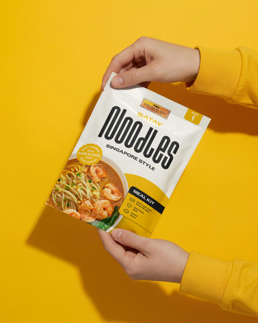
If you’re working on something similar, whether that’s a brand refresh, a retail relaunch, or a campaign that needs to work across a dozen different formats, we’d like to hear about it. We’ve done this for brands like Lee Kum Kee, White Rabbit Pizza Co., and Gr8nola too.
Get in touch and tell us about your project.