How the UK fell for Asian food
Asian food isn’t a takeaway category anymore. It’s a Tuesday-night dinner category. Stir-fries, ramen, dumplings and broths are now weeknight meals in millions of British kitchens.
World cuisines have moved from occasional to mainstream in UK grocery, and East Asian flavours sit near the front of that shift. Mintel’s research lead Trish Caddy has pointed to regional East Asian noodles as one of the trends shaping what ends up on supermarket shelves next, and around half of UK households now say they cook from scratch every day or most days, according to NIQ. Shoppers want flavour that feels real, ingredients they trust, and meals they can actually make on a Wednesday.
That gap, between authentic and easy, is where Lee Kum Kee asked us to work.
The brief: A new take on noodles
Lee Kum Kee has been making Asian sauces since 1888. The brand has 135 years of credibility and a deep product range, but the noodle aisle is its own conversation. We were briefed to design a noodle range for modern UK consumers that didn’t ask people to trade flavour for convenience.
The result is a range built around a simple promise: True flavour at home.
Designing for a growing category
The UK noodle aisle splits cleanly into two ends. Instant noodles at the cheap, functional end. Restaurant-style premium products at the aspirational end. There isn’t much in between.
That middle ground was the opportunity. Real ingredients and real flavour, priced and formatted for everyday cooking. We worked through the brand strategy before touching design, because the positioning had to do the heavy lifting before any wordmark could.
Building a bold and ownable identity
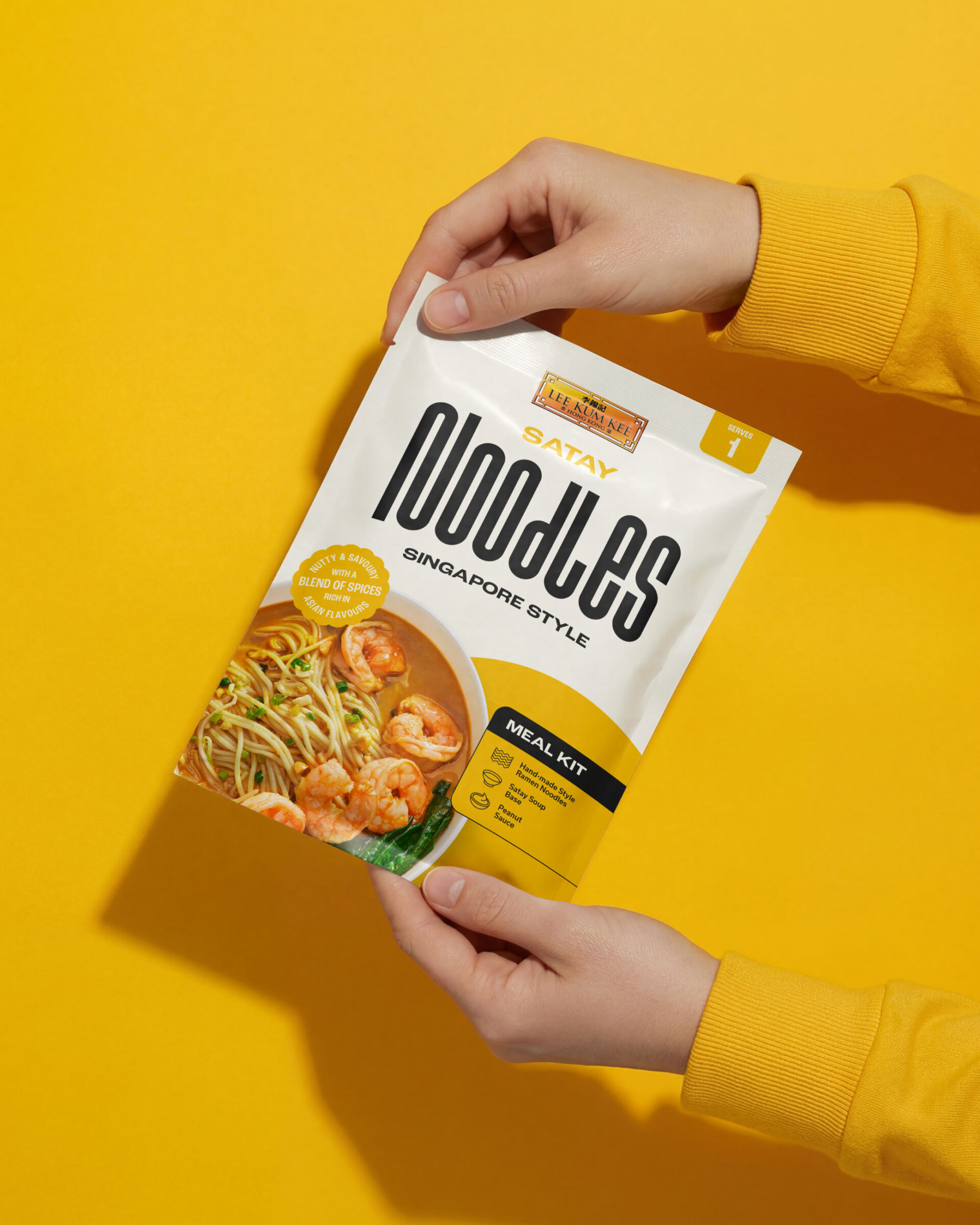
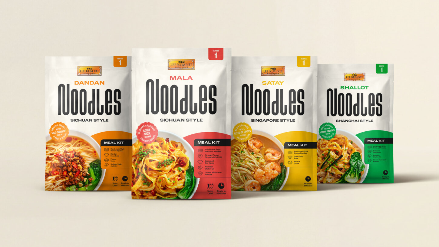
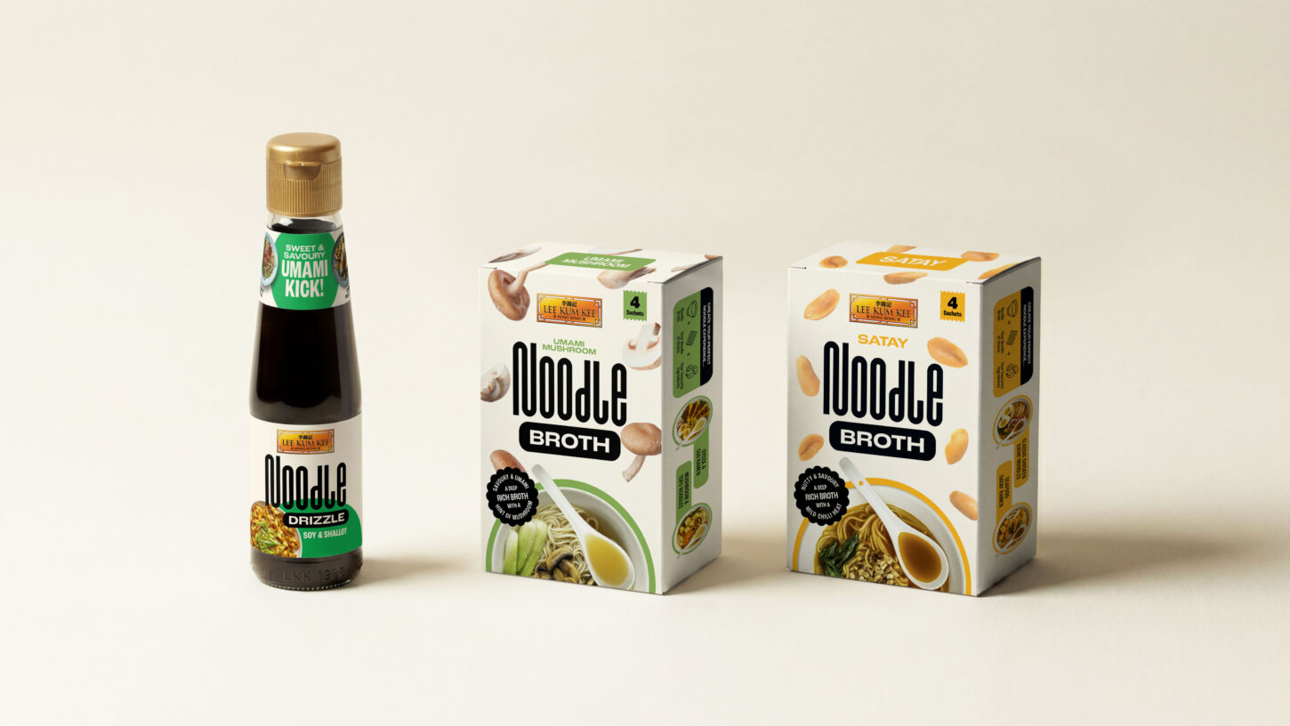
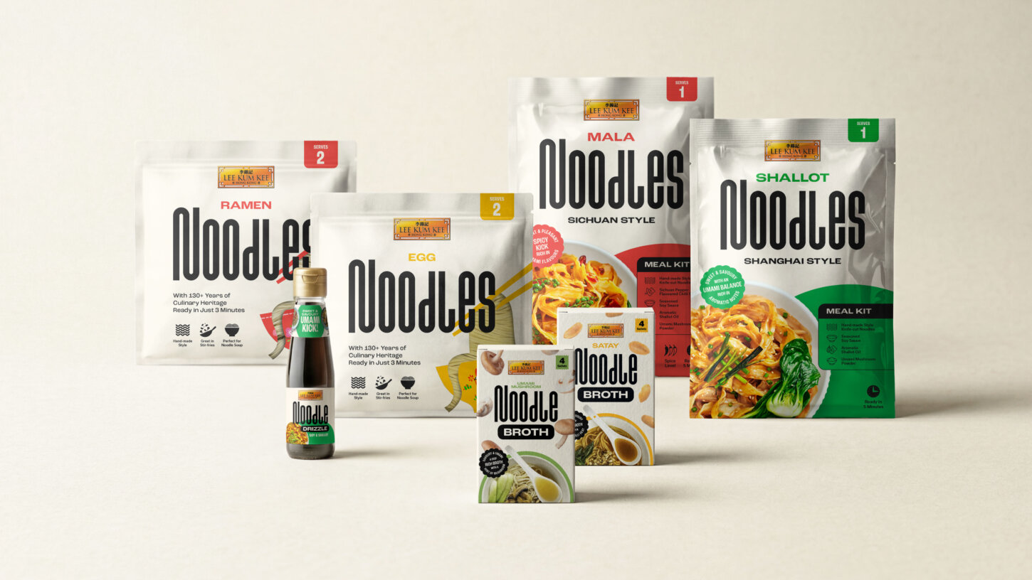
The whole brand identity hinges on one piece of typography. The “noodles” wordmark is rounded and elongated, drawn to suggest the form of noodles themselves. It works as both name and graphic device, and it’s what your eye lands on at three paces from the shelf.
Everything else grows from it. The geometry shows up in the corner radii on icons, in the way photography is framed, in the secondary typography. We used type at varied widths and weights across the system to give it rhythm and keep busy packs readable.
Creating clarity through design
Food packaging design has about three seconds to communicate what something is, how spicy, how long it takes, and how it differs from the pack next to it. We built a system of icons and badges for serving size, spice level, cook time and flavour profile. They sit inside the geometry of the wordmark so they feel native to the design rather than bolted on.
That part isn’t glamorous, but it’s the bit that earns the second purchase.
Designing a range, not just a product
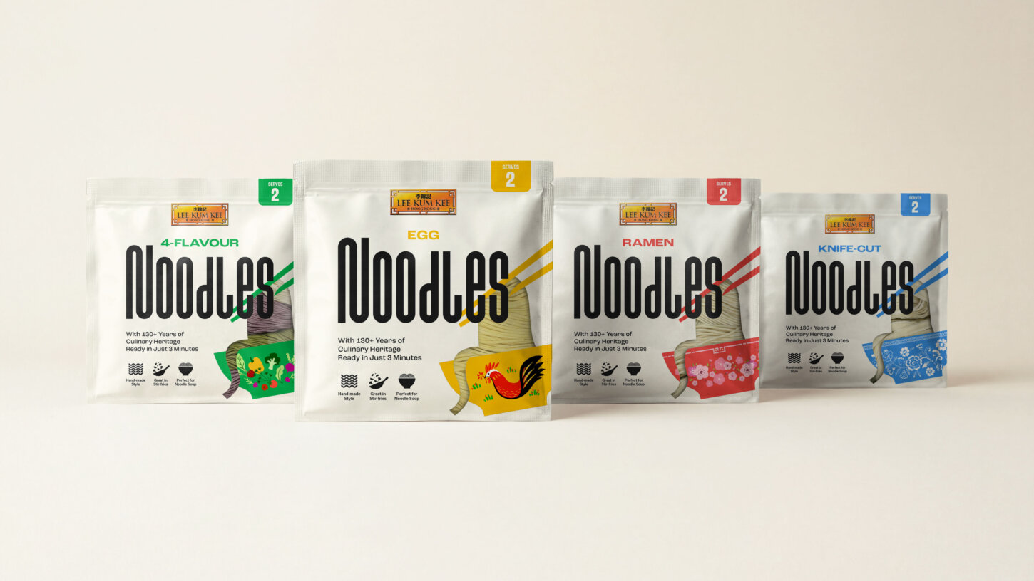
The brief started with dry noodles and expanded to kits, broths and drizzles. Each plays a different role, from quick midweek meals to more layered cooking.
Designing a range means deciding what stays constant and what flexes. We anchored everything to a cream colour palette and the noodles wordmark. Individual products then differentiate through colour, photography and supporting graphics. New flavours and formats can be added without breaking the system, which matters when you’re building for a range that will grow over years, not launching a single SKU.
Photography that brings the flavour
Food is inherently sensory. The design needed to reflect that.
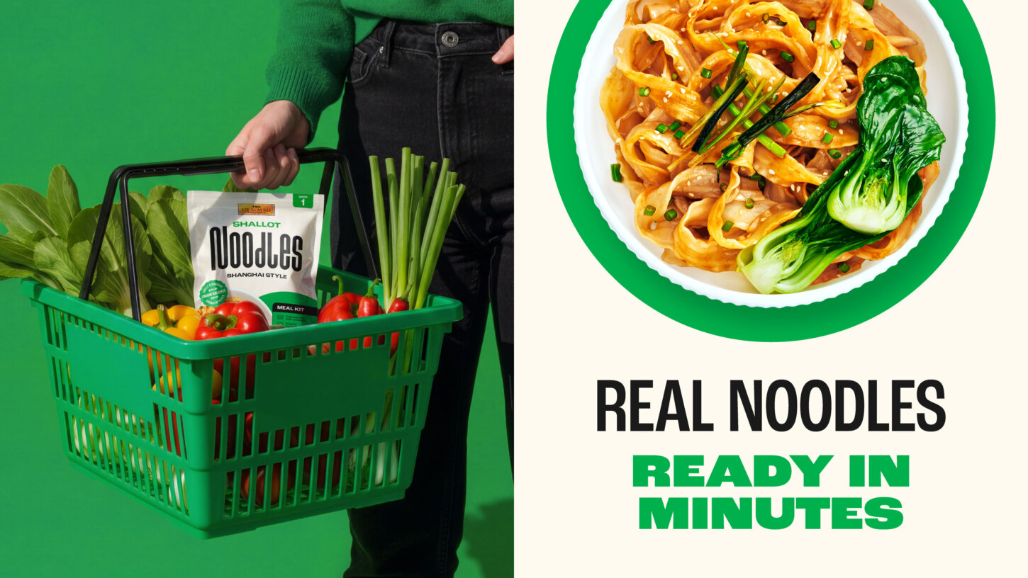
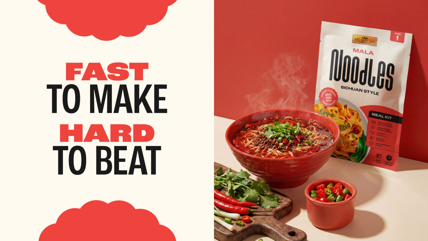
Food packaging stands or falls on whether it looks tasty. The pack photography focuses on dish shots that show texture, colour and ingredients clearly.
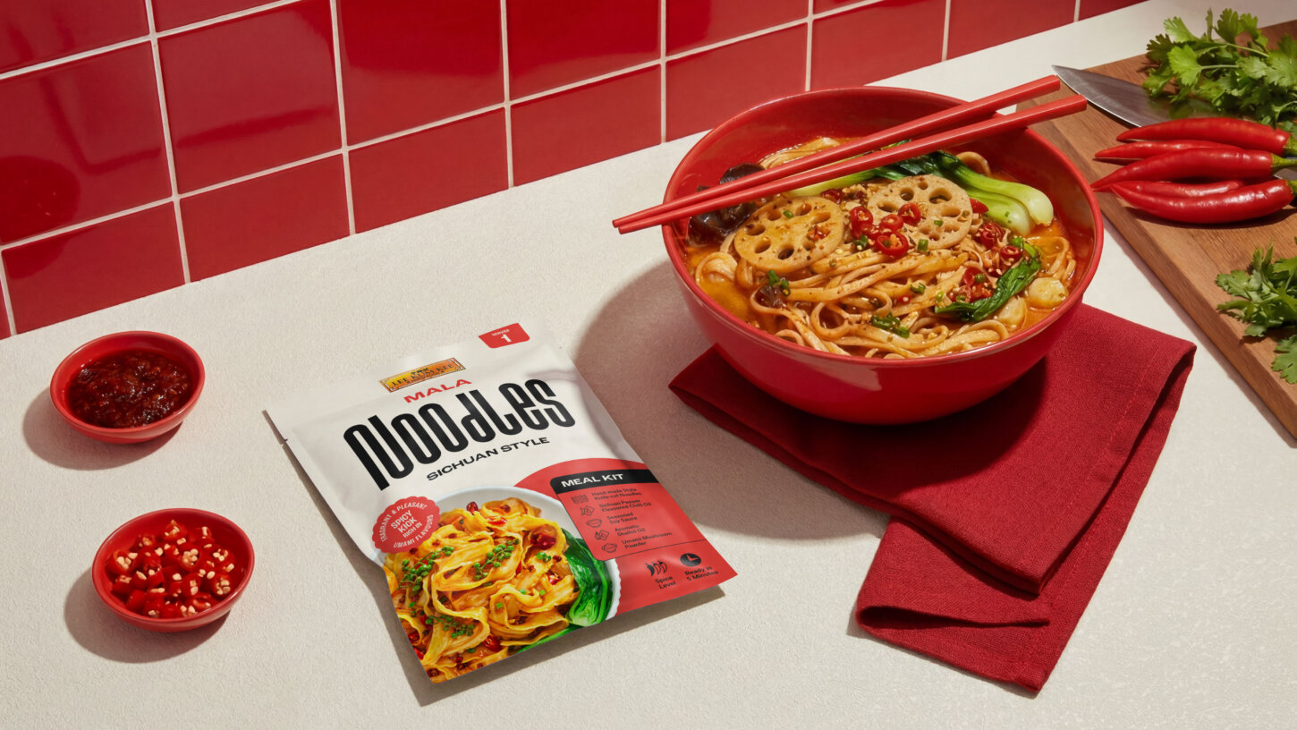
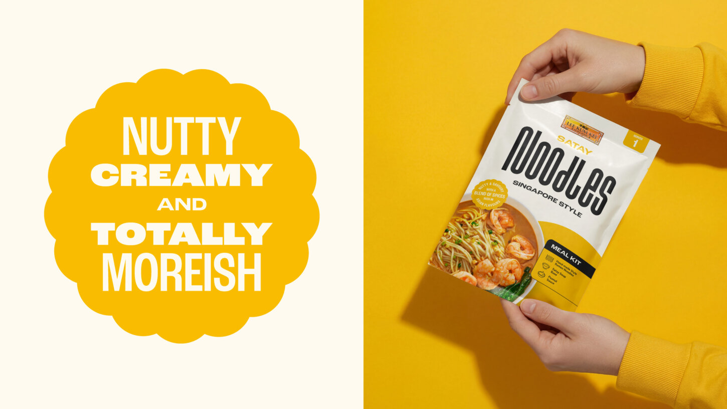
Beyond packaging, lifestyle photography adds another layer.
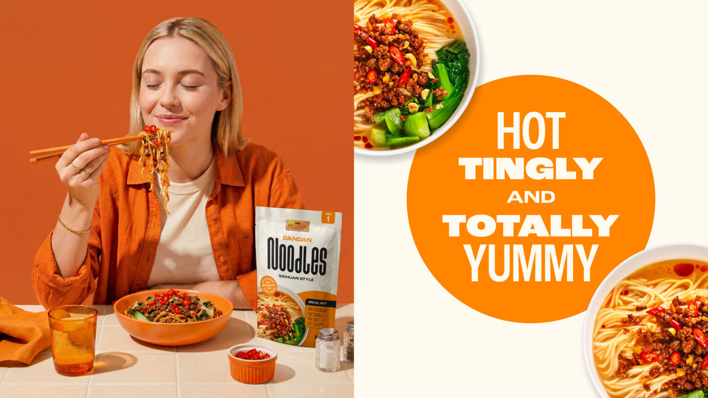
Bright, playful, and full of personality, these images capture the joy of cooking and sharing noodles at home. They often take cues from the packaging itself, using colour, props, and styling inspired by individual flavours.
This creates a cohesive visual world that extends beyond the shelf.
It’s not just about showing the product. It’s about showing the experience.
A tone of voice that makes cooking easy
The tone of voice is designed to match the visual identity.
Fun, punchy, and full of personality, it reflects the idea that cooking with these products should feel easy and enjoyable, not intimidating.
At the same time, it always reinforces the core strengths of the range. Authenticity. Quality. Flavour. Convenience.
Lines like “Real Noodles, Ready in Minutes” and “Hot, Tingly and Totally Yummy” strike that balance. They’re playful, but still informative. They tell you what you need to know, while making the experience feel more engaging.
The language is simple and direct. It invites people in, rather than overwhelming them with technical detail.
Because ultimately, the goal is to make Asian cooking feel accessible to everyone.
Making Asian cooking easy
At the heart of the range is a simple idea: Making Asian cooking easy.
This isn’t about dumbing things down. It’s about removing barriers.
For some consumers, cooking Asian food at home can feel complex or unfamiliar. Too many ingredients. Too many steps. Too much uncertainty.
This range simplifies that.
Whether it’s a quick midweek meal or a more elaborate dish, the products are designed to fit seamlessly into everyday life. Ready in minutes, but still delivering the flavour and quality people expect from Lee Kum Kee.
It’s a balance between speed and authenticity.
And it’s what makes the range feel relevant to modern UK consumers.
Where tradition meets reinvention
Perhaps the most important aspect of the project is how it brings together past and present.
Lee Kum Kee has been producing authentic Asian sauces since 1888. That heritage carries real weight. It’s a mark of trust, quality, and expertise.
But heritage alone isn’t enough.
To connect with today’s audience, the brand needs to evolve. It needs to feel current, dynamic, and in tune with how people cook and eat today.
This noodle range does exactly that.
It respects tradition, drawing on the brand’s history and expertise. But it also reinterprets it, creating something that feels bold, modern, and relevant.
A new take on noodles. Where tradition meets bold reinvention.
Designed to stand out and scale
On shelf, the impact is immediate.
The bold wordmark. The clean, confident layouts. The vibrant photography. Together, they create a range that stands out clearly in a crowded category.
But beyond that initial impact, the strength of the system lies in its flexibility.
It’s designed to grow. To adapt. To evolve alongside the category.
That’s what turns a product range into a brand.
Noodles, your way
At its core, this project is about giving people more freedom in how they cook and enjoy noodles.
Quick comfort. Colourful creations. Everyday classics. More expressive, standout dishes.
The range supports all of it.
By combining bold design with clear functionality, it makes it easier for consumers to explore, experiment, and enjoy authentic Asian flavours at home.
And in doing so, it reflects a broader shift in how we think about food.
Less about rules. More about possibilities.
A new chapter for an iconic brand
This project marks an evolution for Lee Kum Kee.
It takes everything the brand is known for, authenticity, quality, and flavour, and reimagines it for a new generation of consumers.
The result is a range that feels fresh, confident, and full of energy, while still rooted in over a century of expertise.
A system designed not just for today, but for what comes next.
Because as the UK’s appetite for Asian food continues to grow, the brands that succeed will be the ones that make that experience both authentic and accessible.
And that’s exactly what this range sets out to do.
If you’re working on something similar, whether that’s a brand refresh, a retail relaunch, or a campaign that needs to work across a dozen different formats, we’d like to hear about it. We’ve done this for brands like Lee Kum Kee, White Rabbit Pizza Co., and Gr8nola too.
Get in touch and tell us about your project.