Starting with What It Shouldn’t Be
One of the most interesting things about the early stages of the project was that the founder didn’t arrive with a clear visual vision for the brand.
What he did have was a strong sense of what he didn’t want.
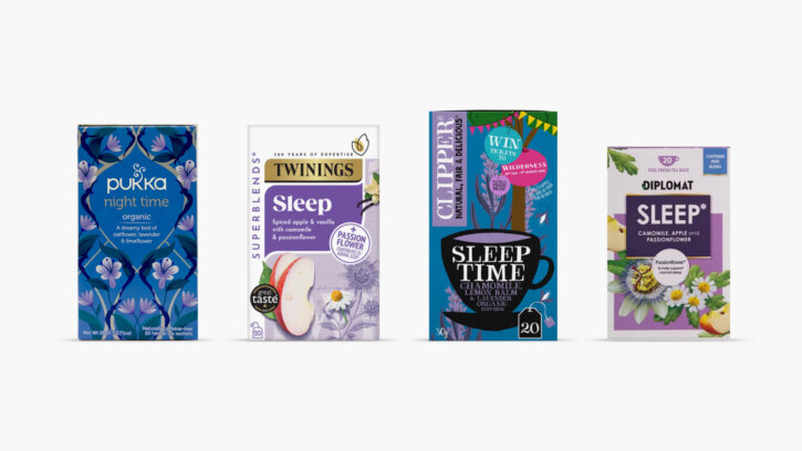
Like many categories, herbal tea has developed its own visual conventions over time. Walk down almost any supermarket aisle and you’ll find packs covered in floral illustrations, blossoming botanicals, rustic textures and imagery that leans heavily into countryside nostalgia.
While those cues have become familiar, they also make many brands feel interchangeable.
From our earliest conversations, it was clear that Cydno needed to move in a different direction.
The ambition wasn’t to create something earthy, quaint or traditionally herbal. The preference was for something simpler. More contemporary. More refined.
That distinction became an important starting point.
Rather than looking backwards at what herbal tea had always looked like, we began exploring what a sleep tea brand could look like for a modern audience.
Building a Brand Around Ritual
One theme kept resurfacing throughout the strategy process.
The product wasn’t really about tea. Or at least, not only tea. The real value sat in the ritual surrounding it.
Making a drink at the end of the day is a small act, but it creates a moment of transition. The kettle goes on. The laptop closes. The pace of the day starts to slow. Long before the tea is consumed, the ritual itself is already beginning to do some of the work.
That insight became the foundation for the brand strategy.
Cydno would help people make better choices through 100% natural products designed to support restful, restorative sleep. More importantly, it would encourage a simple evening habit that people could return to night after night.
This approach felt particularly relevant given wider consumer trends. Research shows growing demand for natural sleep-support products, with consumers increasingly seeking alternatives to pharmaceutical solutions and prioritising ingredients they recognise and trust.
For Cydno, however, the answer wasn’t to lean heavily into wellness claims or scientific jargon. Trust would come through simplicity, consistency and a clear sense of purpose.
The brand needed to feel calm before a customer had even opened the box.
Finding the Right Creative Direction
As with most branding projects, the first idea is rarely the final idea.
A large part of the process involves exploring different possibilities and understanding what feels right, what feels wrong and where the most distinctive opportunities exist.
For Cydno, we explored a number of creative routes.
Some leaned towards a more playful and approachable aesthetic. These concepts used softer illustrations, lighter colour palettes and a friendlier visual language. While they had charm, they began to feel too whimsical and lacked the premium quality we wanted the brand to have.
We also explored directions that felt more scientific and functional. These concepts focused more heavily on efficacy and wellness cues. While they communicated credibility, they felt slightly clinical and lost some of the emotional warmth that sat at the heart of the strategy.
Neither route quite captured what Cydno needed to be. The breakthrough came somewhere between the two.
Rather than taking inspiration directly from herbal tea or wellness products, we began looking at the emotional qualities associated with evening and rest. The gradual shift from day to night. The feeling of calm that arrives when distractions start to fade away. The quiet anticipation of winding down.
This became a much richer creative territory to explore.
A Visual Identity Inspired by Nightfall
The final identity draws heavily from the rhythm of the evening.
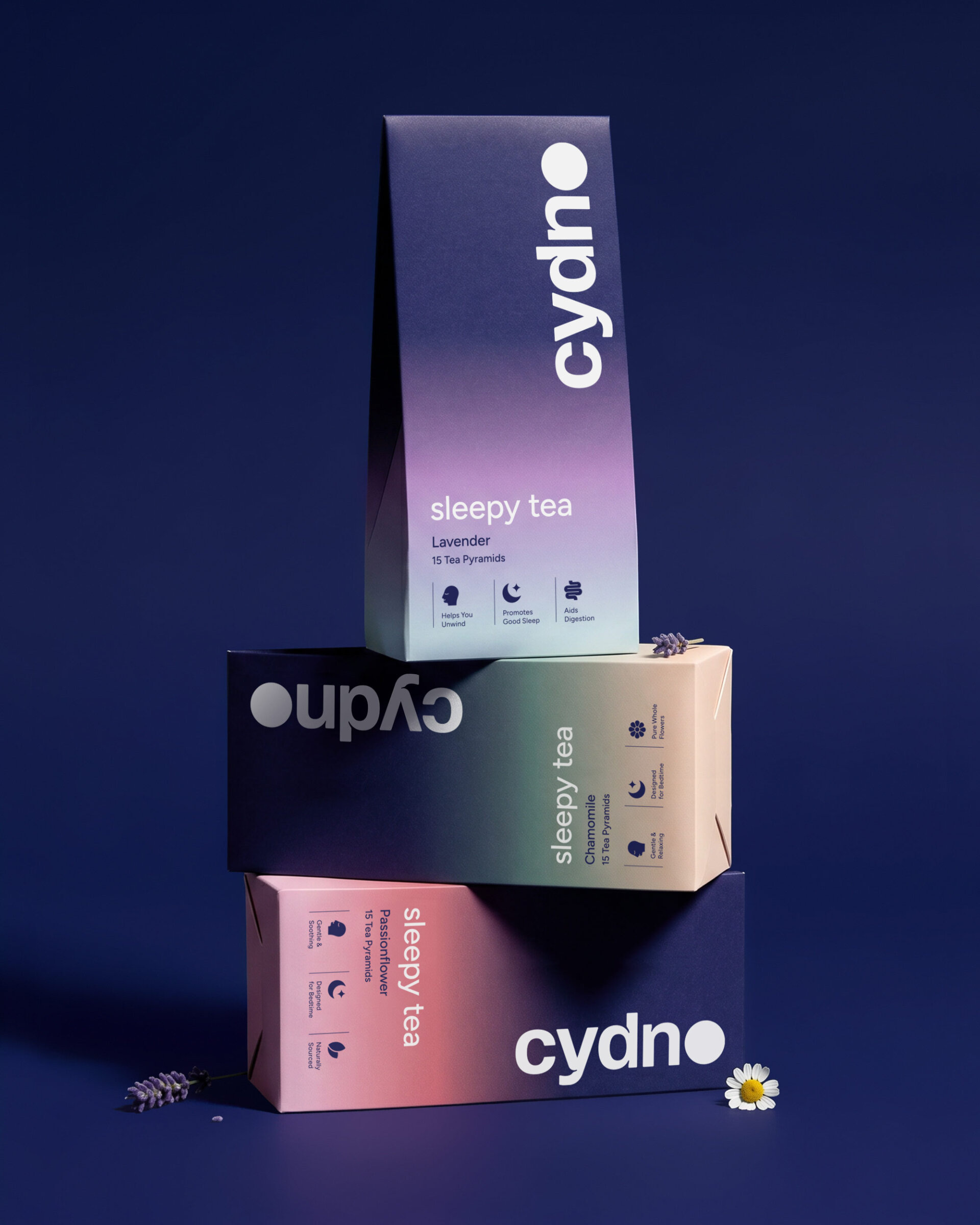
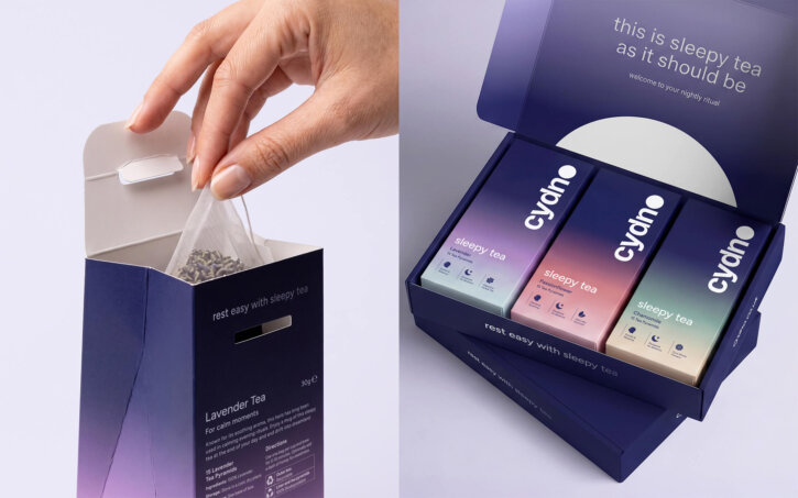
At its centre sits a bespoke wordmark designed specifically for the brand. One of our favourite details is the treatment of the letter O, which doubles as a full moon within the logo itself.
It creates an immediate connection to the brand’s purpose without relying on a separate icon or overly literal sleep symbolism.
The wordmark also features subtle ink traps throughout the letterforms. These create small recesses that soften the typography and give it a slightly pillowy quality. It’s a relatively small detail, but details like these often contribute to the overall feeling of a brand more than people realise.
Throughout the identity, there was a conscious effort to create something that felt calm without becoming passive, and premium without becoming exclusive. Those tensions shaped many of the decisions we made.
Finding the Balance Between Nature and Functionality
Looking back, this was probably the biggest challenge of the project.
Every branding project involves a balancing act of some kind. For Cydno, it was about finding the equilibrium between nature and functionality.
Lean too heavily into nature and the brand risks becoming another conventional herbal tea product.
Lean too heavily into functionality and it starts to resemble a wellness supplement.
Neither felt right. The strongest solution sat somewhere in the middle.
Nature became an inspiration rather than a visual cliché. The brand communicates calm through atmosphere, colour and composition rather than through obvious botanical imagery. At the same time, the design system remains highly functional, making information easy to navigate and products easy to identify.
The final result feels contemporary while still retaining the warmth expected from a product designed to support relaxation.
![]()
Creating Calm on Shelf
Packaging was one of the most important touchpoints within the project.
Retail environments are rarely calm places. Products compete aggressively for attention, often resulting in shelves filled with bright colours, promotional messaging and crowded information hierarchies.
For a brand centred around slowing down, shouting louder didn’t feel like the answer. Instead, we focused on creating a visual world that felt noticeably quieter.
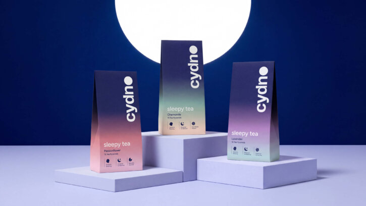
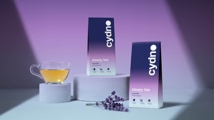
The packaging uses a palette of deep indigo tones that gradually fade into softer pastel hues, with each gradient representing a different tea variety. The transitions create a visual link to the changing colours of the evening sky while helping the range feel cohesive.
Generous spacing, refined typography and a restrained graphic system help reduce visual noise.
The packs don’t demand attention. They invite it.
Interestingly, this approach often creates stronger shelf presence than louder alternatives. When everything around you is competing for attention, calmness can become distinctive in its own right.
Sustainability Considered from the Start
Sustainability wasn’t treated as an afterthought.
Given the brand’s focus on natural ingredients and mindful consumption, it felt important that the packaging reflected the same principles.
The outer carton is fully recyclable.
The inner liner is produced from biodegradable wood pulp.
The tea bags themselves are compostable.
These decisions weren’t made to generate marketing claims. They were made because they aligned with the broader philosophy behind the brand.
Consumers are increasingly aware of the environmental impact of packaging, particularly within wellness and natural food categories. Creating a product that supports personal wellbeing while also reducing environmental impact felt like a natural extension of the brand’s purpose.
Building a Cohesive Brand Experience
Once the packaging was established, the identity was extended across digital and print applications. The same principles guided every touchpoint.
Space was used generously.
Typography remained refined and understated.
Graphic elements were kept deliberately minimal.
The goal wasn’t to create endless visual assets. It was to create consistency.
Whether someone encounters Cydno on a shelf, on social media or through printed materials, the experience feels connected. The same sense of calm carries throughout the brand.
In many ways, that’s what successful branding often comes down to. Not making one thing look good, but creating a system that consistently reinforces the same feeling wherever people encounter it.

A Brand Designed for the Ritual of Rest
What makes Cydno an interesting project is that the product itself was only part of the story.
The real opportunity was creating a brand around a behaviour. A small but meaningful ritual that helps people draw a line under the day and prepare for the evening ahead.
Every decision throughout the project was shaped by that idea. From the strategic positioning and visual identity to the packaging materials and broader brand system, the aim was to make slowing down feel simple, appealing and achievable.
In a category often dominated by familiar herbal cues and wellness clichés, Cydno takes a more considered approach. It doesn’t try to promise dramatic transformation or instant results. Instead, it focuses on creating the right conditions for rest through consistency, simplicity and trust.
The result is a contemporary sleep tea brand that feels calm, confident and distinctive. One that stands apart on shelf while remaining grounded in its purpose.
More than anything, Cydno serves as a reminder that good branding isn’t just about how something looks. It’s about helping people connect with an idea, a habit or a feeling. In this case, that feeling is the quiet satisfaction of finally slowing down at the end of the day.