The three-second rule: attention is everything
In physical and digital retail environments, shoppers aren’t browsing slowly or thoughtfully. They’re often busy and looking to fulfil a craving or a function. Shoppers will scan their eyes across shelves and screens, looking for cues that signal that your product is more relevant than competitors.
Packaging only has a few seconds to interrupt that scanning behaviour and pull someone out of autopilot before they default to their usual choice. Without interrupting that behaviour, your product simply blends into the background among the other competitors.
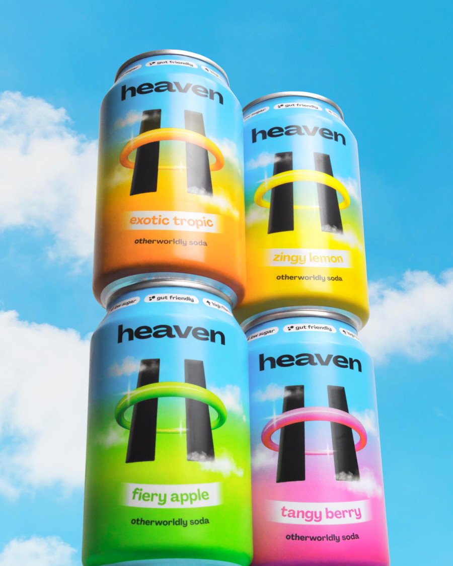
This is why contrast, clarity, and hierarchy of text are so important. They’re not just things that make a product look nice. They grab people’s attention. A strong focal point that is backed up by clear messaging and a disciplined use of space guides customers’ eyes and reduces confusion about what the product is.
When packaging is overcrowded with competing claims about nutrition or unnecessary design flourishes, it doesn’t stress consumers out. That’s a bit strong. But it does make it harder for them to process the information that is going to convince them to buy.
Packaging as a signal of value
Long before someone turns your product around to read the fine print, they will have already made a litany of assumptions about its quality and whether the price is fair. Everything from the weight of a product to the finishes on the packaging (even down to how it feels in their hands) all sends subtle but powerful signals.
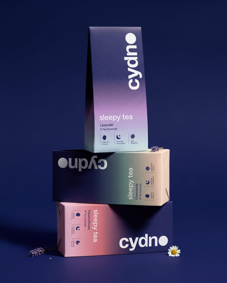
For instance, a minimal design that is confidently executed often communicates premium positioning because it suggests restraint and control. On the other hand, excessive embellishment can feel like the packaging is compensating for a product that is quite cheap.
Matte finishes, thoughtful typography, and generous spacing all influence the perceived value of a brand without a single sentence being read. Consumers aren’t calculating the value of a product logically while they’re in the store. It’s inferred through packaging, which sets expectations about their experience of using the product should they buy it, shaping their willingness to hand over their money.
If the packaging and the performance of the product aren’t aligned, then customers’ trust in a product vanishes. This makes packaging much more than a tool for attracting attention. It is about aligning a customer’s initial perception with the reality of using or consuming it.
Decision fatigue and the power of clarity
Modern consumers have to make hundreds of decisions every day, so by the time they’ve arrived at their local supermarket after a long day, their mental energy is already low.
It’s easy to understand, then, how people will default to the option that they’re either familiar with or the one that is easiest to understand.
Clear messaging that lays out the benefits with strong naming conventions reduces friction for consumers and creates confidence that this new product is going to work for them. Bombarding packaging with information doesn’t make a product more persuasive. It just muddies the waters and can stall decision-making entirely for fatigued customers.
The brands that succeed are the ones that make the choice feel effortless because they clearly present the value of their product and make the next step, putting it in their trolley, feel simple.
The role of familiarity and category codes
Every product category develops a visual shorthand over time. Certain colourways, packaging formats, and typographic styles become deeply associated with specific product types. These categories help shoppers navigate aisles quickly and provide reassurance that a product fits where it claims to.
It can be tempting, for disruptor brands especially, to go against the usual conventions found in product categories in pursuit of originality. This can backfire, though, and make a product feel unfamiliar or risky to audiences who need persuasion to move away from what feels familiar. At the same time, sticking too close to what is already out there just positions your brand as another invisible wannabe.
The strongest packaging strikes a balance. It makes itself recognisable enough to feel credible but with enough distinction to be remembered by audiences. Differentiation works best when it builds on familiar feelings and themes rather than rejecting them altogether.
Packaging in the age of online buying
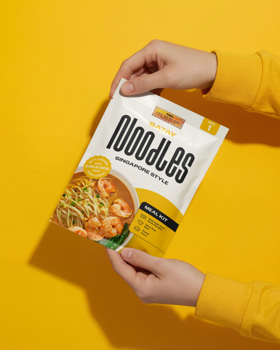
The first interaction a customer has with packaging increasingly happens on a screen where products appear as thumbnails alongside each other, competing for clicks. This level of competition makes visuals at this smaller scale critical.
Bold shapes and strong visual anchors are far better received by online audiences than intricate details that don’t translate through the screen.
And yet, physical moments still matter. The weight of the product in hand, the texture of the materials, and the unboxing experience reinforce that initial online perception.
Packaging must perform twice: once as a digital hook, and again in the aisles as a confirmation of quality.
Packaging is the decision trigger
Founders often treat packaging as the final creative task before launch, seeing it as something to apply once the product is ready. What it should be seen as, however, is one primary factor in how well your product will perform commercially.
Packaging influences attention, trust, and value. It can justify a higher price or undermine it. Once you understand the psychology of packaging, it stops becoming decoration and becomes essential to the success of your product.
Deuce Studio is an award-winning, London-based branding and packaging design agency.
If you are looking for a branding and packaging project, then let’s talk.