A McKinsey’s State of Grocery Europe report (2025) found that roughly equal proportions of shoppers are trading up and trading down at the same time. The market isn’t splitting into cheap and expensive. It’s splitting into “worth it” and “not worth it.” Karyatis needed to land firmly on the “worth it” side.
Before any design work began, we built a clear strategic foundation for the brand campaign. Karyatis is rooted in good quality, authentic Mediterranean food, from antipasti and mezze to everyday cooking ingredients, made accessible at an honest price point for UK shoppers. The brand exists to bring a bit of holiday to your table at home, spreading the joy of food through shared, everyday moments. This thinking allowed us to balance quality and accessibility, appealing to both an existing, slightly older audience who value authenticity, and a younger, more adventurous food audience looking to recreate those Mediterranean moments at home.
The creative idea: every day could be a holiday if you bring home some sun. That became the anchor for everything.
What We Did
With most brand campaigns, we kept the existing logo and tagline. They had recognition, and there was no reason to throw that away. What we built was the visual system around them, grounded in the strategic work and brought to life through a set of clearly defined brand principles.
As part of this, we explored multiple design directions through mood boards rooted in the brand values: authenticity, quality, accessibility and a bright, sunny outlook, alongside an extensive audit of the competitive set across olives, olive oil, roasted peppers and more. This ensured the direction we landed on wasn’t just creatively strong, but strategically differentiated within the category.
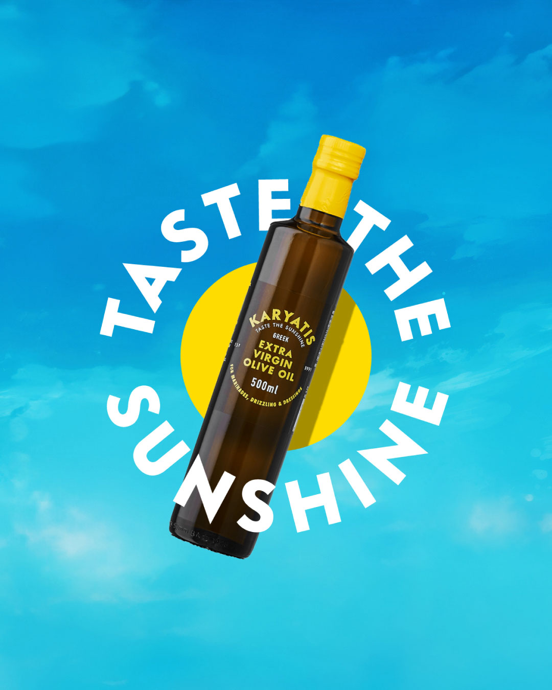
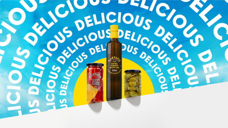
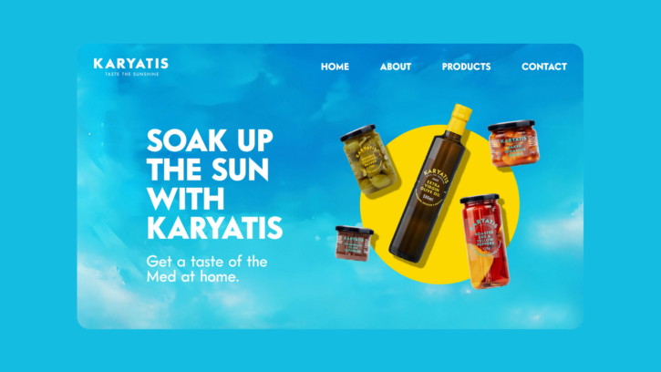
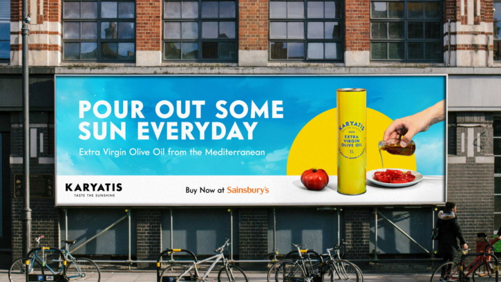
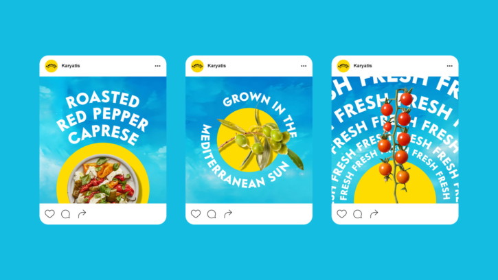
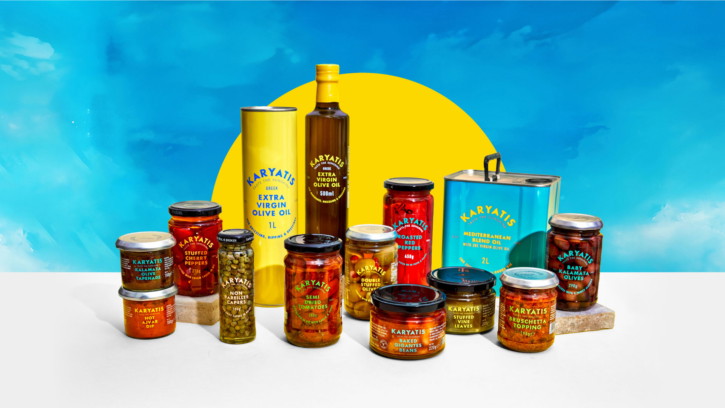
A textural blue sky background. Not a flat colour or a gradient. A warm, textured blue that feels like looking up on a Mediterranean afternoon. It gives every piece of communication an instant sense of place.
A sunny graphic device. Bold, simple, works at any size. From an Instagram story to an in-store header board. It ties the campaign together without the logo having to do all the work.
A range of type styles. Not one font used rigidly across everything. A mix. Headlines that feel warm. Supporting text that’s clean and confident. The typography signals approachability, not exclusivity.
Recognition is expensive to build and easy to throw away. The smarter move was to keep the core assets and build the visual language around them. That’s the difference between a brand refresh and a rebrand.
Making it Work Everywhere
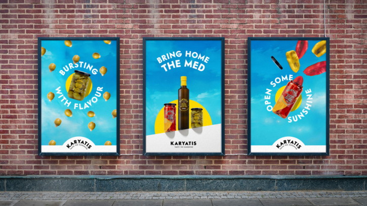
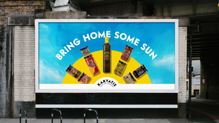
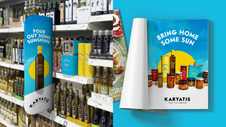
The system had to cover a lot of ground. Social media (posts, stories, reels, carousels). In-store promotions (shelf wobblers, header boards, POS displays). Print and digital advertising. And it had to work with existing pack shots, newly commissioned photography, and found imagery. That last part was deliberate. Karyatis shouldn’t be dependent on one expensive photoshoot to keep the brand looking right.
We designed it as modular components. Building blocks that can be assembled differently depending on the format, but always feel like the same brand. The blue sky, the sunny device, and the typography work together at any scale and in any combination.
The best test of a design system is whether someone else can use it without the whole thing falling apart. We’ve seen it enough times: a brand team gets handed a set of beautiful assets, and within six months the brand looks completely different because nobody understood the rules. The Karyatis system was built with clear component rules so their team can create simpler executions in-house. Not every social post needs to come through us.
The Tone of Voice
The visuals needed a verbal partner. Karyatis had to sound like it looks: inviting, warm, unpretentious.
That meant avoiding two common traps. The foodie-snob voice (“lovingly crafted,” “artisanal”) and the discount-brand voice (“unbeatable value,” “mega deals”). Most food brands fall into one or the other. The middle ground, where you sound like you genuinely like food and genuinely want people to enjoy it, is harder than it looks.
Our tone of voice principles were built around keeping communication simple, optimistic and full of care. The language needed to feel accessible to a wide audience, while still reflecting the quality of the product, always positive, always human, and always rooted in the joy of sharing food.
“Bring home some sun” as a campaign line hits that balance. It promises something emotional (warmth, a bit of holiday) tied to something practical (good food on the table tonight). On social the tone is lighter, more playful. On packaging it’s confident and clear. In advertising it leans into the emotional promise. The words change. The feeling doesn’t.
The Rollout
The campaign is rolling out across socials, in-store POS, print and digital advertising, and photography through 2026. Look out for it in retailers.
Most grocery spending still happens in physical stores, so the in-store work was central to the strategy, not an afterthought. When Karyatis has a display, a shelf strip, and a social campaign running simultaneously, they all need to feel like one voice. The system makes that possible.
Three Things We Took Away From This Project
Protect what already works. The instinct to scrap everything and start fresh is strong. It’s usually wrong. Karyatis had recognition. We built around it instead of replacing it.
Build a system, not a set of assets. Campaigns end. Systems last. The modular toolkit means Karyatis can evolve, run seasonal promotions, and create new content without the visual language breaking down.
Start with the hardest touchpoint. We started with in-store. Not the most glamorous format, but the most constrained. If the system works on a shelf wobbler and a promotional display, it’ll work everywhere else. The reverse isn’t always true.
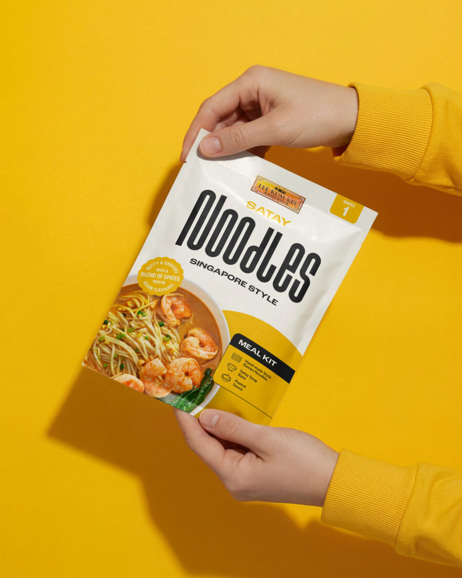
If you’re working on something similar, whether that’s a brand refresh, a retail relaunch, or a campaign that needs to work across a dozen different formats, we’d like to hear about it. We’ve done this for brands like Lee Kum Kee, White Rabbit Pizza Co., and Gr8nola too.
Get in touch and tell us about your project.