New Brands: Building Recognition Through Consistency
If you’re launching a new brand, colour is your fastest route to recognition. Before consumers learn your name, understand your proposition or remember your logo, they remember colour.
This is where consistency becomes critical. One core colour, used relentlessly and confidently, allows your brand to start building memory structures. Think of how quickly you recognise Coca-Cola red or Cadbury Dairy Milk purple. These colours don’t just decorate packaging; they belong to the brand.
In crowded retail environments, especially food and drink, colour does a huge amount of heavy lifting. Shoppers scan shelves quickly. A single, bold brand colour that blocks together across a range can stop people in their tracks.
This is what we often refer to as brand blocking: using one dominant brand colour consistently across multiple SKUs, with flavour differentiation handled through secondary colours, accents or typography rather than changing the core pack colour every time.
Brand Blocking in Practice
Brand blocking is incredibly powerful when done well. It creates shelf impact, aids navigation, and reinforces brand recall every time a consumer encounters your product.
One example from our own work is Gr8nola. When we rebranded the range, the category was awash with beige, white and muted tones, all signalling naturalness in very similar ways. Gr8nola’s previous packaging followed that convention too, making it easy to overlook.
By choosing a bold, confident purple as the core pack colour, we immediately separated the brand from its competitors. Purple was unexpected in the granola aisle, but crucially, it wasn’t random. It signalled confidence, personality and a slightly irreverent take on a category that can sometimes feel overly earnest. Flavours were differentiated through accent colours and graphic elements, but the purple remained constant, allowing the brand to block powerfully on shelf.
The result was instant recognition and a strong, ownable visual territory.
Evolving Brands: When Colour Needs to Grow Up
For established brands, colour decisions become more complex. There’s equity to protect, recognition to maintain, and loyal consumers to consider. But that doesn’t mean colour should be untouchable.
A key question we often ask is: Is your colour still working as hard as it could be?
Markets change. Categories evolve. What once felt disruptive might now feel dated. What once felt bold might now feel noisy. Rebrands are often less about dramatic reinvention and more about recalibration.
Take our work with White Rabbit. The brand had grown significantly and had ambitions to become the UK’s number one gluten-free pizza brand. Their previous darker, edgier palette no longer reflected the quality, inclusivity and confidence of the product.
We introduced a deep navy blue as the core brand colour. Navy is still dark and confident, but it carries different connotations to black. It feels premium without being aggressive, modern without being cold. It also provided a strong backdrop for photography, typography and gluten-free credentials to shine.
The shift wasn’t about standing out for the sake of it; it was about choosing a colour that aligned with where the brand was going, not just where it had been.
Colour With Meaning, Not Just Difference
One of the biggest mistakes brands make is choosing colour purely to be different from competitors. While differentiation is important, contrast alone is not enough.
Colour carries meaning, whether you intend it to or not.
- Darker shades often signal premium, craft, depth and seriousness. They slow people down and suggest quality worth paying for.
- Brighter colours feel energetic, accessible and warm. They can signal fun, flavour and immediacy.
- Muted or natural palettes suggest calm, health, restraint and authenticity.
- High-contrast palettes can feel bold and confident, but also risk visual fatigue if not handled carefully.
The key is aligning colour choice with your brand’s personality, price point and ambition.
In our work for Crosta Mollica, colour played a crucial strategic role. Italian food brands often lean heavily into rustic cues, warm reds or heritage creams. For Crosta Mollica, we wanted to elevate the brand and reinforce its premium credentials while maintaining authenticity.
We landed on a black-and-white base with a hit of yellow. The monochrome palette created a sense of confidence and restraint, while the yellow added warmth, appetite appeal and a subtle nod to Italian sunshine. The result felt premium, modern and unmistakably Italian without resorting to clichés.
Again, the colour choice wasn’t just about standing out. It was about expressing quality, provenance and confidence through colour.
Colour and Quality Expectations
Colour sets expectations before a product is even touched. A darker, richer palette often suggests higher quality and a higher price point. Lighter or brighter palettes can suggest accessibility, playfulness or everyday use.
This is particularly important in food and drink, where packaging colour influences perceived taste. Deep colours can imply richness and intensity. Lighter colours can suggest freshness or lightness.
When choosing a colour, ask yourself:
- What do I want people to expect before they try the product?
- Does this colour justify my price point?
- Does it feel appropriate for the moment the product will be consumed?
Colour should act as a promise that the product then fulfils.
Production, Materials and Reality
Colour doesn’t exist in a vacuum. It lives on materials, substrates and finishes, all of which affect how it appears in the real world.
Matte stocks absorb light and can make colours feel softer and more premium. Gloss finishes increase saturation and vibrancy but can feel more mass or functional if overused. Foils, inks and coatings all behave differently, and cost implications need to be considered early on.
You also need to think about where your packaging will live. Will it sit under harsh supermarket lighting? Will it be delivered to doorsteps and exposed to weather? Will it fade if left in sunlight?
A colour that looks perfect on screen may behave very differently once printed. This is why colour testing and real-world mockups are essential.
Flavours, Variants and Range Expansion
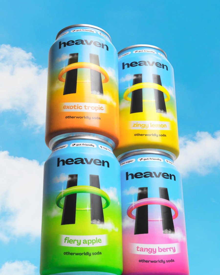
If your product comes in multiple flavours, colour systems become even more important. This is where brand blocking really earns its keep.
Rather than changing the main pack colour for every SKU, strong brands keep the core colour consistent and use secondary colours, patterns or typography to differentiate flavours. This allows the range to feel cohesive while still being easy to navigate.
Cadbury is a masterclass in this approach. No matter the variant, the purple remains dominant. The brand colour leads; flavour cues support.
This approach also future-proofs your brand. As ranges expand, you don’t dilute recognition or lose shelf impact.
Rebrands and Brand Equity
When rebranding, colour decisions should be made with sensitivity. If a colour has strong recognition, the question becomes whether to evolve it rather than abandon it entirely.
Sometimes this means adjusting tone, depth or saturation rather than switching hue completely. Sometimes it means simplifying a palette that has become overly complex over time.
The goal is continuity with progress. You want existing customers to recognise you instantly, while new customers see a brand that feels current and relevant.
Colour as a Strategic Asset
Ultimately, colour is not decoration. It is a strategic asset that should work across every touchpoint: packaging, website, social, advertising, retail environments and beyond.
The strongest brands use colour consistently, confidently and with purpose. They don’t chase trends for the sake of it, but they do evolve when strategy demands it.
Choosing the right colour means understanding your brand deeply, understanding your category honestly, and understanding your audience emotionally.
The rainbow really is the limit—but the smartest brands choose carefully, and then commit fully.
Deuce Studio is an award winning London based branding and packaging design agency.
If you are looking for a branding project, then let’s talk.