A Brand Built on Hands, Heritage and Heart
From the outset, the name itself Hand-tied Knots directed us toward the narrative we needed to convey. This was a distinctive product where the method wasn’t merely a detail; it was the brand. The hand-tied nature of the knots, the quietly obsessive attention to ingredients; these elements deserved prominent placement on the front of the pack.
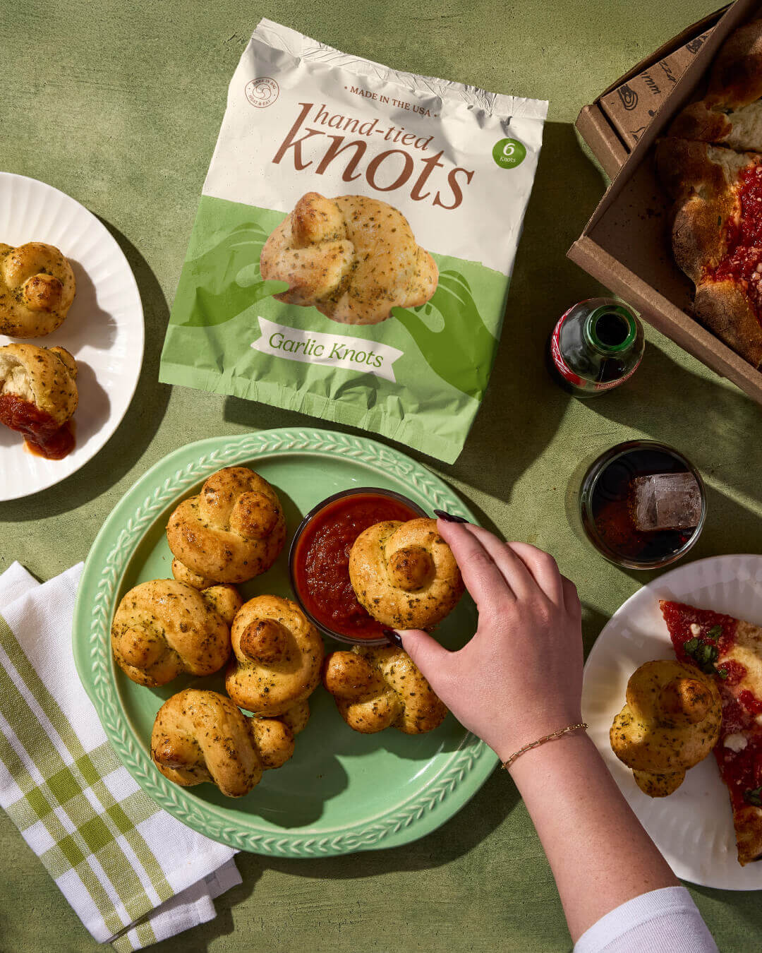
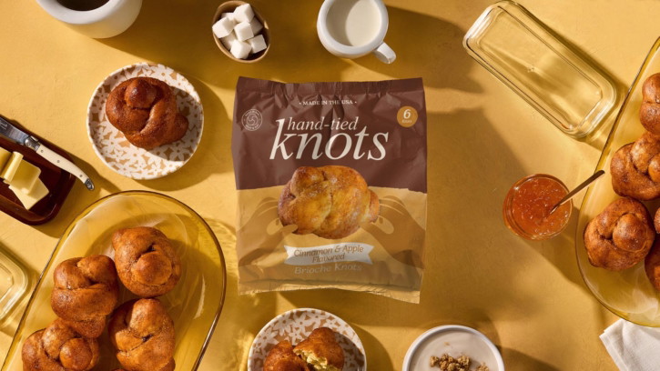
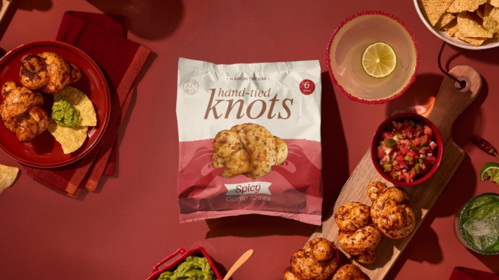
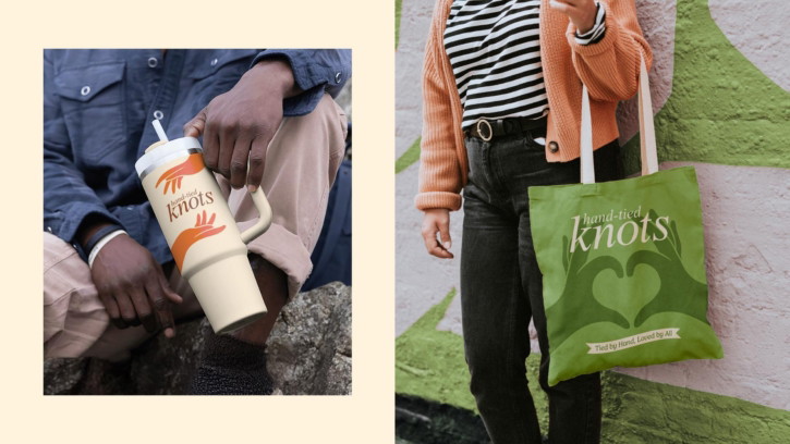
To express this, we developed a series of distinctive illustrated hands, each one interacting directly with a hero photograph of the knot. By pairing illustrations with real photography, the packaging gains a handmade authenticity.
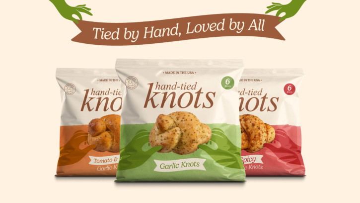
The graphics surrounding the hands embrace texture and a subtly rustic quality, reinforcing the honest, home-baked spirit of the product. The colour palette feels familiar, wholesome and warm, with sufficient vibrancy to signal flavour variation across sweet and savoury ranges. Typography playing a supportive yet expressive role, blending friendliness with clarity so that packs feel approachable, family-oriented, and rooted in comfort.
The interplay of illustration, photography, and texture introduces something genuinely fresh to the freezer aisle: a brand that feels simultaneously nostalgic and new.
Familiar, Yet Freshly Tied Together
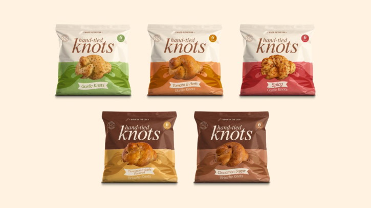
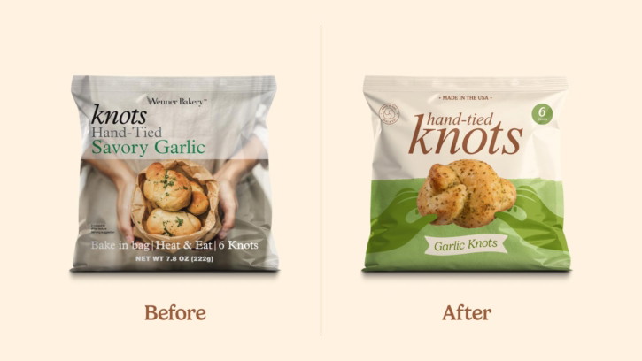
The packaging design required flexibility across dramatically different product types from garlic and savoury herb-based knots to sweet brioche knots. Because flavour divisions weren’t merely about taste but category, the design system demanded both clarity and versatility.
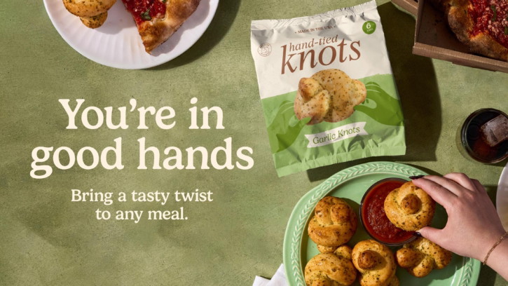
Product photography occupies centre stage. A large, beautifully photographed knot and illustrated hands are front and centre on each pack, making the food feel irresistible without relying on overly styled or artificial presentation.
Supporting elements enhance navigation without creating clutter: playful flag-shaped flavour names, badges communicating key attributes such as heat & eat and bake in the bag, number of knots indicators, and the Made in the USA callout. These components function as friendly signposts that reinforce the brand’s approachable character without overwhelming.
The resulting architecture achieves balance: expressive enough to command attention in a crowded freezer aisle, yet clean enough to feel trustworthy and straightforward for busy families scanning the shelf.
Honest, Appetite-Led, and Emotionally Grounded
Photography plays a dual role in the new brand world. On front of pack, imagery focuses on the hero knot itself. This isn’t about trickery or complexity, it’s about showing the product in its purest, most crave-worthy form, with enough light and texture to communicate freshness and authenticity.
On the back of pack, the knots are shown pulled apart, revealing texture, flavour ingredients and the irresistible softness that families love. No hands appear here; instead, the product speaks for itself. The images are paired with ingredient cues that help communicate each flavour variation in a way that is both clear and appetising.
Lifestyle photography expands the world beyond the packaging. These shots focus on warm, inviting moments, family meals, shared bites, comforting spreads, providing emotional texture and reinforcing the product’s role in everyday American life. This imagery is used across multiple touchpoints including POS, website content and social storytelling.
Warm, Playful, and Proudly Knotty
Beyond the visuals, the brand refresh required an equally distinct verbal personality, one that matched the product’s charm and its position within American mealtime culture. We developed a warm, fuzzy, light-hearted tone of voice that celebrates togetherness, family rituals, and the simple joy of pulling a warm knot apart with your hands.
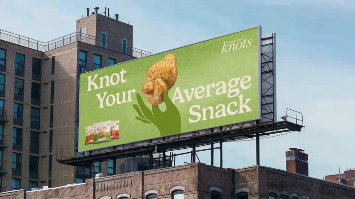
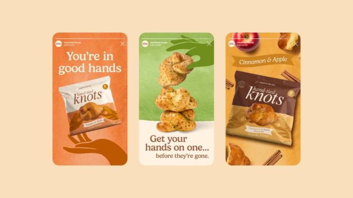
Puns and wordplay aren’t gimmicks here; they’re genuine expressions of character. They translate the physical shape of the product into a verbal style that feels natural, memorable, and charming.
Phrases like:
- Tied by hand, loved by all
- Knot your average snack
- You’re in good hands
Each line communicates brand personality while reinforcing product truths the hand-tied process, the family appeal, and the inviting, comforting nature of each knot.
This tone works seamlessly across touchpoints, from packaging to social to out-of-home, where a line like Knot your average snack becomes a headline with genuine stopping power.orks seamlessly across touchpoints, from packaging to social to OOH, where a line like Knot your average snack becomes a headline with real stopping power.
Building a Full Brand World
Our work extended well beyond the pack. The brand required a flexible system capable of stretching confidently across digital and print environments while maintaining consistent warmth and character. The expressive colour palette, illustrated hands, textured graphics, and inviting food photography combine to create a cohesive ecosystem that feels both playful and grounded.
The website extends this sensibility through an inviting combination of delicious food photography, layered textures, and conversational copy that feels like a friend sharing a favourite family recipe. Out-of-home executions take a bolder, more humorous approach, using large-scale visuals and confident lines like Knot your average snack to command attention in busy public spaces.
Every application circles back to the core idea: celebrating the craft, comfort, and character of these uniquely hand-tied knots.
A Visual Evolution That Finally Tells the Full Story
The new identity brings the product’s genuine strengths: hand-made heritage, flavour variety, and emotional resonance to the forefront. Where previous packaging understated the craft and uniqueness of the knots, the new system celebrates it, providing shoppers with a clearer understanding of what makes these products distinctive.
This is a brand world that respects the product’s past while energising its future. An identity tied together as carefully as the knots themselves.
Deuce Studio is an award-winning London-based branding and packaging design agency.
If you’re considering a branding project, let’s talk.