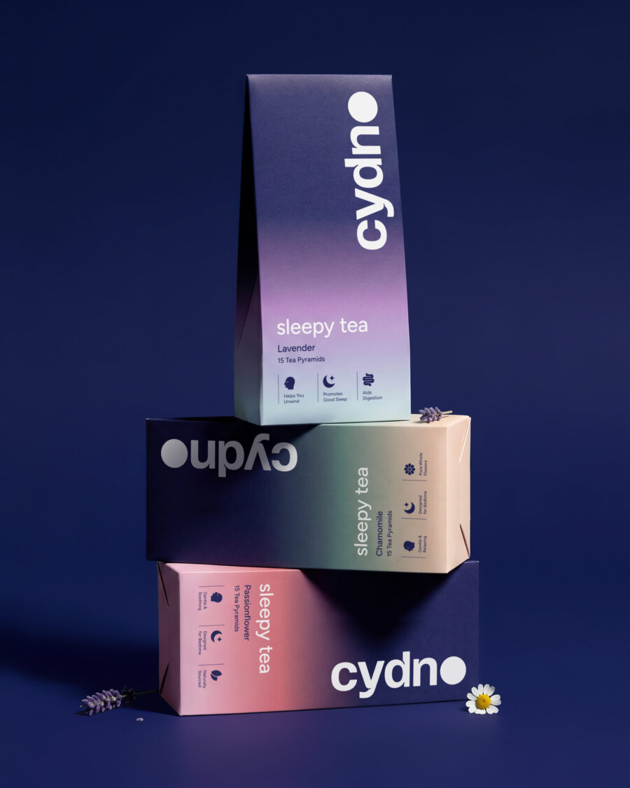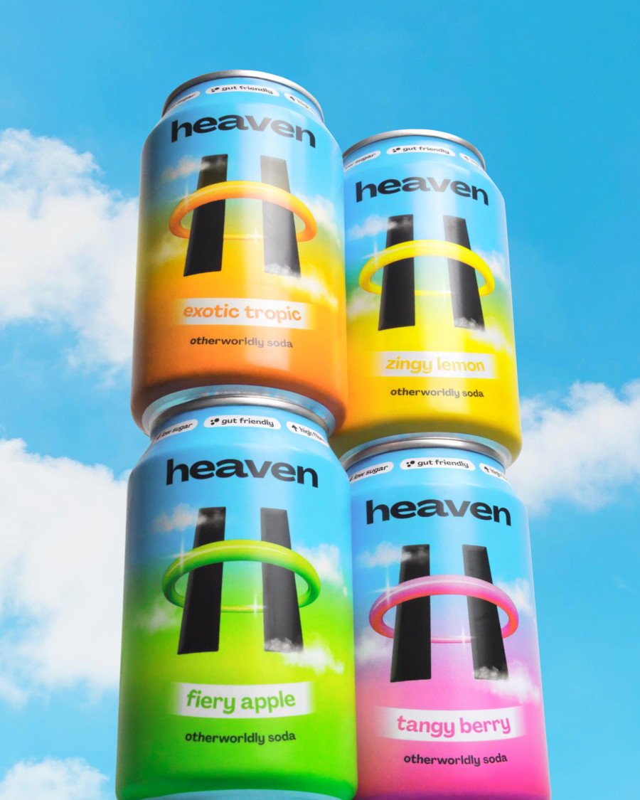
The supplement space is visually crowded. Brands often lean heavily into lifestyle imagery, pastel backdrops and aspirational wellness scenes. While this approach can feel accessible, it rarely signals scientific authority. For a premium brand with advanced formulations and rigorous sourcing standards, that lack of authority can dilute perceived value.
Our objective was simple. Elevate the visual language to reflect the integrity of the product inside the bottle.
Defining the Concept
We began by defining a clear conceptual foundation for the art direction. At the heart of NFO Vitamins is the fusion of science and nature. That idea became our creative anchor.
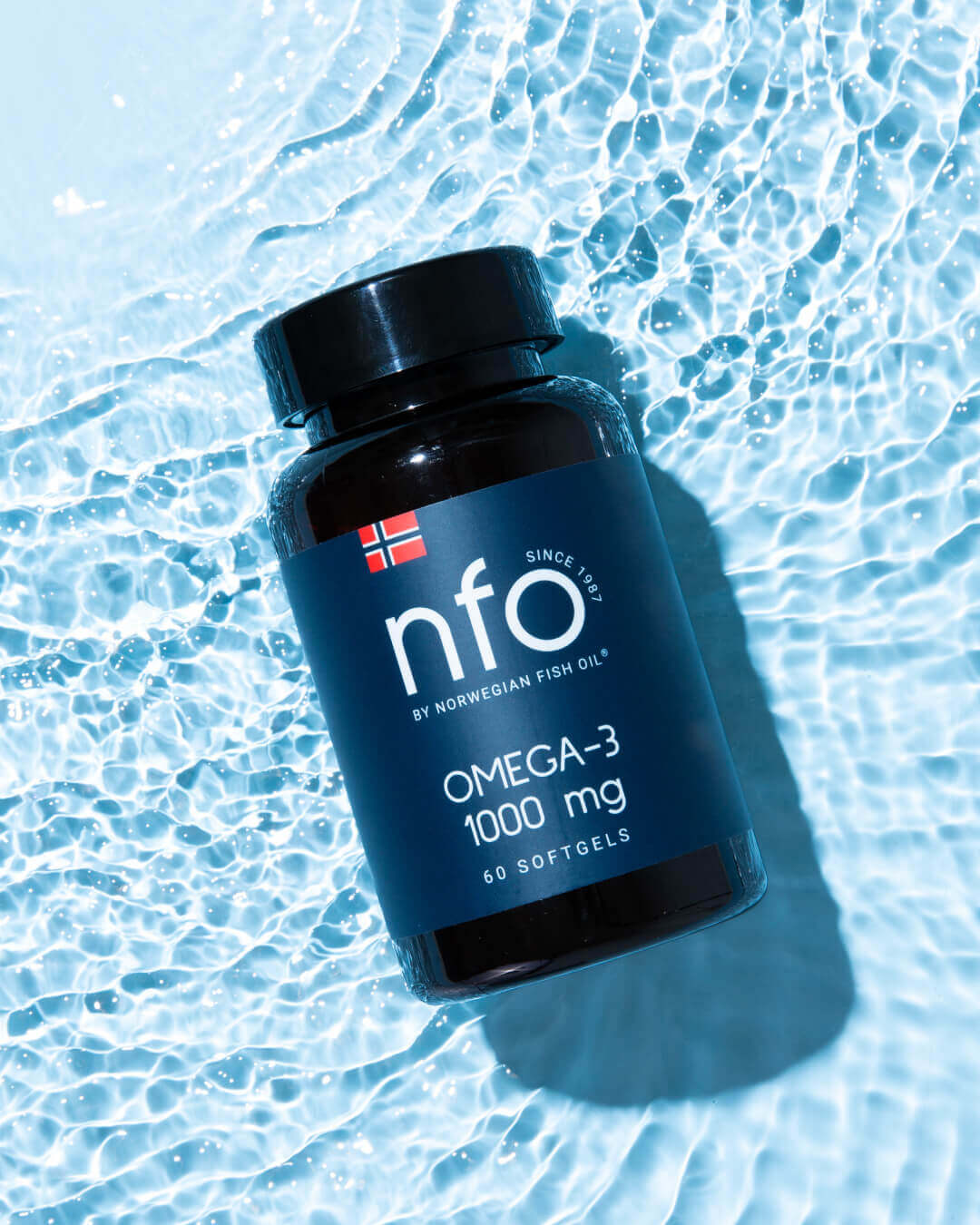
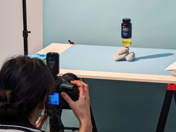
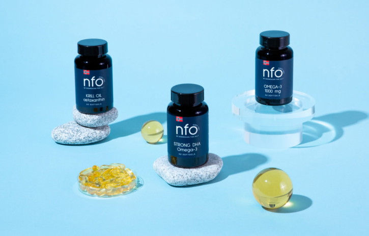
To express the scientific dimension, we introduced laboratory-inspired materials such as perspex, glass and frosted acrylic. These elements added structure, geometry and a sense of precision to each composition. Clean lines and controlled reflections hinted at research environments without becoming literal or clinical. The effect was subtle but intentional. This was a brand grounded in expertise.
To balance that precision, we paired these materials with raw stones and organic textures. These references to the Nordic landscape anchored the imagery in origin and purity. The contrast between engineered surfaces and natural forms created tension and interest. It also told a story. Scientifically formulated products, derived from nature.

Materiality, Light and Form
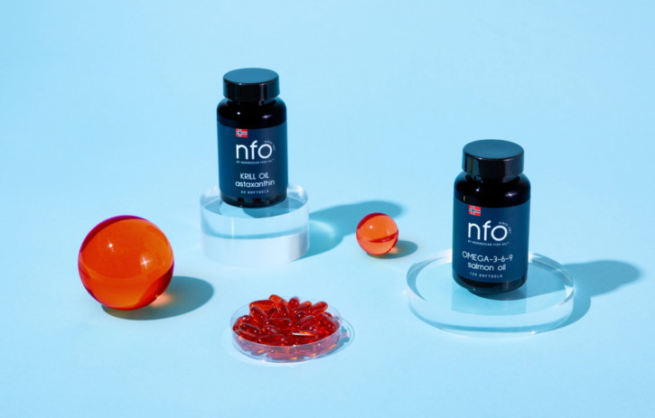
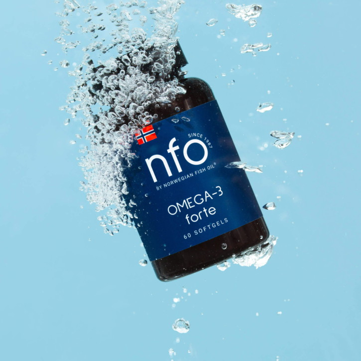
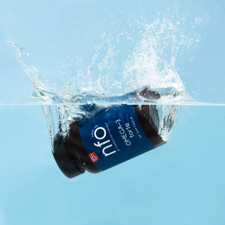
Lighting played a critical role. We opted for crisp, directional lighting that enhanced form and shadow, allowing capsules, oils and packaging to feel sculptural and tactile. The clarity of light reinforced the sense of transparency and trust. Nothing was hidden. Nothing was softened unnecessarily.
Composition was deliberately restrained. Negative space was used confidently to give products room to breathe. This minimalism communicated premium positioning and allowed the materials to speak for themselves. Rather than cluttering frames with props, each element was carefully chosen and placed with intention.
Colour was treated with similar discipline. The cool, neutral palette nodded to the Nordic environment while ensuring that packaging remained the focal point. Subtle tonal shifts within stones and frosted surfaces added depth without distraction.
Building a Scalable Visual System
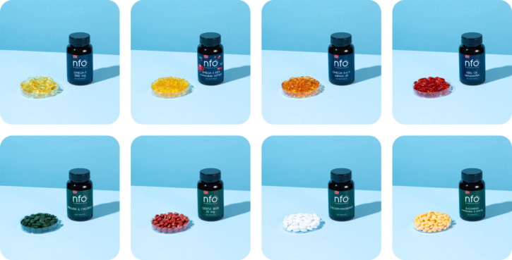
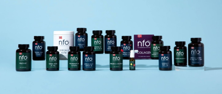
Importantly, the art direction was designed as a system, not a one-off aesthetic. The interplay between perspex, stone and light can flex across product categories and future launches while maintaining coherence. This ensures consistency as the brand evolves, a crucial factor in building long-term equity within a growing supplement portfolio.
The result is a body of imagery that feels confident, elevated and credible. It avoids the visual tropes that dominate the wellness category and instead positions NFO Vitamins as a serious, science-led brand with natural roots.
In a market where trust is everything and differentiation is difficult, photography becomes more than decoration. It becomes proof. Through considered materials, disciplined composition and a clear conceptual foundation, we helped NFO Vitamins articulate who they are without saying a word.
Photography by Iona McCleod
Brand guardianship and activation
While this project centred on art-direction and product shoot, it also reflects a broader aspect of our offering: brand activation and guardianship.
Many of our clients come to us at moments of evolution. They may be launching into new territories, extending product ranges or entering new channels. They do not necessarily need a full rebrand. They need refinement, consistency and strategic expansion.
Our role as brand guardians is to protect and strengthen what makes a brand distinctive, while activating it across new touchpoints. That might mean evolving packaging systems, developing new product sub-ranges, refining tone of voice or creating launch campaigns that align with the core brand world.
For supplement and wellness brands in particular, this is critical. As portfolios grow, it is easy for visual systems to fragment. Sub-brands emerge. Claims become inconsistent. Photography styles drift. Over time, cohesion erodes.
Through careful stewardship, we ensure that new launches, whether products or digital platforms, feel like natural extensions of the core brand rather than departures from it.
Deuce Studio is an award winning London based branding and packaging design agency.
If you are looking for a branding project, then let’s talk.
Deuce Studio is an award-winning London-based branding and packaging design agency.
If you’re considering a branding project, let’s talk.