Performance nutrition has a format problem. Energy drinks can feel heavy, gels can be difficult to stomach, protein bars can be chalky, and supplement routines can be complicated. For people balancing training, work and everyday life, getting the right support should be simpler.
That was the opportunity behind Ruly. The brand came to us with a fundamental question: where do energy gummies belong? Sitting somewhere between confectionery and supplements, they offer the potential to combine functional benefits with the enjoyment and convenience of a snack. But to stand out in a crowded performance category, Ruly needed more than a new look. It needed a clear position, a distinctive personality and a brand identity that could make this space its own.
At Deuce Studio, we built the brand around a simple idea: performance should be on your terms. From the Microboost® format to the visual identity, packaging and tone of voice, every element was designed to make performance feel functional without being complicated, confident without being intimidating, and enjoyable without compromising its purpose.
Finding a new space in sports nutrition
Ruly sits at the intersection of healthy snacking and sports nutrition, competing with energy gels, protein bars and electrolyte drinks while offering a more convenient, enjoyable and flexible alternative.
Traditional sports nutrition often asks people to adapt to the product. You carry a bulky bottle, squeeze down a gel or work a heavy bar into your routine. The experience can feel inconvenient or unpleasant, particularly when you’re already pushing yourself physically or mentally.
Ruly takes a different approach. Its Microboost® format puts functional gummies into a convenient bag, with each gummy providing a controlled dose. Take one or two over time, or eat the whole bag. The experience and intake are yours to manage.
This flexibility is central to the proposition. Rather than asking people to build their day around their nutrition, Ruly fits around the moments that matter. It offers everyday performance support across energy, strength and recovery in a format that’s easy to carry, enjoy and use.
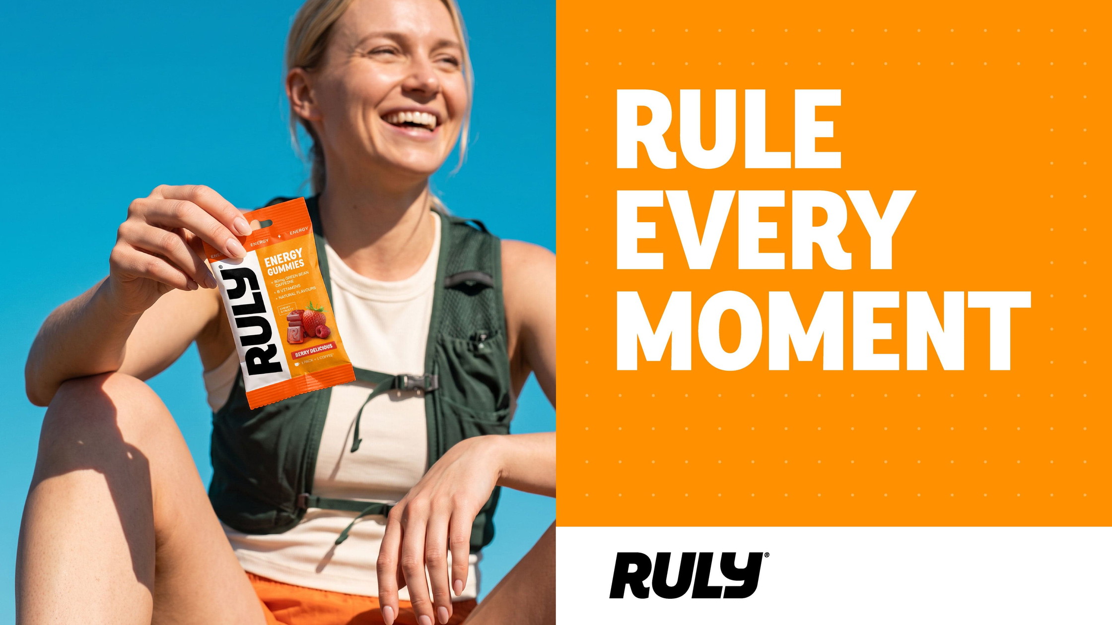
The functional benefit is clear, but the emotional benefit is just as important: being ready to rule the moment, with performance you control.
Performance for real life
Ruly is designed for active people who take their performance seriously without necessarily being elite athletes. We identified two key audiences.
The Performance Improver wants to get more from running, cycling, lifting or endurance training. They value convenient, effective support that fits their routine, helps them stay consistent and gives them control over how they use it.
The Everyday Endurer sees performance as more than what happens in the gym. It’s about staying focused through a busy day, balancing work and social life, and having enough energy for whatever comes next. They want effective support that feels enjoyable and effortless to fit into everyday life.
Although their priorities differ, both audiences want to feel ready for what’s ahead, without unnecessary hassle.
This insight shaped Ruly’s brand values. Empowering Performance means helping people feel capable and in control. Accessible Function makes everyday performance support easier to enjoy. Confidently Effective reflects a commitment to products designed for consistent use and dependable support.
Together, these principles gave us a clear direction: create a brand that respects performance while making it more human and accessible.
A brand built around being ready
Our central creative idea was Ruling Every Moment. Not in an overblown, superhuman sense, but in the everyday moments when you want to feel capable and ready to get on with things.
A tough session. A long shift. A demanding week. The small wins that come from showing up and keeping going.
The brand statement, Daily Performance, Your Way, captures this balance. Ruly combines functional support with a format people actually want to use, offering a more enjoyable approach to everyday performance.
This thinking also informed the tone of voice. We wanted Ruly to be direct, grounded, warm but not soft, and confidently effective. It needed the clarity of a performance brand while recognising that its audience is made up of real people, not professional athletes in a perpetual state of competition.
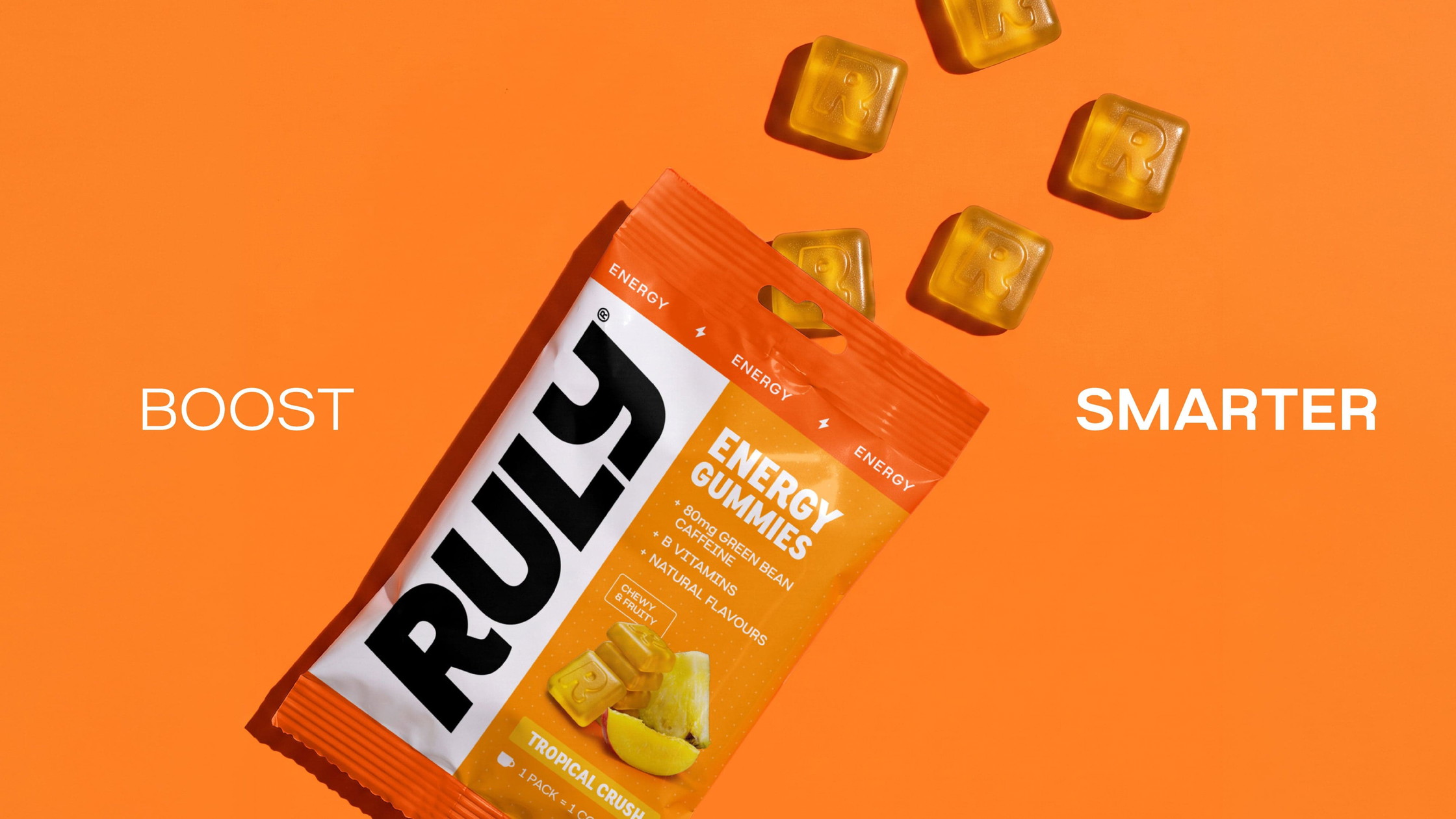
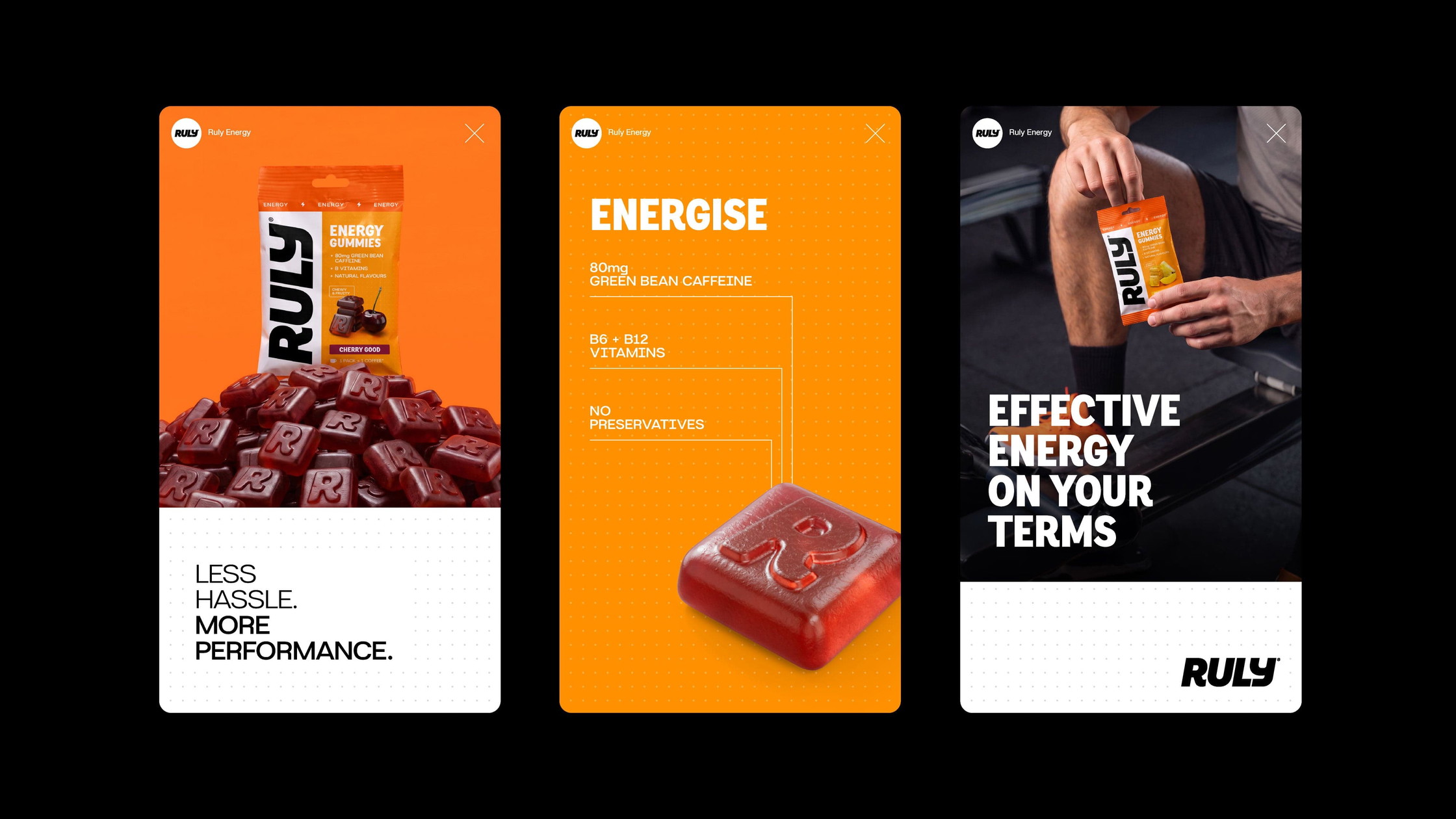
That meant avoiding the clichés of extreme sports nutrition in favour of language focused on effort, control and making the most of the moment. Lines such as “Boost Smarter”, “Small but mighty” and “Less hassle, more performance” give the brand a concise, purposeful voice.
The result is a personality that feels motivating without becoming preachy. Ruly wants the best from you, but understands that performance looks different for everyone.
 Creating a bold, functional visual identity
Visually, we wanted Ruly to feel established and credible in the performance category, while using colour and product imagery to communicate the enjoyment of the format.
A strong black and white foundation creates a clean, considered aesthetic, giving information room to breathe. Typography balances impact with usability, pairing bold, condensed headlines with a clear, functional typeface for subheadings, callouts and body copy. Strong hierarchy and left-aligned layouts make communications easy to navigate.
Colour follows the same principle of clarity. White, black and grey underpin the identity, while vibrant orange provides a distinctive shorthand for energy. Additional benefit colours differentiate products without disrupting the wider system.
Every colour combination has a purpose. Benefit colours pair with darker accents to add depth, while products sit against their corresponding benefit colour to strengthen the connection between appearance and function. When imagery appears within a layout, the colour reflects the benefit of the product shown.
This gives Ruly the flexibility to create bold, varied communications while remaining instantly recognisable.
Structure that brings the brand to life
A repeating dot matrix is the identity’s primary graphic element. Used in the background of communications, it introduces texture and reinforces the brand’s functional character without competing with the content.
Boxes and modular blocks provide further structure, separating text and imagery and drawing attention to key information. Subtle rounded corners add approachability while retaining a confident, considered feel.
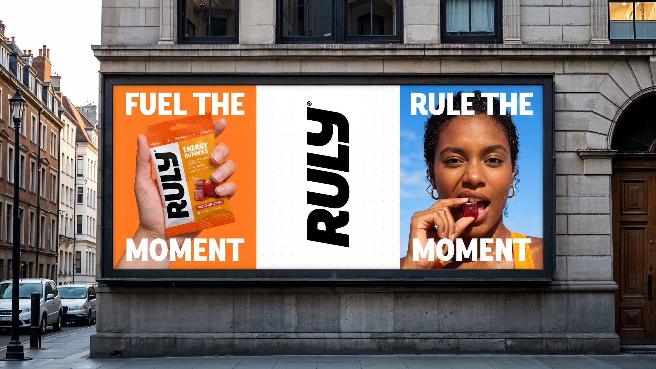
These elements work together through a flexible modular grid. Defined sections accommodate imagery, copy and the logo in different combinations, creating consistency without making every execution look the same. The system adapts to everything from larger advertising formats to social posts, where a single benefit colour or text over imagery can deliver a simpler, more direct message.
Making the product the hero
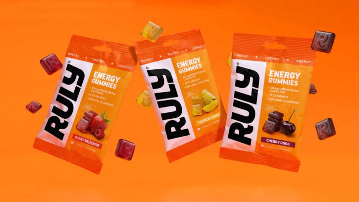
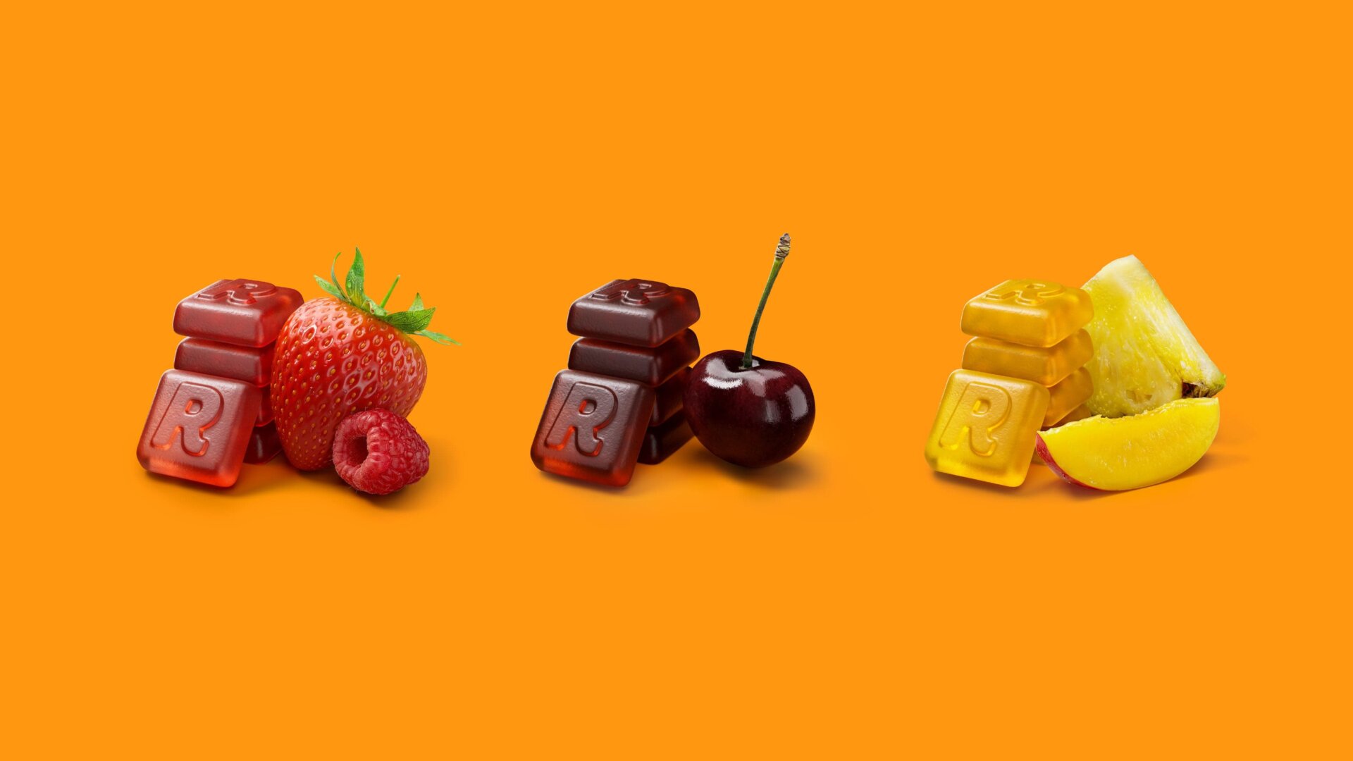
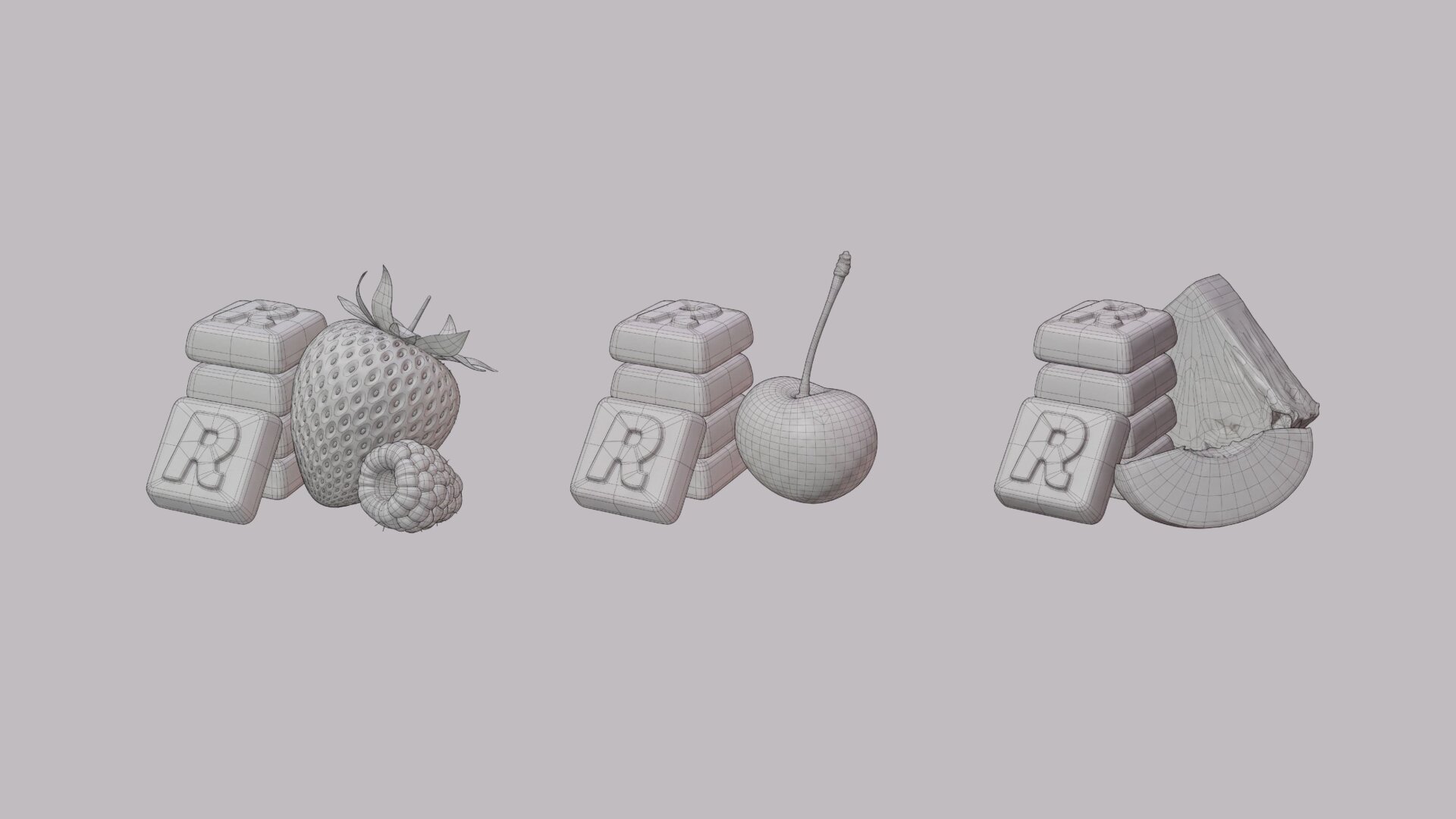
For a brand combining function and enjoyment, product imagery needed to communicate both. Our food imagery pairs detailed 3D renders of the gummies with their corresponding fruit, bringing together product clarity and immediate flavour appeal.
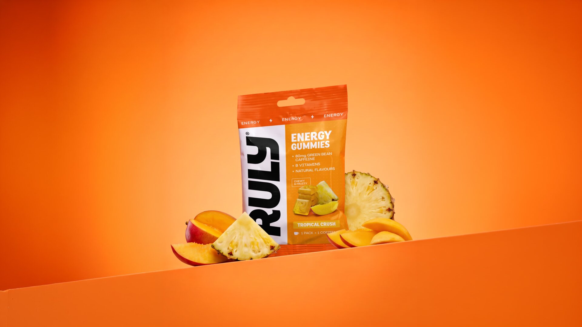
Neatly arranged gummies reinforce the identity’s structured character, while the fruit adds vibrancy and appetite appeal. Product photography puts the packaging and gummies centre stage, moving beyond straightforward pack shots to create engaging compositions that invite a closer look.
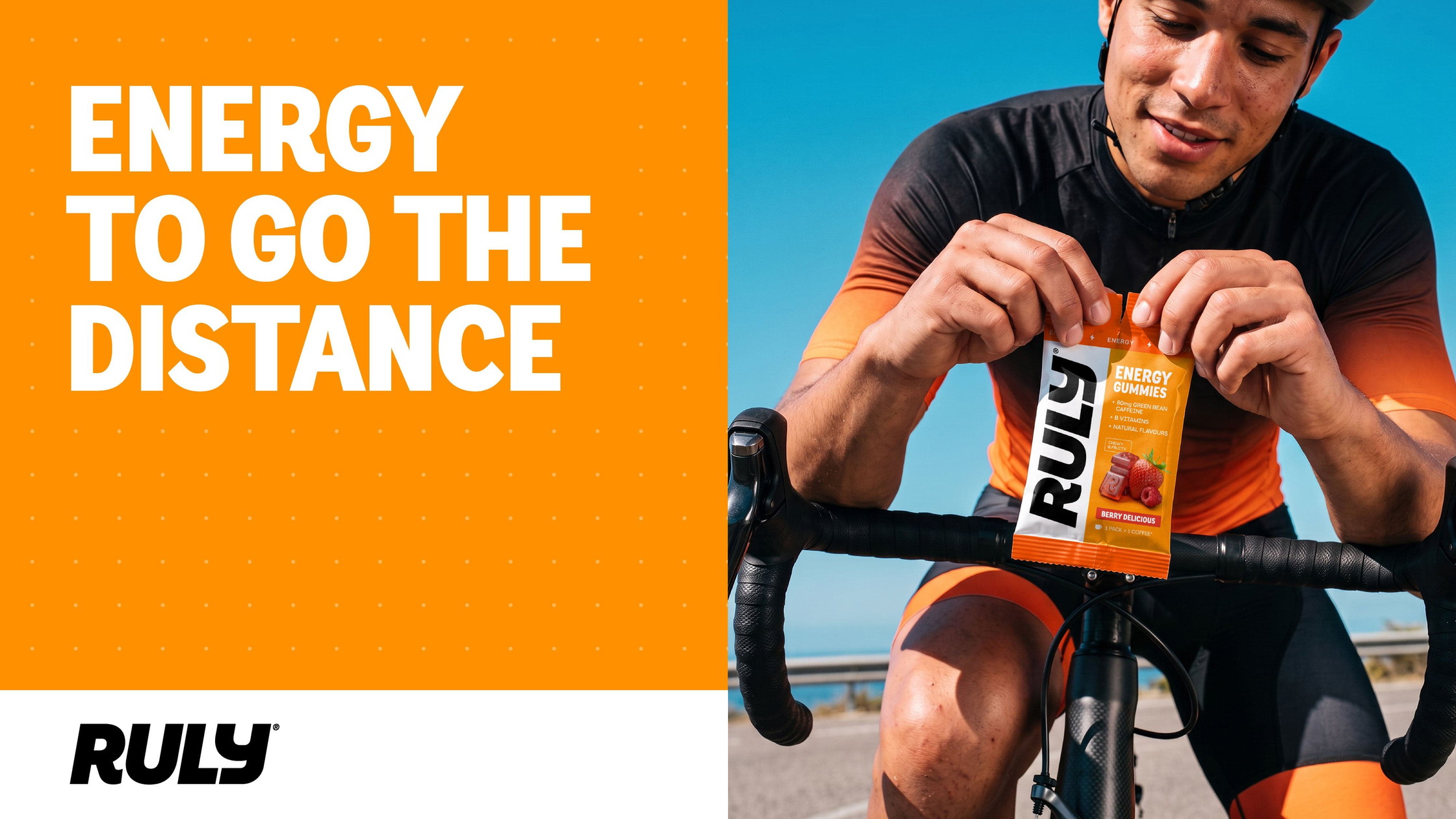
Lifestyle photography takes Ruly into the real world. Bright, dynamic and grounded in natural moments, it captures people around fitness and sport, celebrating the enjoyment of making an effort rather than the pursuit of elite performance.
The imagery is aspirational without being intimidating, reflecting a diverse audience and showing that performance belongs to anyone who wants to get more out of their day.
Packaging with purpose
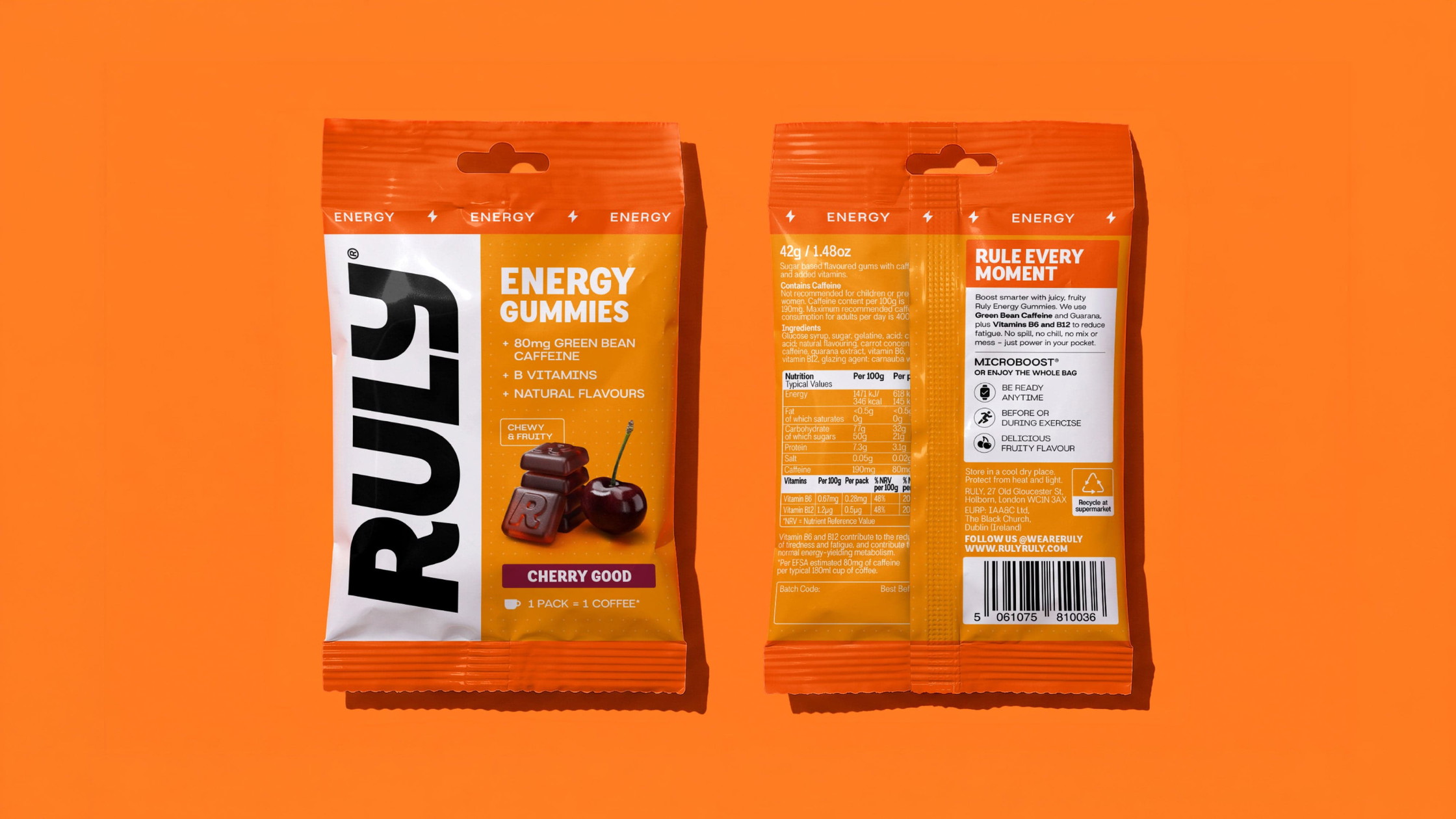
Too much sports nutrition packaging asks shoppers to decode a wall of claims. Ruly’s packaging brings the strategy and visual identity together in a format designed to be understood quickly.
A large, vertically positioned logo runs up the left-hand side of the pack, creating a distinctive asset that stands out on shelf. Product information sits alongside it in a clear hierarchy, bringing together the product name, key callouts, gummy imagery and flavour.
Benefit colour takes centre stage, making each product’s function easy to identify. Repeating the benefit and icon along the top edge provides another point of recognition, helping new customers understand the product’s purpose at a glance. That’s also where a lot of sports nutrition packaging falls down.
The back of pack uses the same structured approach, giving the brand story, nutritional details and supporting information their own defined spaces. A simple lightning bolt communicates energy, while the wider icon system highlights product benefits and reasons to buy.
Every element has a job to do: communicate function, distinguish products and build brand recognition, while keeping the gummies appealing and easy to understand.
Performance, on your terms
Ruly started with a simple question about where energy gummies belong. Our answer was to create a brand that doesn’t have to choose between functional performance and the enjoyment of snacking.
By defining a clear position at the intersection of sports nutrition and healthy snacking, we gave Ruly a distinctive role in the category. Microboost® puts control in the hands of the consumer, while the identity translates that proposition into a confident, flexible system built around clarity, energy and everyday usability.
From the visual language to the packaging and tone of voice, every element reinforces the same idea: performance should fit your life, not interrupt it.
Because performance isn’t just about the biggest challenge or the hardest session. It’s about being ready for whatever comes next.
Ruly. Rule every moment.
Building a sports nutrition or functional brand? See how we refreshed Phizz, or get in touch.