As designers at Deuce Studio, we thrive on translating passion into branding and packaging, and our collaboration with Gr8nola was a perfect match. When founder Erica Liu Williams approached us, she had a vision. Her all-natural granola, born from a post–Super Bowl cleanse and fine-tuned through farmers’ markets, needed the brand overhaul to grow, and we were delighted to help.
The Granola Boom: Low Sugar + Superfoods, USA
The granola category is exploding. From 2024 to 2035, the market is projected to surge from around USD 4 billion to nearly USD 12.6 billion, spurred by health-conscious, on-the-go consumers embracing clean-label, low-sugar, and nutrient-dense snacking. North America leads the way, driven by a mature wellness culture favoring low-sugar, gluten-free, and plant-based options.
Innovations further amplify growth: superfoods like matcha, cacao, turmeric, and activated charcoal (all found in Gr8nola) are increasingly incorporated into granola blends to deliver functional health benefits. At Expo West 2025, industry leaders flagged that granola has evolved into an all-day, nutrient-dense snack, not just a cereal topper.
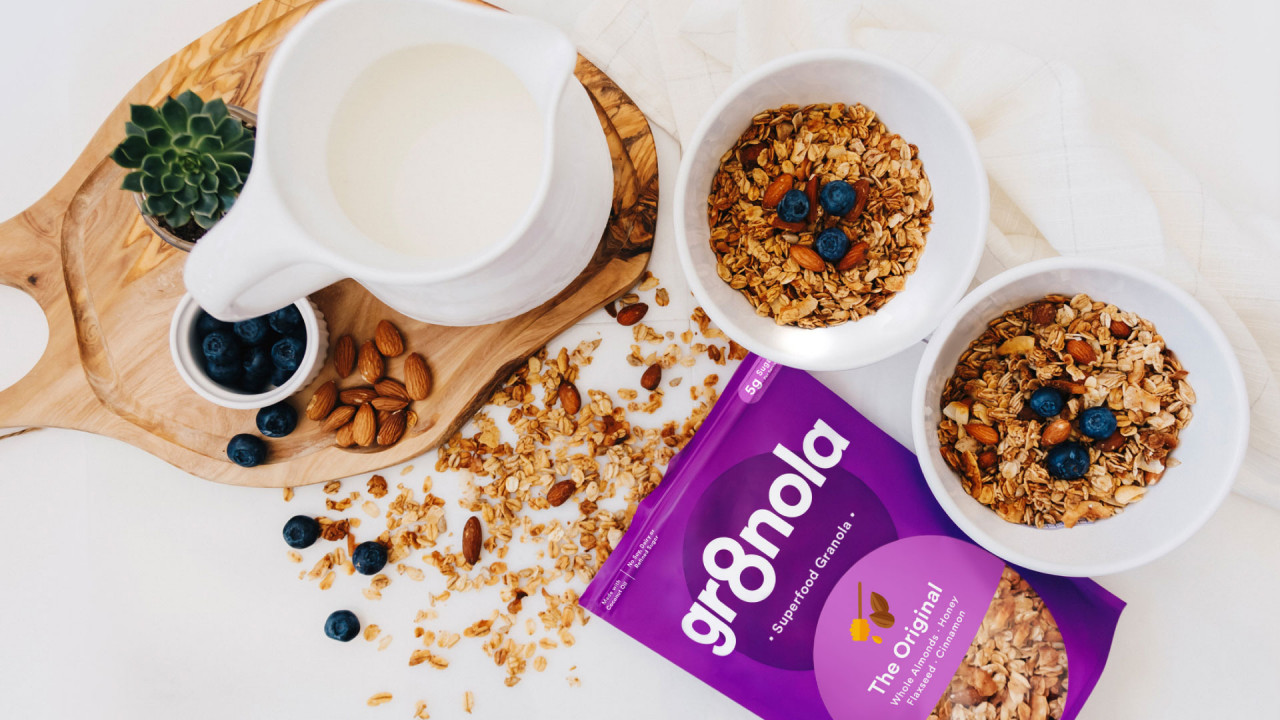
In this booming landscape, Gr8nola stands out, combining all-natural, low-sugar granola with superfood ingredients, perfectly aligned with modern nutrition trends.
The Gr8nola Story: From Tech to Clean Snacking
Erica’s journey resonates deeply with us. Formerly in the tech world, she began making clean granola at home, inspired by an annual Super Bowl cleanse. She sold it first at farmers’ markets, where instant feedback confirmed the product’s promise, and gradually secured placement in tech offices and online sales.
The pandemic shifted her business radically. Losing corporate accounts encouraged her to pivot to D2C and retail channels and reframe her brand strategy. When the business was ready to “go retail”, she turned to us to craft a powerful brand identity that could hold its own on busy grocery shelves.
Brand Foundations: Beyond Packaging
Our collaboration extended well beyond packaging to encompass a full brand identity and website redesign. We worked with Erica to first clarify her brand’s essence, its mission, tone, value proposition, before diving into visual decisions. She found the process eye-opening: previously, brand decisions had been largely tactical.
By building clarity around Gr8nola’s identity, packaging, and digital presence, we created a holistic and scalable brand ready for retail and D2C expansion.
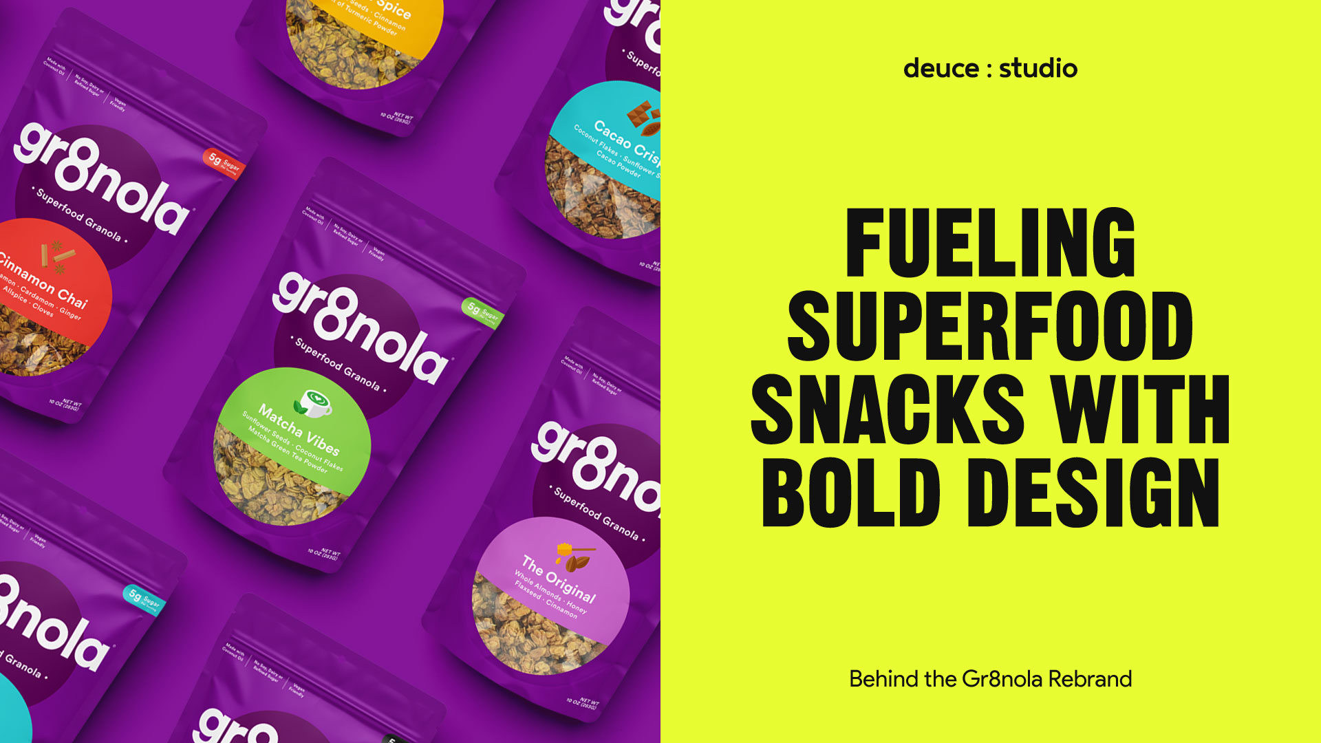
Designing Gr8nola: The Power of Eight
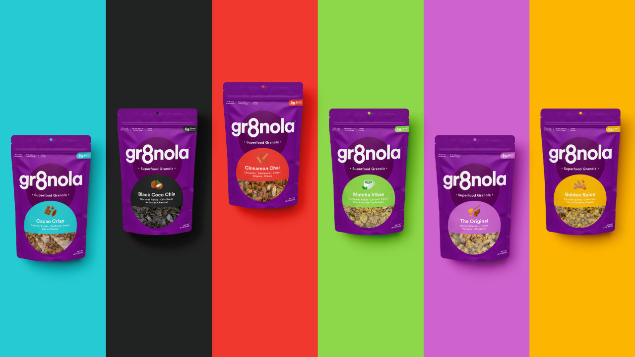
Our creative spark came from the name “Gr8nola”, with its clear nod to the number 8. We quickly realised that the numeral 8 could become a strong visual anchor. The new identity centred on that: a bold, minimal, and memorable device that would make the brand instantly recognisable.
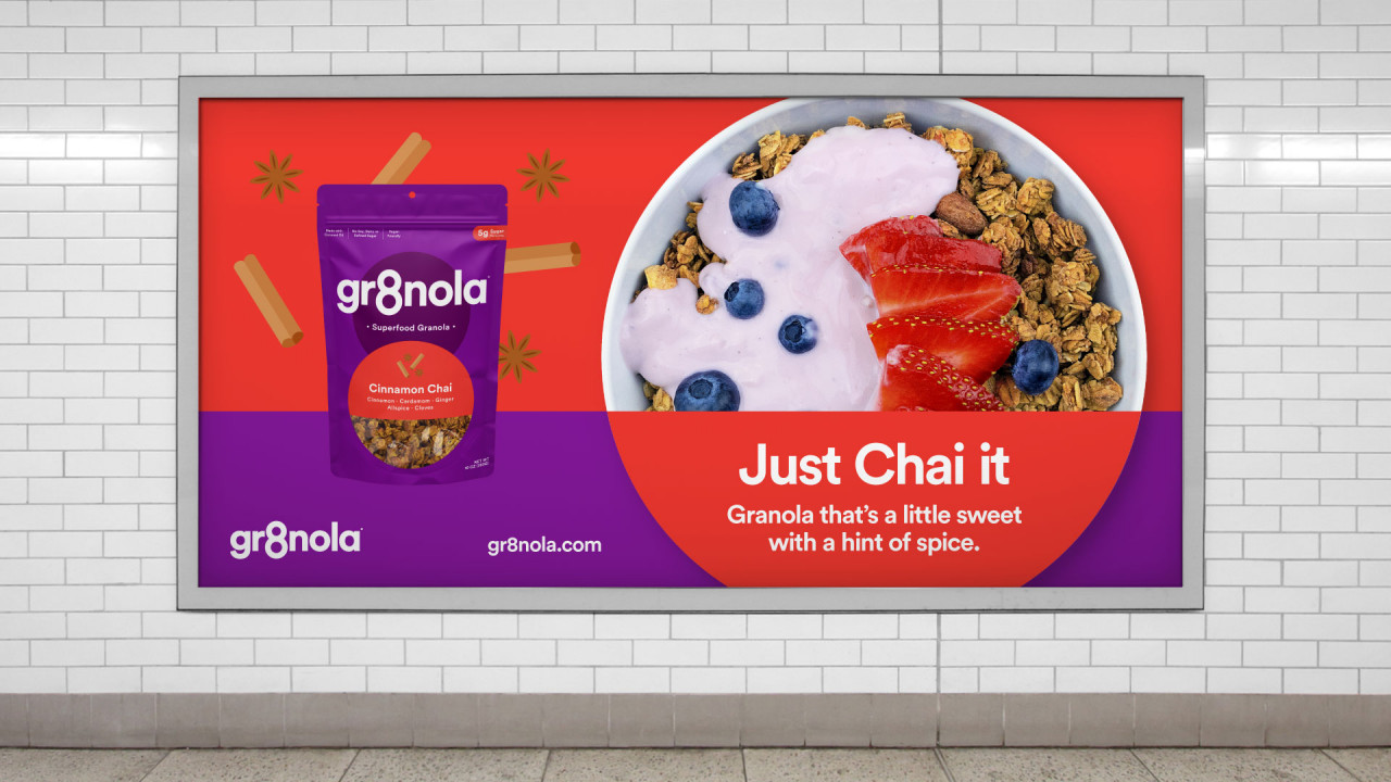
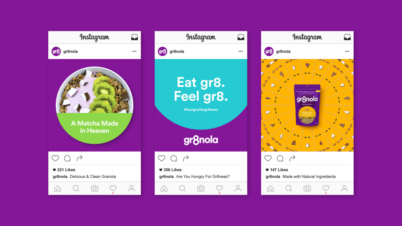
We created a cohesive packaging system using clean, vibrant designs where the “8” motif plays proudly alongside a clear, modern wordmark. The visual language speaks “Delicious & Clean”, bold, simple, yet playful. This reflects Gr8nola’s core belief: “you can do anything you put your mind to”, with health as a fundamental goal.
Erica’s tone of voice, playful and empowering, was embedded through messaging like #HungryForGr8ness, reinforcing that health and enjoyment can coexist.
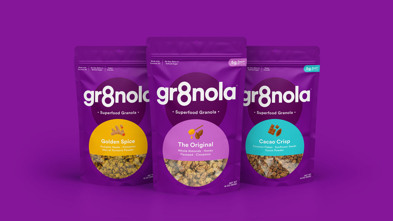
Packaging with Purpose: Clear, Bold & Functional
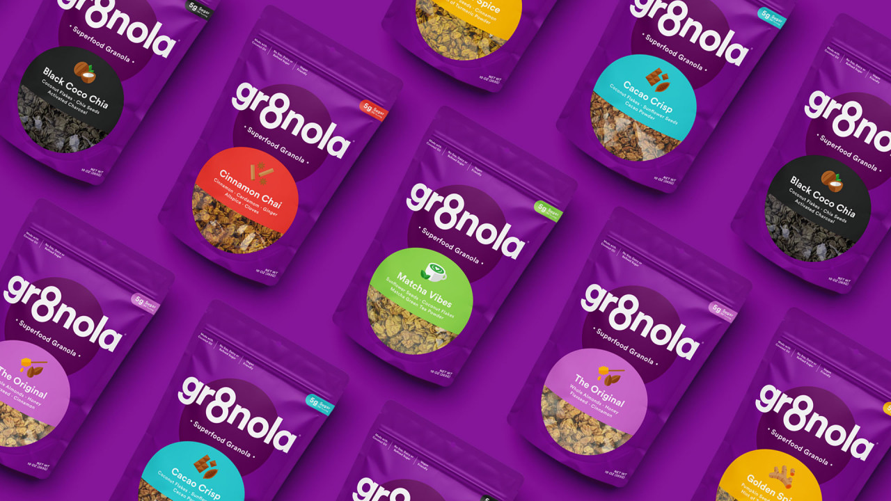
We redesigned flavor names to be more appealing and easy to understand at shelf glance. For instance:
- Charcoal Chia became Black Coco Chia
- Golden Turmeric became Golden Spice
- Coco Cacao became Cacao Crisp
- Matcha Green Tea became Matcha Vibes
Consumers loved the flavours, but often needed persuasion to try them. Renaming them gave them instant appeal without losing their superfood credibility.
We then unified the look with a consistent color direction: even when tempted to give Black Coco Chia a black pack to reflect charcoal, we opted to return to a cohesive purple palette. This reinforced brand-blocking on shelf and improved aesthetic consistency .
Results: Growth that Speaks for Itself
The impact of the rebrand was immediate. Online sales more than doubled within the first year of relaunch. Retail interest soared, Gr8nola was approached by three retailers and ended up stocked in places like The Market, Berkeley Bowl West, and even on walmart.com
Erica’s words reflect our partnership:
“Working with Deuce Studio has been amazing. Super communicative, timely, thoughtful… they really pushed me to think about my brand and drive me towards better design decisions. Definitely a key partner in the process of branding and design!”
Why This Works in Today’s Granola World
- Low-Sugar & Clean Label: Gr8nola delivers with only ~5 g sugar per serving, no refined sugar, meeting modern low-sugar expectations.
- Superfood Power: The brand’s use of matcha, activated charcoal, turmeric, cacao, chia, and more aligns with functional ingredient trends.
- Versatility: Granola is no longer just breakfast, it’s all-day snacking, topping, baking, and more.
- Strong Design Makes Difference: Packaging holds the product’s promise visually and Gr8nola’s distinctive “8” identity and bold, clean aesthetic cut through the clutter.
Conclusion: Designing Gr8ness with Gr8nola
Our work with Gr8nola exemplifies how confident brand design, rooted in market insight and founder vision, can turn a passionate product into a standout contender. By centering the number 8, embracing clean superfood imagery, and establishing a cohesive identity across pack and web, Gr8nola is uniquely positioned within the thriving low-sugar, functional granola market.
For us at Deuce Studio, this project was about more than visuals, it was about helping Erica bring her brand philosophy to life: that eating well can be empowering, playful, and relentlessly delicious.
Deuce Studio is an award winning London based packaging design agency.
If you are looking for a branding project, then let’s talk.