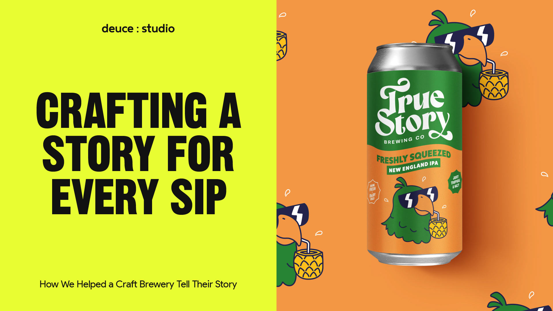
When it comes to craft beer, the flavour isn’t the only thing that should leave a lasting impression. Packaging, branding, and visual storytelling all play an equally vital role in connecting with drinkers and building a loyal following. At Deuce Studio, we recently had the pleasure of working with True Story Brewing Co., a microbrewery in the South West of England that takes craft beer and storytelling to a whole new level. Our challenge? To translate the brewery’s irreverent, story-driven identity into an unforgettable branding and packaging system.
In this blog post, we’ll delve into what makes craft beer branding effective, from understanding your target audience to crafting engaging packaging designs. Using the True Story Brewing Co. project as a case study, we’ll explore the strategies, design choices, and creative thinking behind building a brand that’s as bold as the beers themselves.
The Importance of Branding
Branding is far more than a logo or a colour palette; it’s the personality, values, and story that your audience connects with. For craft breweries, branding is especially important. In a market saturated with labels, hop varieties, and beer styles, a strong brand identity can make a product instantly recognisable on crowded shelves.
True Story Brewing Co. approached us with a simple but ambitious goal: to create a brand that reflects the founders’ unique love of storytelling, humour, and the slightly absurd moments that can only happen over a few beers. This allowed us to design a visual identity that didn’t just sell a product, but invited people to engage with the captivating stories behind each brew.
A brewery’s branding is the first impression a customer has. It’s what makes someone reach for a can, linger over the design, and ultimately decide to taste what’s inside. By carefully considering every element, from logo to illustration, colour to typography, we ensured that True Story’s branding would be a canvas for creativity, memorable, recognisable and full of personality.
Who Doesn’t Love a Beer?
Every successful branding project begins with a deep understanding of the target audience. For True Story Brewing Co., this meant identifying craft beer drinkers who value creativity, quality, and a touch of humour. Their audience appreciates beers that push boundaries, experiment with flavour, and tell a story. This strategic understanding guided our design direction with a clear purpose in mind.
By profiling the target audience, it guided the design direction with a clear purpose in mind. We chose a quirky, slightly irreverent illustration style and bold, vibrant colours to capture the energy and playfulness to help draw the brewery’s customers in.
Understanding your audience is also about identifying how they interact with packaging. Craft beer enthusiasts often make purchase decisions on the shelf, where visuals need to grab attention in seconds. This insight informed our approach to beer label design, ensuring that each can would stop a consumer mid-scroll and make them want to engage with the story.
Creating a Unique Brand Identity
The core of True Story Brewing Co.’s identity lies in storytelling. Each beer is inspired by a real story from the founders’ lives, which meant that every label needed to be distinctive, yet part of a cohesive system.
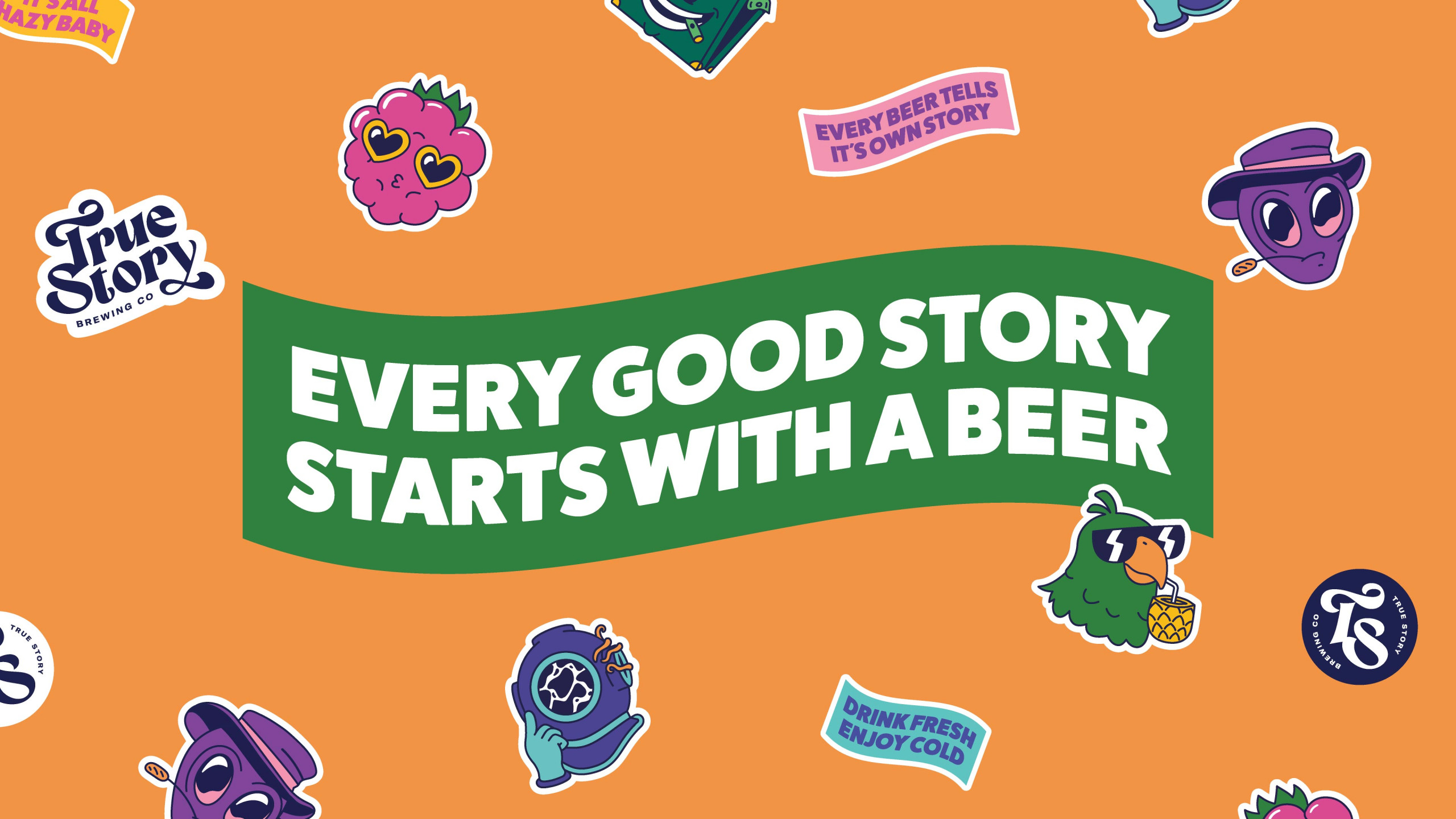
At Deuce Studio, we focused on creating a brand identity that was ownable, versatile, and immediately recognisable. We introduced a graphic language based on wavy shapes, which is repeated throughout the identity and forms the foundation of the logo, complemented by other clean typographic elements. These waves weren’t just decorative; they acted as dividers, content frames, and visual anchors to maintain consistency across all brand touchpoints.
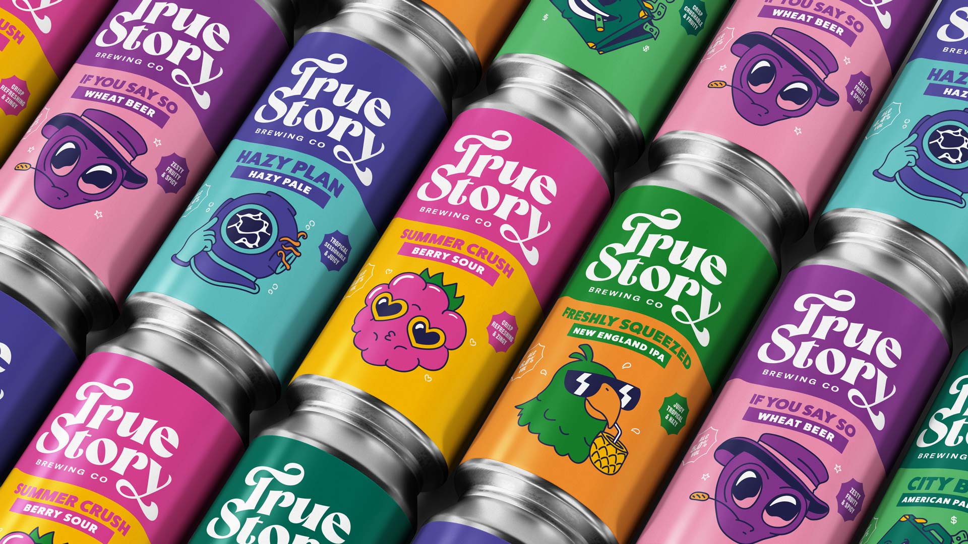
Illustration design played a pivotal role. Each pack features a quirky character or scene referencing the story behind the beer, offering a visual representation that’s humorous, charming, and sometimes a little outrageous, just like the tales themselves. This approach to craft beer branding ensures that the packaging isn’t just attractive, but also meaningful, shareable and highly adaptable.
Creating Engaging Packaging Designs
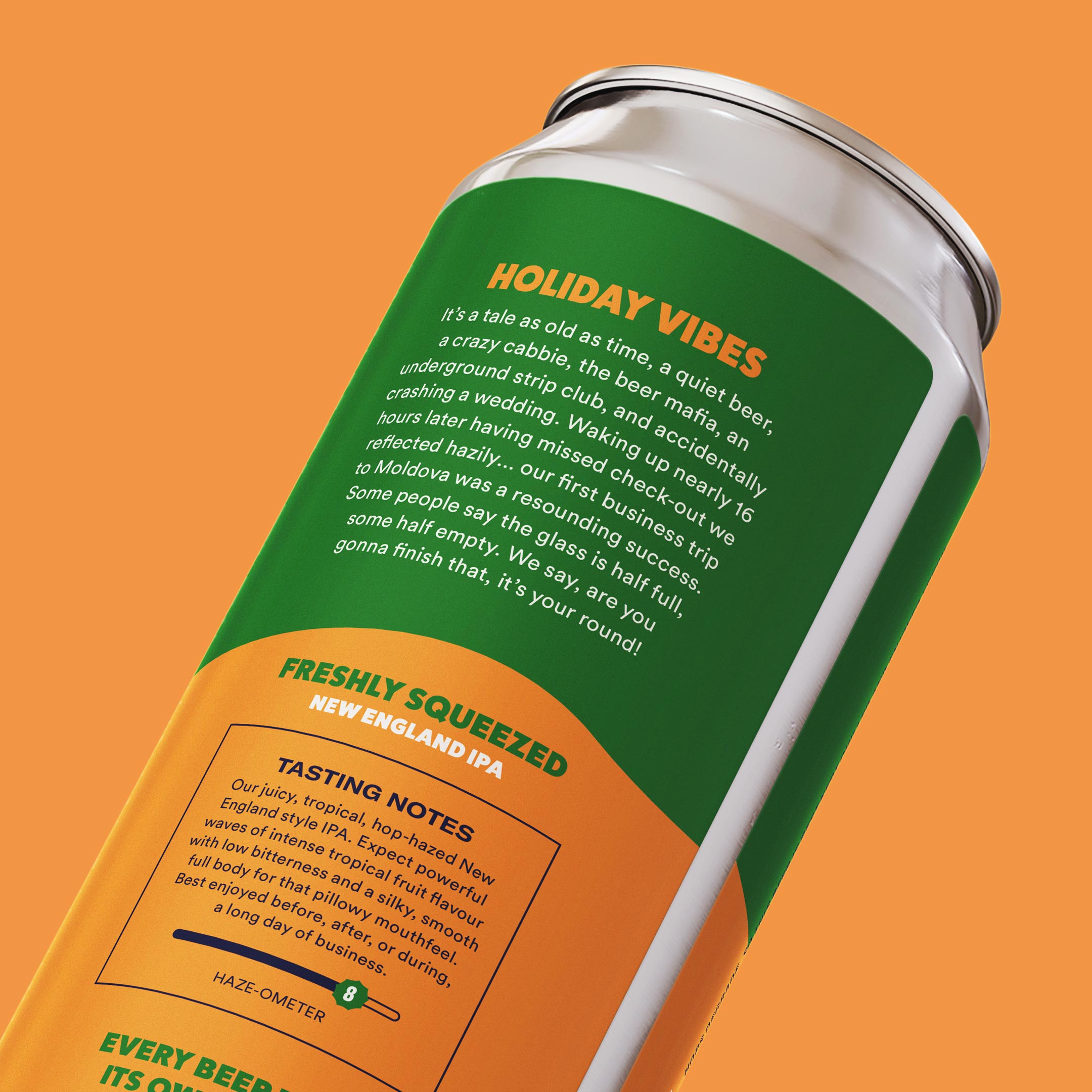
Packaging design is a storytelling medium, and the best designs invite interaction. For True Story Brewing Co., the narrative is literal: the back of every can contains the story that inspired the beer. This transforms a simple purchase into an experience, encouraging drinkers to read, share, and engage with the brand.
Illustration and typography work in tandem to create a playful and memorable experience. Characters are designed to resonate emotionally, whether eliciting laughter, curiosity, or surprise. The wave motif guides the eye, breaking up content and highlighting the story while maintaining a cohesive look across the range.
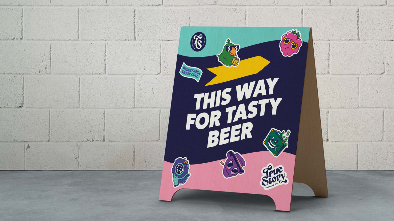
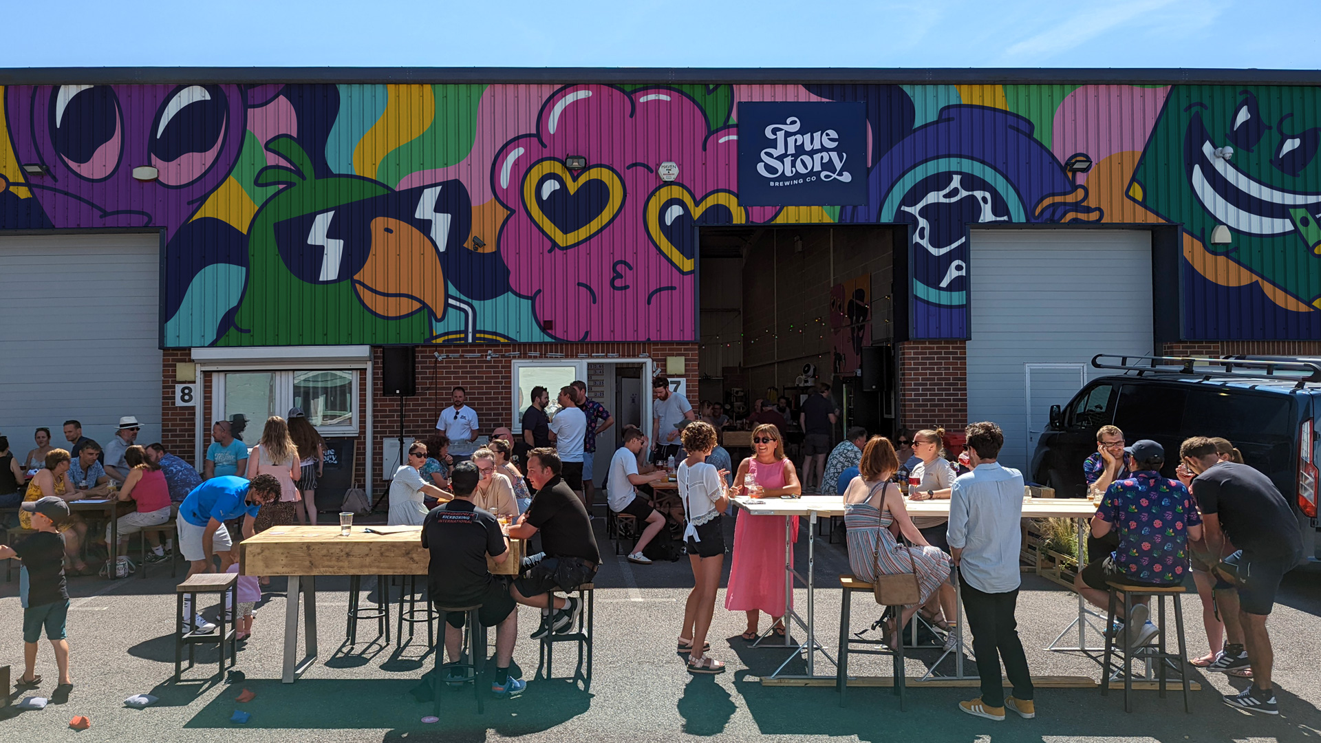
Beyond the cans, the brand extends into the physical space of the brewery bar and merchandise. The visual language adapts seamlessly, demonstrating how a well-considered craft beer branding system can work across multiple touchpoints while remaining instantly recognisable.
Elements of Effective Packaging
Effective packaging design is a balance of aesthetics, functionality, and storytelling. For True Story Brewing Co., we implemented several key elements to make the beer cans both visually striking and easy to understand for consumers.
- Story-Driven Illustrations: Each beer has its own unique illustration, designed to reflect the story and the character of the beer. This adds personality and invites drinkers to engage with the narrative.
- Badges and Icons: To make style and flavour instantly recognisable, we created badges that describe the type of beer on the front of the pack. A simple glance conveys crucial information, helping customers make informed choices.
- Haze-O-Meter: The back of the can features a haze-ometer, indicating the beer’s haziness. This playful touch not only educates but reinforces the brand’s personality.
- Typography and Colour: Bold, expressive typefaces combined with a vibrant colour palette ensure that each can is eye-catching and consistent across the range.
These design choices illustrate that beer label design is more than decorative; it’s a tool to communicate brand values, provide clarity, and, most importantly, make the product irresistible.
Design Considerations
When designing for craft beer branding, several considerations go beyond aesthetics. For example, legibility is critical. Typography must remain clear across different can sizes and lighting conditions. Colour choices should resonate with the brand personality while standing out on shelves without overwhelming the eye.
Illustrations need to be versatile and scalable, working as effectively on a small Can as they would on larger formats or promotional materials. The wave-based graphic system we developed for True Story provided a flexible framework that supports a wide range of applications, from labels to merch, without losing identity coherence.
Additionally, understanding the competitive landscape is crucial. In a crowded craft beer market, your branding must not only be original but also strategically positioned to appeal to your audience while differentiating from competitors.
The Future of Packaging
The craft beer industry is evolving, and so are consumer expectations. Drinkers are increasingly seeking brands that are authentic, transparent, and interactive. True Story Brewing Co.’s approach, using storytelling, illustration, and playful design, demonstrates how craft beer branding can meet these expectations while standing out on crowded shelves.
Looking forward, breweries will continue to explore packaging that is environmentally sustainable, highly engaging, and digitally integrated. QR codes, augmented reality experiences, personal AI flavour matching and interactive social campaigns can transform a beer can into a portal for storytelling, education, and community building.
By creating a flexible, ownable, and personality-driven branding system, True Story Brewing Co. is well-positioned to evolve with trends while staying true to its core identity: celebrating the stories that make drinking a beer an experience, not just a refreshment.
And They All Sipped Happily Ever After
Craft beer branding is about more than just packaging; it’s about creating an identity that resonates with drinkers, tells a compelling story, and fosters a sense of community. Through our work with True Story Brewing Co., we demonstrated how illustration design, thoughtful typography, and strategic packaging can bring a brand to life.
From quirky characters and vibrant colour palettes to innovative badge systems and haze-ometers, we carefully designed every element to communicate personality, flavour, and story. The brand now stands out on shelves, engages drinkers, and leaves a lasting impression long after the last sip.
At Deuce Studio, we believe that every craft beer deserves a story, and every story deserves a design that brings it to life. By combining creativity, strategy, and passion, we help breweries like True Story Brewing Co. turn each can into a conversation starter, a keepsake, and an experience that fans will want to share again and again.
If you’d like to explore how the correct packaging format could transform your brand, get in touch with our team or take a look at some of our case studies
Deuce Studio is an award-winning, London-based branding and packaging design agency.
If you are looking for a branding and packaging project, then let’s talk.