In 2021, we partnered with Budweiser to create a limited-edition can design that celebrated the backbone of America. The COVID-19 pandemic has fundamentally altered how Americans view work, community, and the essential services that help to keep America running. Against this backdrop, Budweiser sought to honour these unsung heroes who kept America running, and we at Deuce had the privilege of translating that mission into a visual and experiential campaign to show our appreciation.
The Campaign Concept
The idea was simple. We invited Budweiser drinkers from across America to nominate a hardworking individual in their life, whether a friend, family member, or colleague, and share their photo and story on social media. These weren’t nominations for celebrities or influencers, but for the real people who keep America moving.
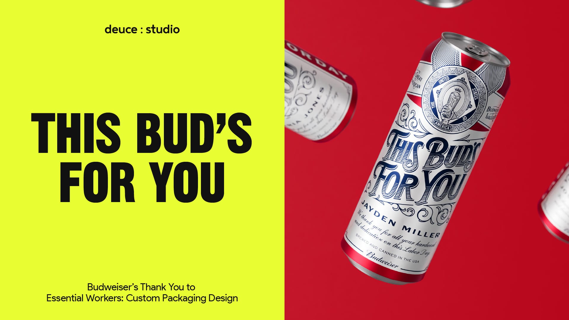
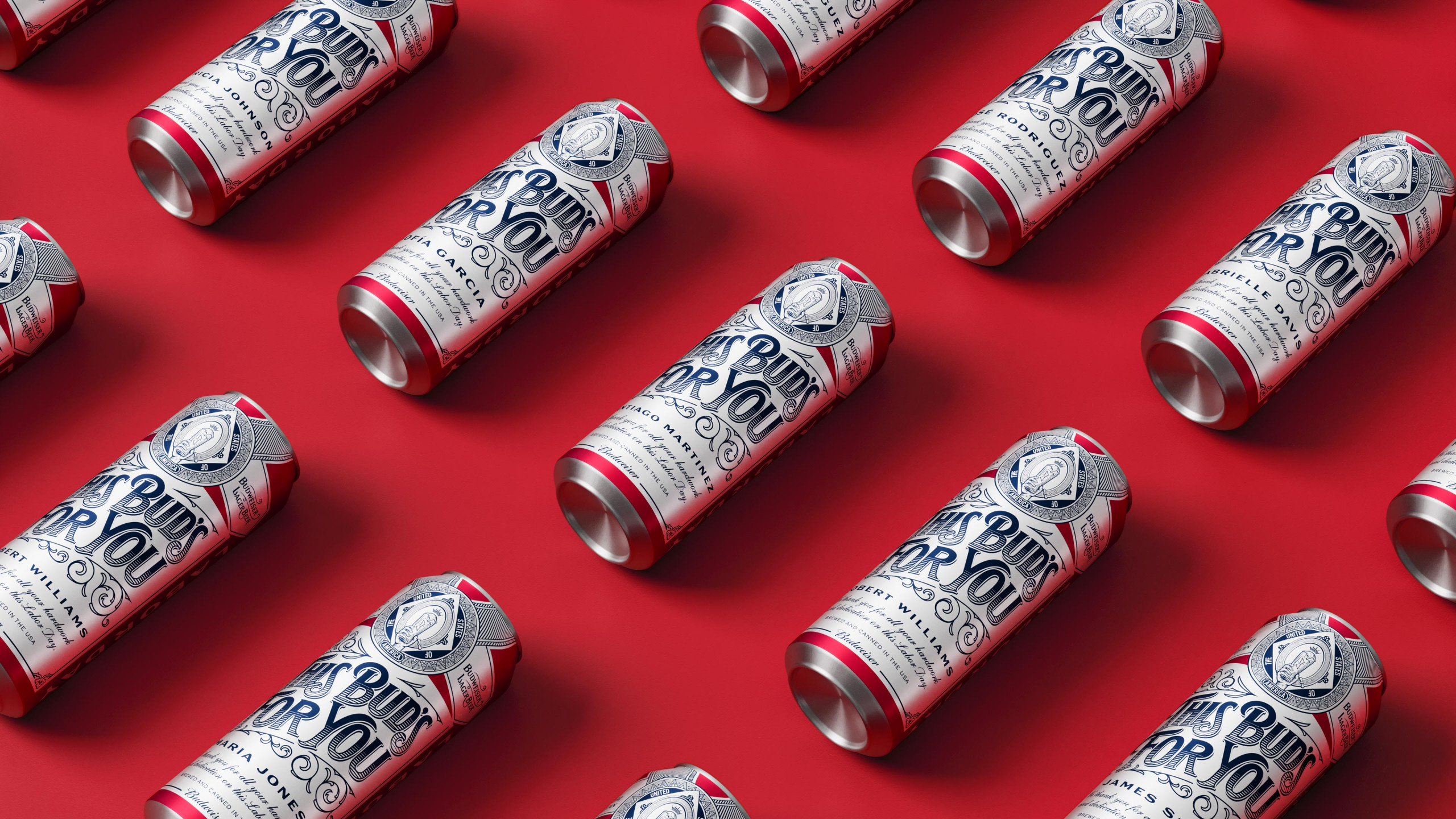
From the many heartfelt submissions Budweiser received, 10 finalists were selected to receive the ultimate honour: their name emblazoned on a personalised Labor Day can, custom-made exclusively for them. Each 24 fl oz can was a physical recognition of their dedication, a commemorative piece they could hold in their hands and share with pride. Although only a small gesture, it would go some way to celebrate the crucial work of each of these workers. In addition, one lucky entry would receive three months’ worth of wages paid for by Budweiser as an acknowledgement of their dedication and hard work.
The nomination process itself became a powerful exercise in gratitude. By actively asking consumers to identify and celebrate the workers in their lives, we transformed passive appreciation into active acknowledgement. The campaign gave people a platform and reason to tell the stories that might otherwise have gone unheard, shining a spotlight on everyday heroism.
Blood, Sweat, and Beers
To ensure the campaign and packaging resonated with Budweiser’s consumer base, we developed the strategic framework “Blood, Sweat, and Beers”. It was a lens through which we examined the relationship between the brand, its consumers, and the American worker experience.
Blood represented family connections and heritage, concepts that took on new meaning during the pandemic. In the context of COVID-19, the importance of home and family became more pronounced than ever. Lockdowns and social distancing reminded Americans of what truly matters: the people we come home to, the traditions we maintain, and the legacies we build. Just as Budweiser consumers value their roots and family connections, Budweiser itself is a heritage brand that takes fierce pride in its provenance and ancestral connections. Founded in 1876, the brand has been woven into the fabric of American life for nearly 150 years. This shared value of legacy became a concept that informed everything from the tone of voice for the campaign to our visual references, such as period-specific typographic choices.
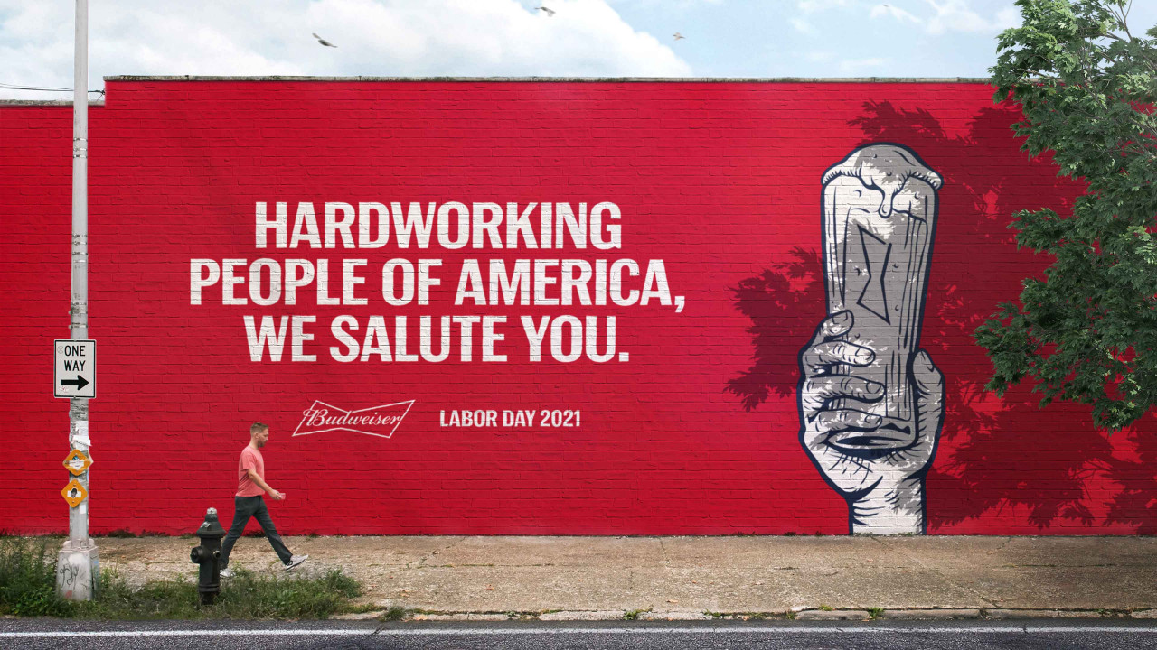
Sweat acknowledged the stark reality facing American workers during an unprecedented crisis. At the pandemic’s onset, one in six US employees lost their jobs, a staggering statistic that represented millions of families facing uncertainty and hardship. Yet simultaneously, 12 industries employing over 55 million people were deemed essential, creating a stark divide between those who could shelter safely at home and those whose presence was required to keep society functioning. The COVID-19 pandemic highlighted both the critical importance of workers and their vulnerability to danger and job loss. The Healthcare workers who faced virus exposure daily. The service workers who navigated public interactions when safety protocols were still being developed and implemented. The campaign & packaging design needed to honour this resilience and sacrifice, acknowledging the burden and the selflessness of showing up when others couldn’t.
Beers recognised that workers are the lifeblood of Budweiser itself, creating a natural alignment between the brand’s success and the American workforce. Approximately 210,000 Americans are employed by brewers and distributors, with each brewing industry job generating roughly 30 additional jobs in associated sectors like farming, transportation, and hospitality. From the farmers growing barley and hops and the truckers delivering cases to shops, to the warehouse workers and the bartenders pouring drinks, the beer industry represents a vast ecosystem of American labor. The symbiotic relationship between Budweiser and the American workers isn’t just marketing; it’s reality. By celebrating workers, Budweiser was celebrating the very people who make its existence possible.
Anatomy of a Can
The Budweiser can is one of the most recognisable pieces of packaging design in the world. It is distinctive, with its red and white colour scheme, ornate labelling, and classic typography, making it a piece of packaging history in itself. So rather than overshadowing the brand’s heritage, we decided to make subtle yet impactful alterations that would help adapt the design while maintaining its immediate brand recognition.
First, we reworked the traditional Budweiser insignia to resemble a commemorative medallion, guiding the packaging design to create an air of honour and achievement. Medallions have historically been awarded for service, valour, and exceptional achievement. By incorporating this visual language into the design, we elevated the recipient from consumer to honoree.
We worked with illustrators to create bespoke artwork that felt crafted and honed. This attention to detail reinforced the message that these cans were special, one-of-a-kind creations rather than a mass-produced product.
When developing the Labor Day campaign, the focus needed to remain on the workers and their contributions, with each decision serving the larger narrative of recognition and appreciation. By using the rich visual cues from Labor Day’s origins and history, we were able to pay homage to previous generations of workers while celebrating today’s essential workers.
The winner’s name took centre stage on the can. As the hero of the design, it was presented in a size and position that left no doubt as to who was being celebrated. Above the name, we incorporated bespoke typography inspired by the late 19th century, the era of the first Labor Day, featuring the classic Budweiser phrase “This Bud’s For You.” This typographic choice served multiple purposes: it connected the contemporary campaign to Labor Day’s historical roots and evoked the craftsmanship and artisanship of an earlier era. It framed the recipient’s name within a context of tradition and honour, which is often forgotten today. The resulting personalised packaging design felt simultaneously classic and contemporary.
Beyond the Can
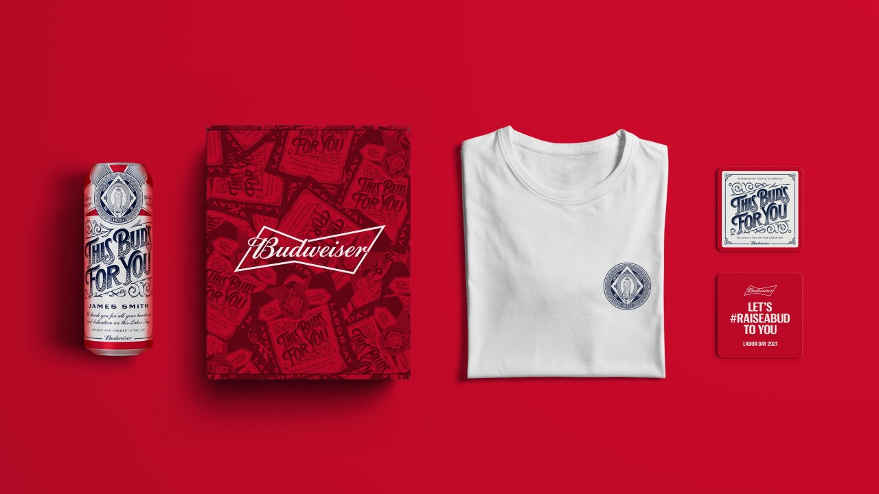
Great packaging design tells a story, but we understood that the story was the most crucial part. To complement the initial social media campaign and create a more comprehensive experience, we developed a dedicated website that created an archive of these stories, thus helping to extend the campaign’s reach beyond those holding a physical can.
The history of Labor Day and its evolution over more than a century is a significant part of America’s history. Many Americans enjoy the long weekend without fully understanding the labor movement’s struggles that led to the holiday’s creation.
The website served multiple purposes within the campaign ecosystem. First, it functioned as the hub for the nomination process, providing clear instructions on how to participate and what criteria would be used for selection. Secondly, it would feature the inspiring stories of the nominated workers, allowing visitors to read about the dedication, sacrifice, and everyday heroism of their fellow Americans. It helped to highlight the human impact of the pandemic and the resilience of the American spirit. Lastly, it provided educational and historical content as to the importance of Labor Day in America and the proud tradition of labor activism and worker recognition, exploring how it has impacted the American worker since its inception in 1894.
Visually, the website design echoed the packaging design elements, creating a cohesive brand experience across touchpoints. The late 19th-century typographic influences, the medallion imagery, and the red and white colour palette carried through to the digital experience.
Stories Worth Telling
The campaign’s primary objective was to generate quality nominations and shine a light on amazing stories of dedicated workers from across America. We weren’t chasing vanity metrics or viral moments for their own sake; we wanted genuine engagement from people who had something tangible to say about the workers in their lives.
Running over Labor Day weekend, the #RaiseABud campaign achieved impressive results, racking up over 500,000 impressions across social media platforms and generating 200 submissions from grateful friends, family members, and colleagues eager to celebrate the hardworking individuals in their lives. They were organic expressions of gratitude and recognition from real people.
The quality of submissions exceeded our expectations. People didn’t just drop names and photos; they shared stories and anecdotes about why their nominee deserved recognition. We read about single parents working multiple jobs to provide for their families, about frontline healthcare workers who hadn’t seen their own families in months to avoid potential exposure. Each submission represented a moment of genuine appreciation, a pause in someone’s busy life to acknowledge someone else’s contributions.
But beyond the numbers, the campaign succeeded in its most important mission: making people feel seen, valued, and appreciated. Each personalised can became a tangible symbol of recognition, a keepsake that honoured not just individual achievement but the collective spirit of the American worker. Several recipients shared emotional reactions on social media when they received their cans, choosing to display them as cherished mementoes.
The Power of Personalised Packaging Design
This project demonstrates how packaging design can transcend its traditional role. For decades, packaging design has been evaluated primarily on shelf appeal, brand recognition, and protective functionality. While these elements remain essential, the Budweiser Labor Day campaign showed that packaging can serve a higher purpose; it can become a medium for storytelling, recognition, and emotional connection.
By personalising the Budweiser can for Labor Day, we didn’t just create a limited-edition product. Recipients weren’t just consumers anymore; they were honoured guests at a national celebration of their contributions. This also highlights the power of physical objects in an increasingly digital world. In an era where so much recognition happens through likes, comments, and shares, there is something uniquely powerful about holding something with your name on it. It was a tactile symbol of appreciation, something you could photograph, display, and share with pride. The packaging design became a bridge between digital engagement and physical experience, between social media celebration and real-world recognition.
In an era where consumers increasingly seek authenticity and purpose from brands, packaging design offers a unique opportunity to deliver both. Today’s consumers, particularly younger generations, expect brands to stand for something beyond profit. They want to support companies that share their values and contribute positively to society. We think that the Budweiser Labor Day campaign proved that when you combine strategic insight, thoughtful design, and genuine appreciation for your audience, you create something that goes beyond marketing and elicits an authentic response.
This project offers valuable lessons for brands to consider how packaging design can serve their larger strategic goals. First, personalisation at scale is now technologically feasible and, when done well, can be emotionally powerful. Digital printing and flexible manufacturing processes make it possible to create customised packaging without astronomically prohibitive costs.
Secondly, consumers respond to authenticity and genuine recognition rather than hollow gestures. The campaign worked because it was rooted in genuine appreciation for real people, not manufactured sentiment.
Third, the most effective campaigns integrate multiple touchpoints, social media, physical products, and digital experiences to create a comprehensive brand narrative and campaign.
Design That Matters
The #RaiseABud campaign represents our belief that the best design work serves purposes larger than aesthetics or commerce. Great packaging design should do more than catch the eye on a shelf; it should be used to communicate what the brand stands for, the moment, and the people it serves.
By centring on workers’ stories, honouring Labor Day’s heritage, and creating personalised packaging that made people feel valued, the campaign benefited the brand, engaged consumers, and positively impacted the people it celebrated.
If you are looking for a branding and packaging project, then let’s talk.
Deuce Studio is an award-winning, London-based branding and packaging design agency.