At Deuce Studio, we’re passionate about helping heritage brands evolve for modern audiences without losing what makes them iconic. So, when Lee Kum Kee, a global leader in authentic Asian flavours for over 135 years, approached us to create their first-ever bottled hot sauce range, we knew it had to be more than just another condiment. It needed to be a bold yet authentic expression of their culinary legacy, one that resonated with a new generation of chilli lovers.
The Rise of the Hot Sauce Revolution in the UK
Hot sauce has become a compelling space in the UK. Once a niche condiment, it is now part of mainstream eating culture. In fact, the UK hot sauce market was estimated at around £140 million in 2024 and is projected to reach £205 million by 2033. Retailers report dramatic rises: one major UK supermarket saw demand for hot sauces surge nearly 20% in one year, with 2.5 million extra bottles sold.
These figures reflect more than just heat. They signal appetite for flavour innovation, authenticity, and global inspiration. UK consumers are increasingly “trying everything” from Korean gochujang to Caribbean scotch bonnet sauces, and heat is now seen as a badge of adventurous eating.
Brands like Tingly Ted’s and Sauce Shop are riding this wave, introducing unique flavour combinations and strong storytelling. Meanwhile, legacy brands such as Flying Goose and Tabasco still command respect through heritage, but face growing pressure from these agile newcomers.
This shift is being fuelled by changing lifestyles. Millennials and Gen Z spend more on experiences than possessions. They want brands with story, meaning and authenticity. Older Millennials and Gen X, many now at peak spending years, are increasingly choosing premium, authentic food experiences over traditional luxuries. Within this context, Lee Kum Kee’s move into bottled hot sauces is perfectly timed: an authentic heritage brand entering a dynamic, experience-driven category.
The Challenge: Staying Authentic While Standing Out
Lee Kum Kee is beloved for its oyster sauce, soy sauce and other Asian condiments. Their traditional designs, the golden plaque logo, and heritage dual-language names have built trust over decades. Yet the brief was clear: create a new chilli sauce range that feels modern, fresh and daring, without losing the brand’s authenticity.
The hot sauce shelf is crowded. Many hot sauce packaging designs lean into clichéd flaming-chilli visuals and over-the-top macho copy. But our audience research told a different story. When we surveyed UK consumers aged 18–35, the dominant preference was for designs that are bold yet clean; authentic yet accessible; flavour-driven rather than gimmicky.
These insights formed the foundation for our creative direction: simplicity, authenticity and cultural richness. The challenge was to strike a balance that speaks to adventurous foodies and loyal Lee Kum Kee fans alike.
Designing the New Flavour Experience
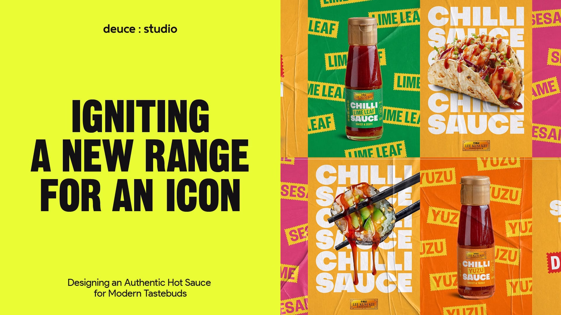
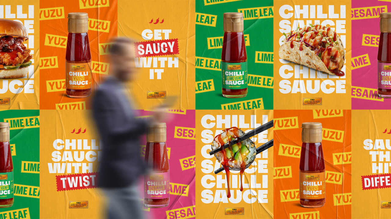
We began our design process by immersing ourselves in Lee Kum Kee’s brand heritage. Every product they make tells a story of craftsmanship, tradition and flavour. We wanted the new chilli sauce range, with flavours like sesame, lime leaf and yuzu, to feel like a natural evolution of that story.
We developed the identity around a structural grid system, reflecting discipline and craftsmanship, layered with jagged badge elements inspired by Asian symbolism and traditional seals. These badge shapes communicate energy and spice-like movement without resorting to cliché pepper icons or flames.
Large, confident typography dominates the label. This improves shelf legibility but also conveys strength of flavour. We also integrated dual-language product names (English & Chinese) as a nod to brand origin and to appeal to culturally curious consumers.
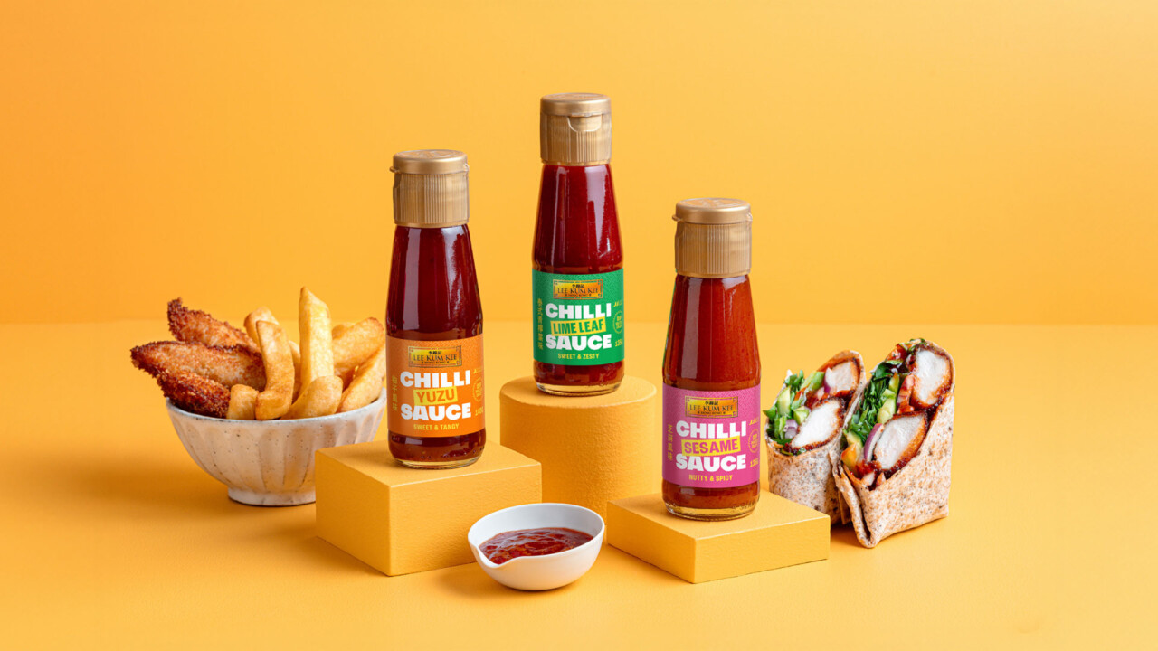
Colour choice was key. Each flavour variant has its own vibrant accent, bright green for lime leaf, hot pink for sesame, vivid yellow for yuzu, while still anchored by Lee Kum Kee’s signature gold plaque logo. This ensured the range felt premium yet playful, traditional yet modern. We also used the iconic Lee Kum Kee pattern in the background of each label to connect with the broader brand family.
From a format perspective, we selected a clear glass bottle with a short neck and wide label area. The clear bottle allows the vibrant sauce colours to shine through, an immediate visual cue of flavour intensity, and glass supports the premium, authentic positioning. It says “crafted”, not “cheap”.
Bringing the Brand to Life
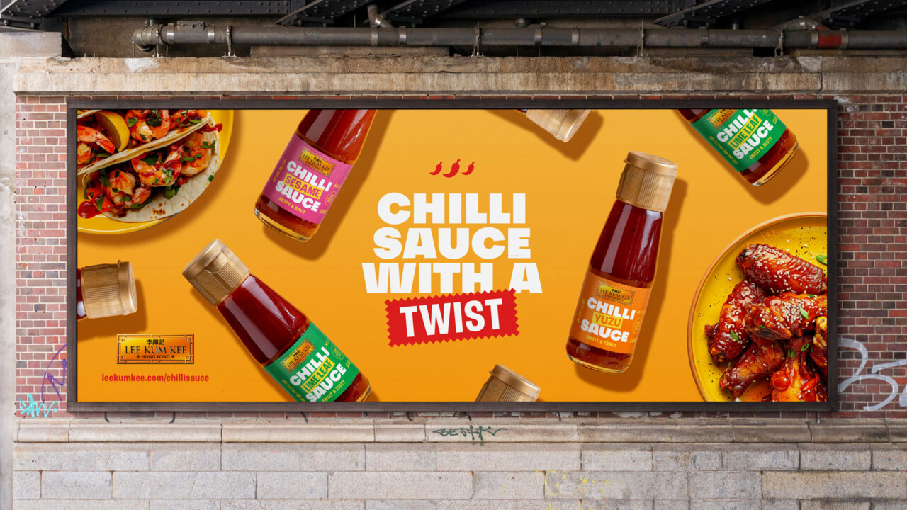
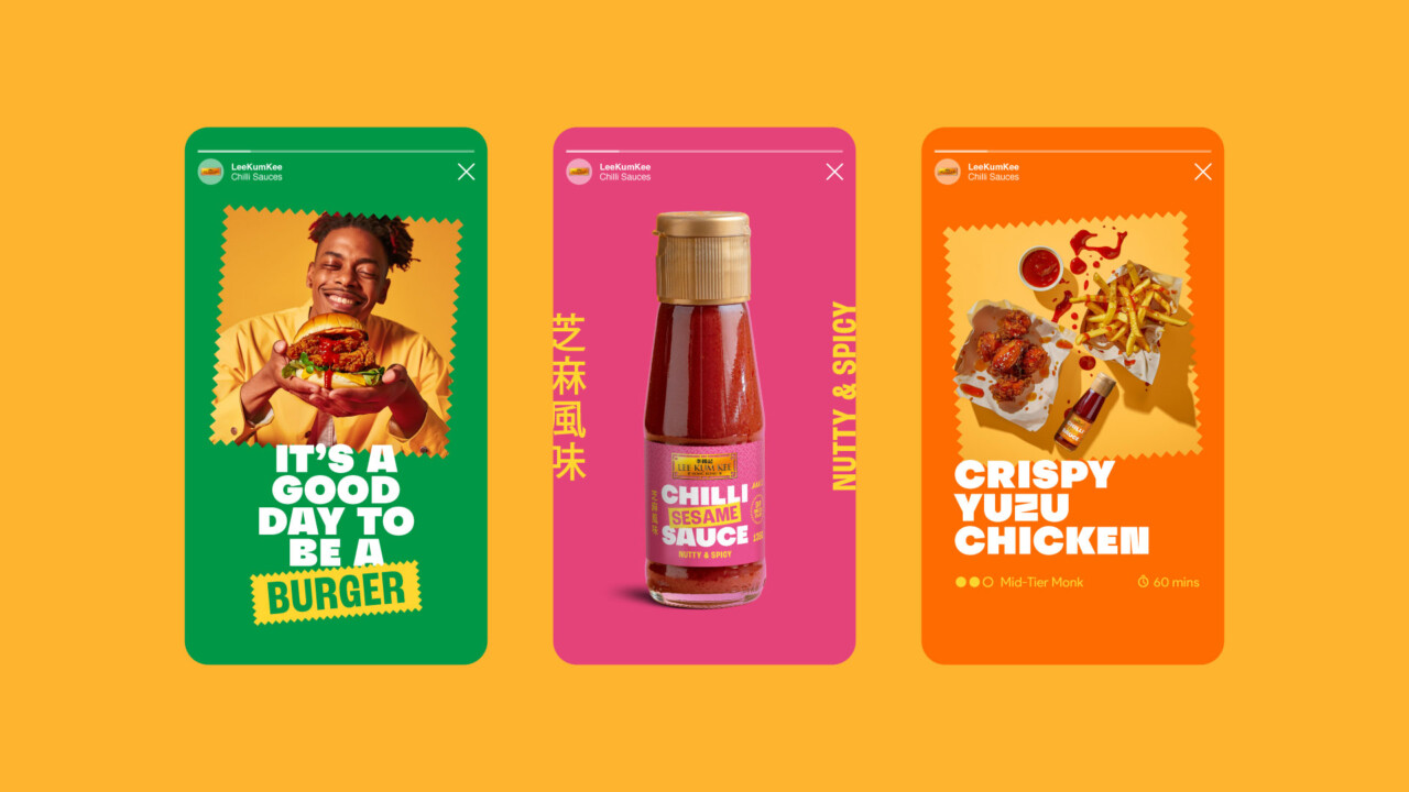
Label design was just the beginning. At Deuce Studio, we create brand worlds that extend beyond the pack. We explored how the sauces could live across print, digital, social and outdoor spaces, from recipe cards and motion campaigns to influencer partnerships and in-store activations.
The jagged badges we created became holding shapes for copy and imagery, giving the brand a dynamic, modular system. We combined this with close-up food photography dripping with sauce to evoke taste, texture and intensity, the kind of imagery that stops a scroller in their tracks.
Digital campaigns were animated: badges popped in, bottles slid across frames, and food photography glistened. Copywriting mirrored the visual tone, short, punchy and flavour-first. The messaging spoke to younger, experience-driven consumers but retained heritage cues to reassure long-time Lee Kum Kee fans.
Across every touchpoint, the result was cohesive and impactful, the design, tone and photography working together to celebrate real flavour and authentic craft.
Understanding the Audience: The Experience Generation
Our audience wasn’t defined purely by age, but by attitude. Gen Z and Millennials are flavour explorers. They follow street-food trends, travel for cuisine, and seek out brands with story and provenance. They value authenticity and transparency, knowing the sauce they buy comes from a brand with real history, not a fad label.
Meanwhile, Gen X and older Millennials, many of whom grew up with Lee Kum Kee’s sauces in their households. Now seek quality and authenticity. They’re willing to spend more on products that deliver elevated, exotic flavour and tell a story of craftsmanship.
We also discovered that these groups tend to treat food as an extension of lifestyle. Cooking at home has become an act of self-expression, fuelled by social media trends, global recipes and the thrill of experimentation. In this context, a bottle of chilli sauce isn’t just a condiment, it’s an invitation to try something new.
By combining these insights, we positioned the new range as an authentic, experience-driven product that bridges generations: nostalgic enough for loyal consumers, yet bold and fresh enough for new fans.
A Design Rooted in Authenticity
Throughout the project, our focus was on authentic modernisation. Lee Kum Kee didn’t need a full rebrand, it needed to express its tradition in a way that resonates with today’s consumer.
The gold plaque logo, the dual languages, the heritage patterns, these acted as brand anchors. Around them, we built a new aesthetic: adventurous, confident, visually modern. Authenticity became a design principle, not a buzzword. From layout precision to flavour cues, every element reinforced that this was a genuine Lee Kum Kee product, reinvented for today’s consumers.
Crafting Shelf Presence
With hundreds of hot sauces competing for attention, we wanted Lee Kum Kee’s range to command the shelf through clarity and confidence rather than chaos. Instead of relying on aggressive colour clashes or extreme imagery, we focused on balance, the interplay between structure, space and bold type.
The large typography gives each product a powerful, instantly recognisable wordmark. The consistent grid and golden details tie the range together, while the individual colours give each flavour its own personality. Together, they form a family that feels both cohesive and collectable.
The result is packaging that not only holds its own against louder competitors, but elevates the entire category, setting a new benchmark for how authenticity can look modern, fresh and desirable.
Tradition Meets Modern Heat
The final identity captures what we set out to achieve: a chilli sauce range that feels vibrant, modern and proudly authentic. It is unmistakably Lee Kum Kee, yet refreshingly different.
This range is built for a new generation of heat-seekers who value flavour and story, while staying grounded in the trust of a long-established brand. Across campaigns, the product has already started to spark conversations, proof that when design craft meets cultural insight, you don’t just create packaging, you craft an experience.
As UK palates evolve, Lee Kum Kee’s foray into the hot sauce category marks an exciting new chapter. It celebrates authenticity meeting innovation, a 135-year-old company still finding new ways to grow and stay relevant.
For us at Deuce Studio, this project reinforced a core belief: great design is about balance. It’s about respecting history while embracing change. It’s about using creativity to connect timeless values with contemporary culture.
Because when a brand like Lee Kum Kee takes on the world of chilli sauces, it’s not just about heat, it’s about flavour, story and authenticity.
If you’d like to explore this project further, including design mock-ups and campaign strategy, get in touch with our team at Deuce Studio. We’d love to help your brand take its next bold step.
If you are looking for a branding and packaging project, then let’s talk.
Deuce Studio is an award-winning, London-based branding and packaging design agency.