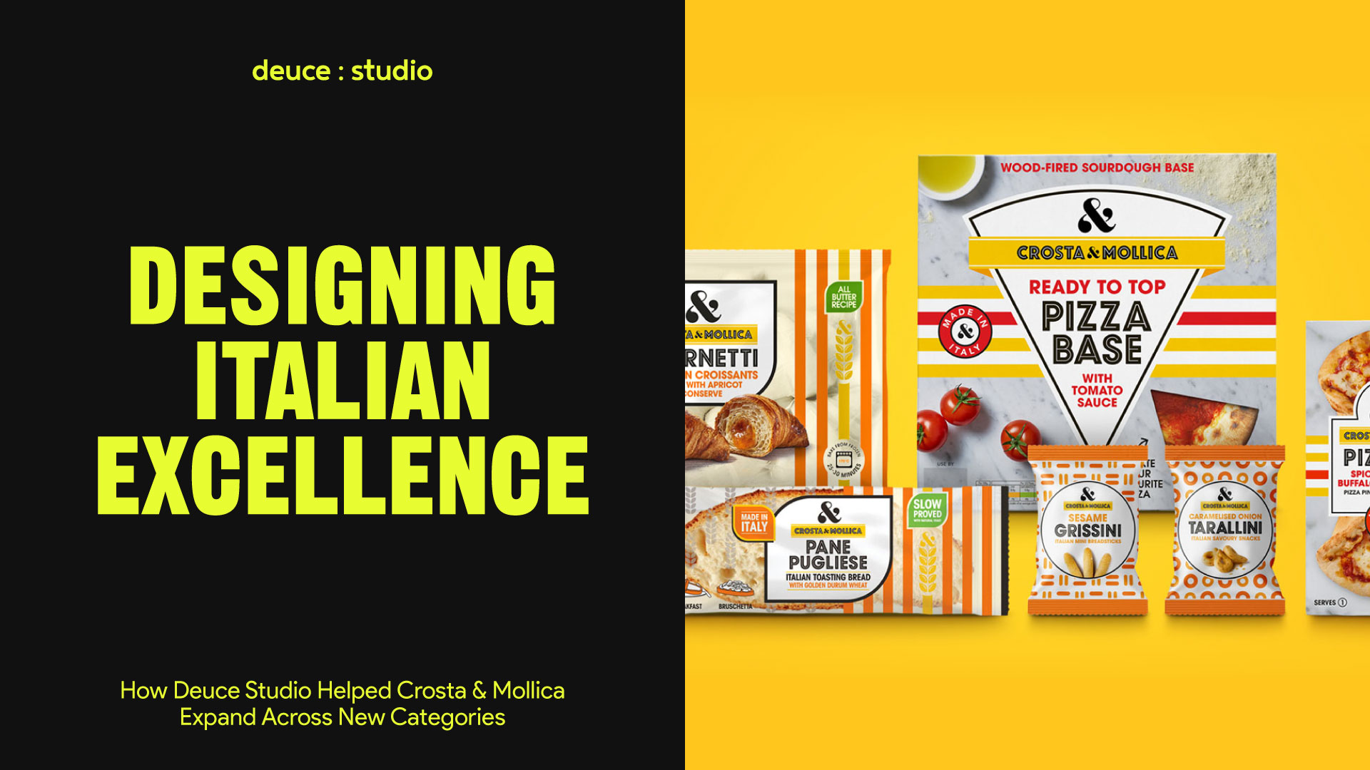
At Deuce Studio, we’re passionate about creating branding and packaging that is as authentic and compelling as the products inside. So when Crosta & Mollica approached us to help them expand their packaging across new categories, we knew this was an opportunity to not just design packaging, but to design an experience.
Crosta & Mollica, who were already a household name for their artisanal Italian breads, expanded into included chilled pizzas, frozen patisserie, on-the-go snacking, and a special Christmas range. Each of these product lines needed packaging that not only stood out on crowded UK supermarket shelves but also communicated the brand’s “Made in Italy” credentials, premium quality, and regional authenticity. Our goal was to create a cohesive visual identity that worked seamlessly across all these categories while retaining the brand’s instantly recognisable personality.
The Growing Demand for Authentic Italian Products in the UK
Before diving into the design, we took time to understand the cultural and retail context we were designing for. Italian food is more than just a staple in the UK – it’s an enduring love affair. From fresh burrata to wood-fired pizza, UK consumers increasingly seek products that are authentically Italian, not just Italian-inspired.
Recent retail data shows significant growth in the category: sales of focaccia, ciabatta, and piadina breads are up over 40% in major supermarkets, while mozzarella sales have surged by almost 400%. Cheeses like burrata and gorgonzola, along with Italian charcuterie, have seen similar boosts. This is not just about flavour, it’s about consumers connecting with the romance and craftsmanship of Italian regional cuisine.
This context shaped our thinking: the design needed to make authenticity instantly visible, helping Crosta & Mollica stand apart from the flood of “Italian-sounding” products that often lack true provenance.
Building on a Bold and Recognisable Brand Identity
Crosta & Mollica already had a strong brand DNA: bold monochrome stripes, a prominent ampersand logo, and high-impact food photography. Our task was to evolve this identity into a flexible system that could stretch across very different product categories without losing its recognisable impact.
The stripes became a visual anchor, framing each pack in a way that felt confident, contemporary, and distinctively Italian. The ampersand (already a key brand asset) was retained as a focal point, reinforcing brand recognition at a glance.
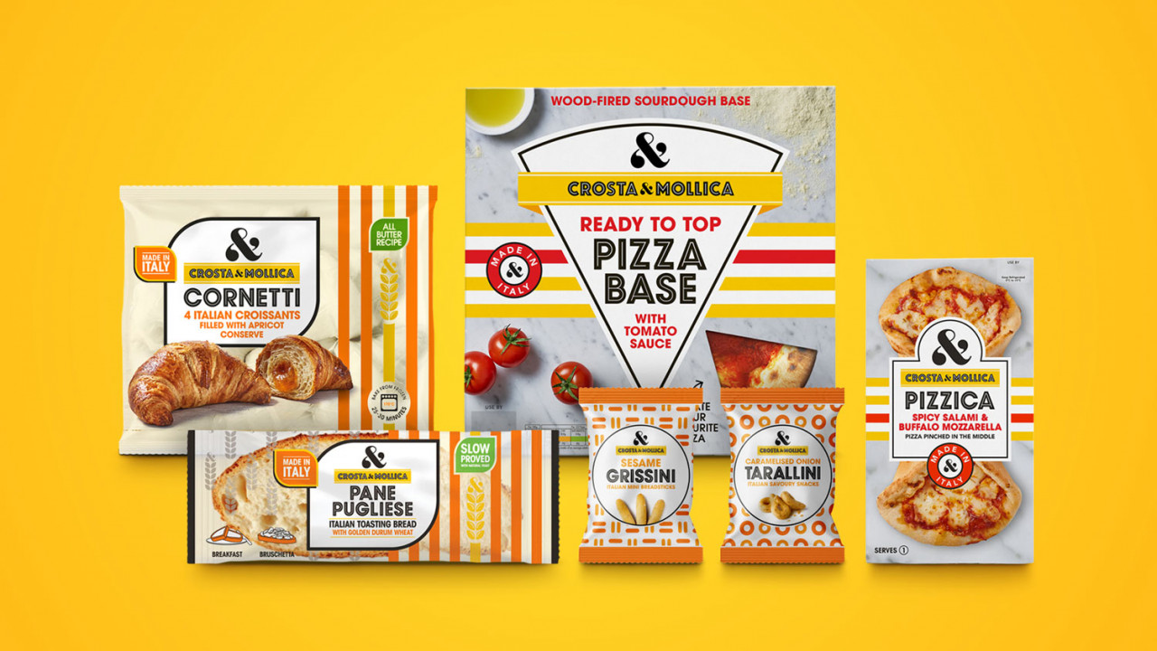
Adapting the Identity Across Categories
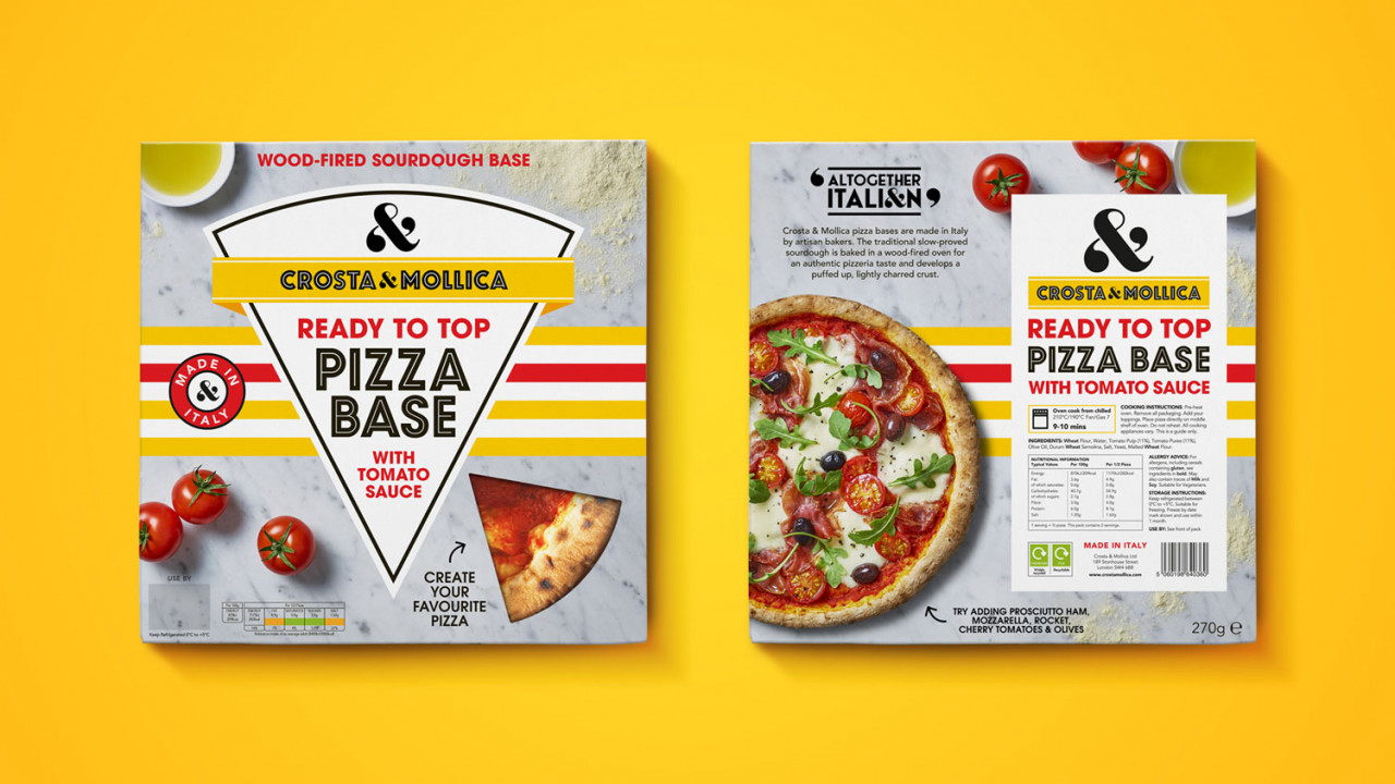
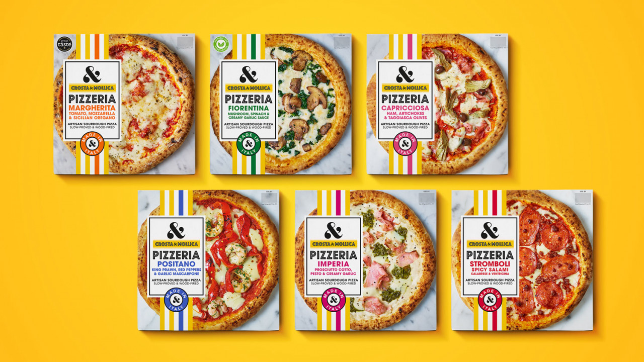
Chilled Pizza – Heroic, overhead photography of pizzas, shot to highlight authentic toppings and artisanal crusts. The design allowed the food to do the talking, supported by typography that nodded to traditional Italian menu boards.
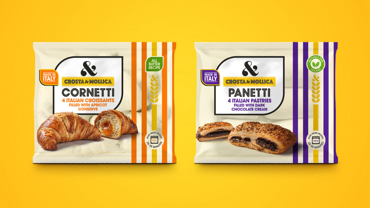
Frozen Patisserie – More indulgent and celebratory in tone, using richer colour accents and compositions that conveyed decadence and treat-worthiness.
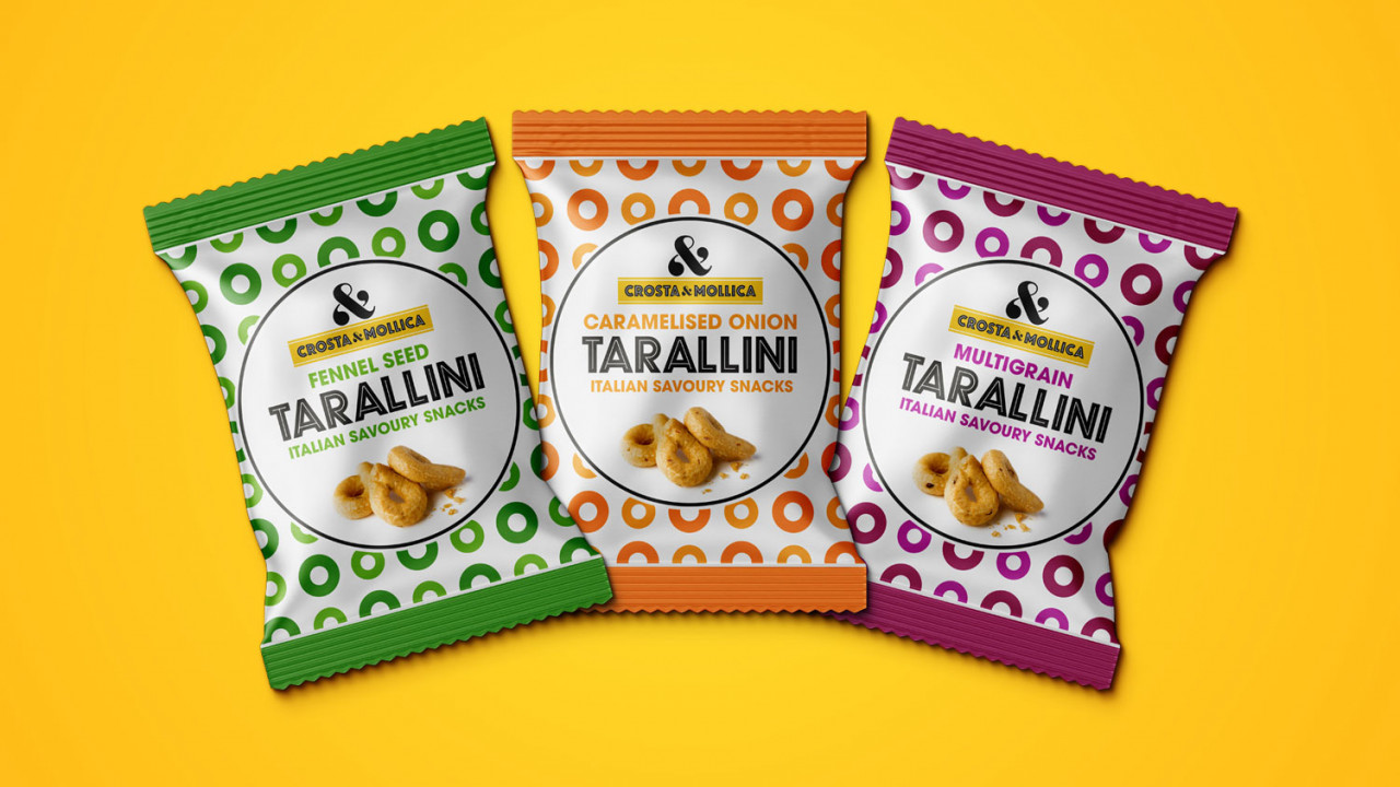
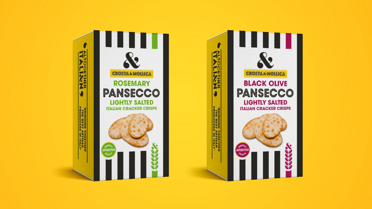
On-the-Go Snacks – Clean, energetic layouts with vibrant accents, making them appealing for impulse purchases while still premium.
Christmas Range – We introduced subtle seasonal cues such as gold foils and festive typography while keeping the Italian authenticity at the forefront, so the range felt special yet consistent with the core brand.
Communicating ‘Made in Italy’ at Every Touchpoint
One of the biggest challenges in the Italian food category is cutting through the noise of products that look Italian but aren’t. Our design strategy was to make Crosta & Mollica’s authenticity undeniable.
We did this through:
- Clear provenance messaging: prominently stating “Made in Italy” and sometimes highlighting specific regions.
- Typography choices: inspired by Italian artisan markets and signage, subtly embedding a sense of place.
- Colour palettes: taking cues from Italian ceramic tiles, olive groves, and traditional patisserie counters.
- Photography styling: using natural lighting and rustic props to evoke the feeling of eating in a real Italian kitchen or trattoria.
The result was a packaging system that didn’t just say it was authentic, it looked and felt authentic at first glance.
Regionality: A Key Ingredient in Authentic Design
Italian food is famously regional. Naples for pizza, Sicily for cannoli, Emilia-Romagna for cured meats… and consumers increasingly value this specificity. Our research showed that shoppers respond positively to products that feel tied to a place and tradition.
Where possible, we incorporated references to these regions through storytelling on-pack, choice of imagery, and subtle design motifs. This allowed each product to feel like it had its own authentic narrative, while still belonging to the Crosta & Mollica family.
Photography: Making Quality Visible
Food photography was a crucial element of the redesign. We know that UK consumers make many purchase decisions visually, especially in chilled and frozen categories. For Crosta & Mollica, we worked with photography that felt as fresh, vibrant, and honest as the food itself, minimal retouching, natural textures, and close-up shots that let the ingredients shine.
In a supermarket aisle filled with overly stylised or generic food photography, this honest, appetite-whetting approach stood out and reinforced the brand’s premium positioning.
Consistency Across Categories Without Losing Character
The challenge of designing across multiple product lines is maintaining a consistent brand feel while allowing each category to have its own distinct energy. Our solution was to create a robust design framework – anchored by the stripes, ampersand, and bold food photography, but with enough flexibility to adapt colour accents, typography nuances, and composition styles to suit the product type.
This ensured that whether you picked up a frozen tart, a chilled pizza, or a Christmas panettone, you knew instantly it was Crosta & Mollica, while still feeling that each range had its own purpose and mood.
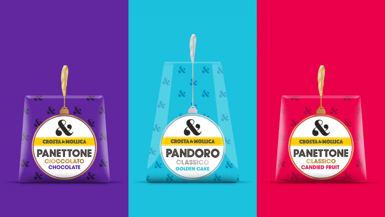
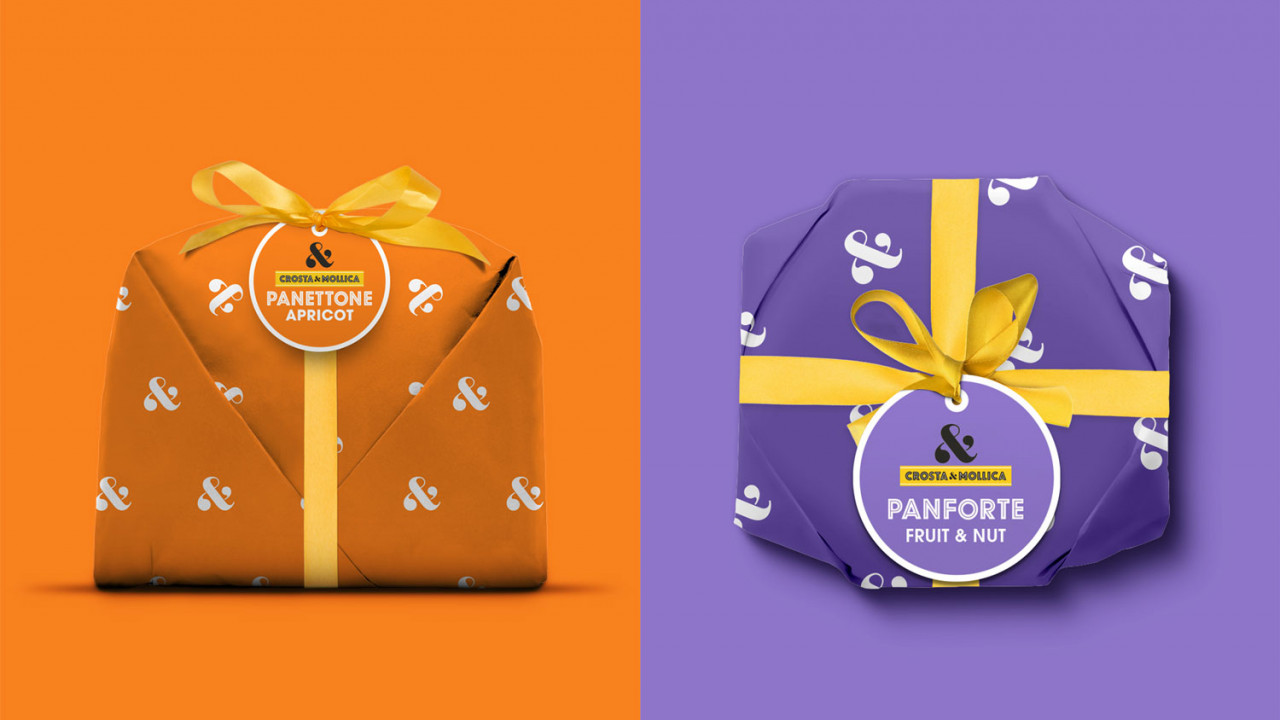
Christmas: Seasonal but Still Italian
The Christmas range was a particular highlight of the project. We wanted it to feel festive and giftable while still rooted in the brand’s Italian identity. Instead of using generic Christmas clichés, we incorporated gold foil detailing, elegant type, and photography that emphasised indulgence and generosity, all the hallmarks of an Italian holiday table. The result was packaging that felt like a celebration, without losing sight of authenticity.
Why Authentic Design Matters in the UK Italian Food Category
The rise in UK demand for Italian food isn’t slowing down, but with it comes a wave of inauthentic products. For Crosta & Mollica, and for us at Deuce Studio, the design challenge was about making the brand’s genuine Italian heritage impossible to miss.
By combining bold, distinctive branding with real provenance cues and high-quality photography, we created packaging that communicates exactly what the product is: delicious, authentic, and worth paying a premium for.
Looking Ahead
Crosta & Mollica’s expanded range now enjoys a strong, unified brand presence across multiple categories, helping the products stand out in a competitive market and reinforcing the brand’s position as a leader in authentic Italian food in the UK.
For us at Deuce Studio, this project was about more than aesthetics – it was about understanding the cultural value of Italian food in the UK, the consumer’s desire for authenticity, and the importance of packaging as the first point of trust.
Authenticity is more than a word. It’s a design choice, and we’re proud to have brought it to life for Crosta & Mollica across pizzas, pastries, snacks, and festive treats.
Deuce Studio is an award winning London based packaging design agency.
If you are looking for a branding project, then let’s talk.