When Roll & Play Press first reached out to us, they weren’t the same scrappy lockdown start-up they once were. Founders Kay and Sam took a simple idea; a handy toolkit to make life easier for Dungeon Masters and other RPG players, and grew into a multi-award-winning publishing house with a loyal community and a catalogue of books, toolkits and stationery to aid any budding RPG player on their next adventure. What started as a Kickstarter campaign had become a thriving business, and they were ready to take it to the next level.
But there was a problem. Their brand and website hadn’t caught up with their success.
Roll & Play Press required a brand identity that reflected the quality of their products and the professional reputation they had established, while maintaining the independent spirit that defines them. That’s where we came in. This is the story of how we partnered with Roll & Play Press to redefine their brand identity and create a digital experience worthy of the adventures they inspire.
Immersing Ourselves in the World of RPGs
Every successful branding project begins with empathy, and to understand Roll & Play Press, we first had to understand the culture and community of role-playing games. Central to this world is Dungeons & Dragons (often shortened to D&D), the world’s most popular fantasy tabletop role-playing game. In D&D, players create characters and embark on adventures led by a game master (the Dungeon Master), who acts as storyteller, referee, and world-builder.
Rather than following a fixed script, the story unfolds through improvisation, dice rolls, and collective imagination. One moment, a player might be negotiating with a suspicious innkeeper, the next, they could be battling a dragon, every outcome shaped by chance and creativity. At its heart, D&D is about collaborative storytelling, where players come together to build worlds, overcome challenges, and share unforgettable adventures. Immersing ourselves in this experience was crucial to understanding the spirit of Roll & Play Press and the communities it serves.
So rather than relying on research alone, we joined the team for a game of Dungeons & Dragons. This wasn’t just fun (although it absolutely was), it was essential. Sitting at the table, rolling dice, and navigating fantastical scenarios gave us an authentic sense of what players love about RPGs: creativity, storytelling, and a sense of camaraderie.
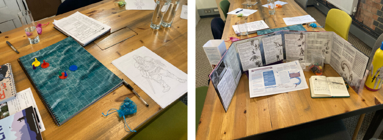
During our adventure, we dove into Roll & Play Press’s existing products. Their guides are designed to empower both seasoned dungeon masters and complete beginners, lowering the barriers to entry and sparking creativity. Experiencing the tools firsthand gave us clarity on what makes their offering unique: practical, beautifully presented content that never loses its sense of wonder.
Discovering the Core of the Brand
From those early sessions, we moved into a structured brand strategy process with Kay and Sam. Through workshops and deep conversations, we asked the big questions:
- What does Roll & Play Press stand for?
- How do they want players to feel when they use their products?
- What role do they play within the broader RPG community?
What emerged was a clear set of values: empowerment, imagination, and accessibility. Roll & Play Press wasn’t just about creating books; it was about opening doors for people to step into their own creativity, said in a tone of voice that’s friendly, playful, and encouraging, guiding players through their adventures rather than instructing them.
This voice shapes everything from product copy to community interactions, making the brand feel approachable, imaginative, and aligned with the sense of discovery at the heart of RPGs.
That insight became our north star for the entire project.
Breaking Away from the Expected
The fantasy RPG space has a well-established visual language. Bold reds, shadowy blacks, and fiery oranges dominate. It’s a world of dramatic contrasts, often leaning into the dark and the epic.
But Roll & Play Press isn’t about replicating tropes, it’s about helping people shape their own adventures. So we asked ourselves: how could we visually set them apart while still feeling connected to the world of fantasy?
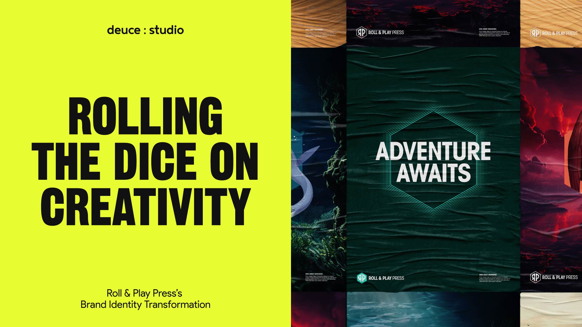
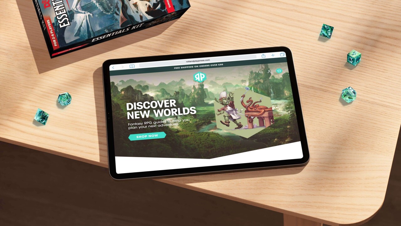
Our answer was to shift the palette. We moved away from their existing orange and into a spectrum of cool teals. This immediately distinguished them from competitors, bringing a freshness that felt modern and enchanting. Teal also carried a dual quality: grounded enough to signal trust and professionalism, but vibrant enough to spark imagination.
Reimagining the Dice
One element we knew we couldn’t lose from their old brand was the dice. In tabletop RPG culture, the twenty-sided die, the icosahedron is iconic. For Roll & Play Press, it had already become a recognizable part of their brand.
We often look at existing elements within a brand to see if they have legs beyond how they have been deployed previously. This time we looked at the existing assets and started to play with the brand as it was, coming up with new ways to use the dice, no longer using it as a static symbol but as a portal to new worlds.
The result is a versatile brand device where the dice acts like a window into endless worlds. Sometimes, it introduces mythological landscapes, other times it showcases fantastical characters, and occasionally, it just serves as a practical space for text or buttons on the website.
This flexibility gave the brand a dynamic quality, reinforcing the idea that Roll & Play Press is all about unlocking imagination.
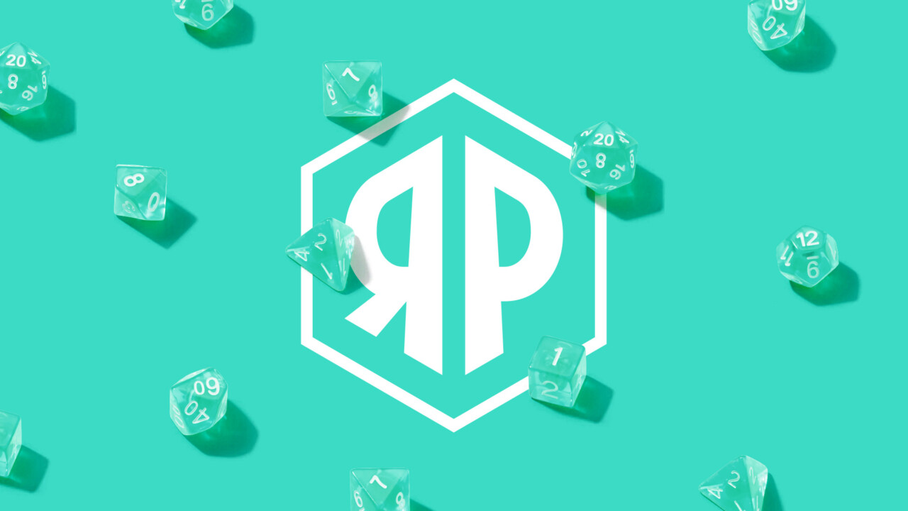
The Monogram: A Shortcut to Adventure
Alongside the core logo, we created a monogram that could stand on its own.
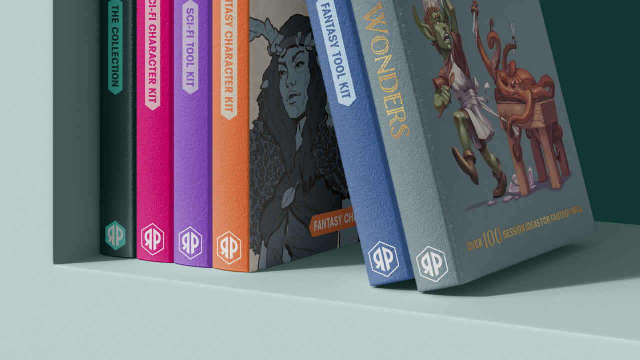
Built from the silhouette of the 20-sided dice, the monogram works perfectly in tight spaces, on book spines, packaging, or as a simple favicon online. It’s a shorthand signifier that reinforces recognition without needing the full logotype.
This small but powerful addition gave Roll & Play Press a toolkit that could flex across every touchpoint.
Building the Digital Experience
Branding doesn’t live in isolation. For Roll & Play Press, the website is often the first real point of contact for players discovering their products. It needed to do more than just look good, it had to work.
We designed and built a new e-commerce platform that integrated seamlessly with the updated brand identity. Key improvements included:
- Streamlined navigation, making it easy for visitors to find the right product.
- Enhanced product pages, with clear visuals and descriptions that bring the guides to life.
- Functional refinements, from smoother checkout flows to new features that improve usability.
The result was a digital experience that felt as polished and professional as the books themselves, all while still carrying the sense of adventure that defines Roll & Play Press.
Designing for Every Touchpoint
Beyond the website, we extended the brand into other areas of the customer journey. One important piece was delivery packaging.
For many customers, opening a Roll & Play Press order is the first physical interaction they have with the brand. We wanted that moment to feel exciting, like unwrapping a gateway to new worlds. By weaving the new identity into packaging design, we ensured that sense of wonder carried through from the digital storefront to the player’s hands.
Every detail mattered, building consistency without losing playfulness.

Challenges Along the Way
No behind-the-scenes story would be complete without its challenges. One of the trickiest parts of this project was striking the right balance between professionalism and independence.
Roll & Play Press had grown fast, and they needed a brand that reflected their credibility. At the same time, their community truly appreciated them because they weren’t just a faceless corporation. Losing that spirit would have been a mistake.
We solved this by keeping the tone human and approachable. The visuals carried more weight and polish, but the storytelling stayed rooted in the founders’ journey and the joy of RPGs. The result is a brand that feels bigger, but never cold.

The Outcome
The transformation was more than just cosmetic. Roll & Play Press emerged with a brand and website that matched their ambitions. They now had the tools to:
- Stand out visually in a crowded market.
- Build recognition through distinctive brand assets.
- Deliver a smoother, more enjoyable customer experience.
- Inspire confidence in both new players and long-term fans.
Since launch, the refreshed identity has supported their continued growth, helping them expand their audience, team and product offering, all solidifying their place as a trusted name in the RPG publishing world.
Working with Roll & Play Press meant stepping into a world of creativity, imagination, and community. By immersing ourselves fully, we were able to design a brand identity that doesn’t just represent them, it empowers them to keep unlocking adventures for players everywhere. And in the end, that’s what good branding should do: not just look the part, but open doors to new worlds.
Deuce Studio is an award winning London based branding and packaging design agency.
If you are looking for a branding project, then let’s talk.