At Deuce Studio, we love working with challenger brands that are driven by belief as much as ambition. Brands that don’t just want to grow, but want to change the way a category behaves. White Rabbit is exactly that kind of brand.
What began as two founders making pizza in the back of an Oxford pub has grown into one of the most exciting names in UK gluten-free food. But when White Rabbit approached us, they were at a pivotal moment. Their product had evolved. Their ambitions had grown. Yet their packaging and brand identity no longer reflected the quality, confidence or scale of the business they had become.
Their goal was clear: to become the UK’s number one gluten-free pizza brand. To get there, they needed packaging that could communicate premium quality, justify a higher price point, and credibly speak to both gluten-free consumers and mainstream pizza lovers.
Our task was not to reinvent White Rabbit, but to sharpen, elevate and future-proof the brand, while staying true to its roots.
The Growth of Gluten-Free in the UK
The timing of White Rabbit’s rebrand couldn’t have been better. The UK gluten-free market has undergone a fundamental shift over the past decade. Once seen as a niche or medical category, gluten-free has moved firmly into the mainstream.
The UK gluten-free food market is now worth over £500 million, with consistent year-on-year growth. What’s changed most significantly is who is buying gluten-free products. While those with coeliac disease remain a core audience, a growing number of consumers now choose gluten-free for lifestyle, digestion, or perceived wellness benefits.
Supermarkets have responded accordingly. Major UK retailers have expanded gluten-free ranges beyond own-label basics, making space for specialist brands that can deliver on taste, quality and credibility. At the same time, the bar has been raised. Consumers are no longer willing to compromise on flavour, texture or enjoyment just because a product is gluten-free.
In pizza specifically, this shift has been dramatic. Gluten-free pizza was once synonymous with dry bases and underwhelming taste. Today, shoppers expect gluten-free pizza to stand shoulder to shoulder with its wheat-based equivalents.
This changing landscape created a huge opportunity for White Rabbit, but also intensified competition. Packaging needed to work harder than ever.
Reframing Gluten-Free as Premium and Inclusive
White Rabbit already had strong foundations. Their pizzas are made in a dedicated gluten-free bakery, using Italian ingredients and a slow, 24-hour sourdough proving process. Co-founder Teo’s Italian heritage, rooted in Bergamo, gave the brand genuine provenance. And critically, the product delivered on taste.
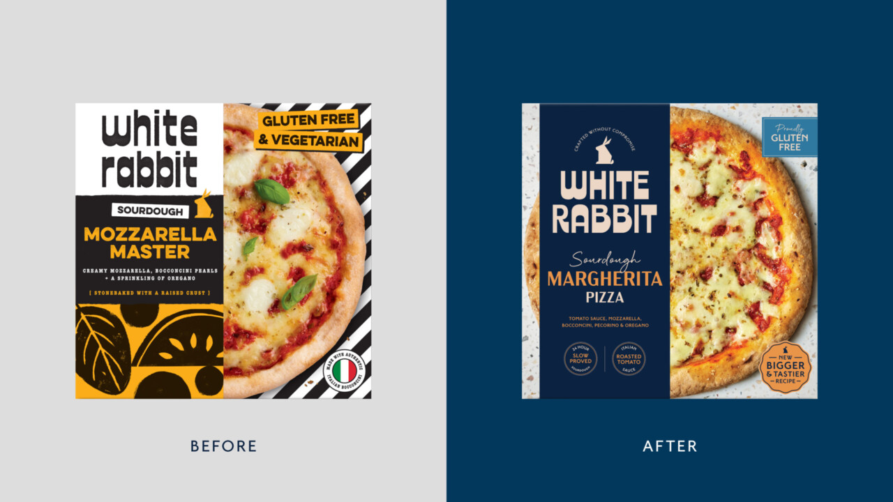
Yet the brand’s previous packaging wasn’t doing that story justice.
The design felt darker and more niche, and leaned too heavily on the idea of gluten-free as an alternative. It didn’t fully communicate the craft, the joy, or the inclusivity at the heart of the brand. Nor did it clearly explain why White Rabbit pizzas deserved their premium price point.
Our challenge was threefold:
• Clarify what makes White Rabbit different
• Elevate gluten-free from functional to desirable
• Create a brand world capable of scaling across retail
Defining What Makes White Rabbit Unique
Our process began with strategy. Before touching design, we worked closely with the White Rabbit team to refine their positioning and priorities.
Four pillars emerged.
Italian Authenticity
Authenticity matters deeply in pizza. From ingredients to technique, consumers are increasingly knowledgeable and discerning. White Rabbit had a powerful story to tell here, sourcing ingredients from Italy and grounding the brand in real Italian heritage through Teo’s background. This wasn’t Italian-inspired; it was genuinely Italian.
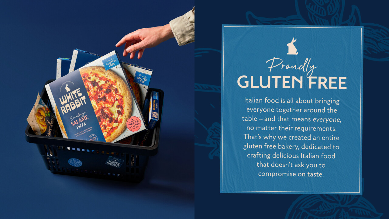
Proudly Gluten-Free
Unlike many brands offering gluten-free as an add-on, White Rabbit is a dedicated gluten-free bakery. This isn’t a compromise or a side project; it’s the reason the brand exists. That distinction became central to the narrative. These are pizzas designed to be delicious first, gluten-free second.
Craft and Value
To justify a premium price point, consumers need to understand what they’re paying for. White Rabbit’s slow-fermented sourdough base, proved for 24 hours, is a key differentiator. It signals time, care and craft, qualities more often associated with artisan bakeries than frozen or chilled pizza.
Inclusive Enjoyment
Perhaps most importantly, White Rabbit believes pizza should be for everyone. Gluten-free shouldn’t mean eating something separate or second-best. The brand celebrates shared moments around food, rooted in Italian culture and hospitality.
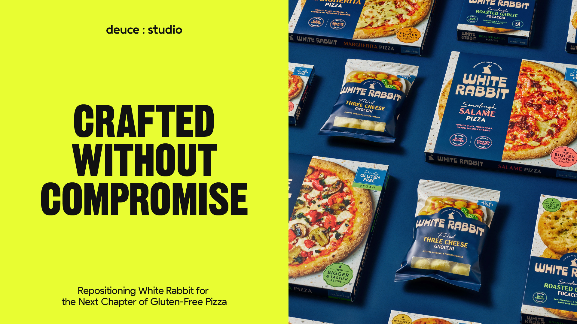
These pillars came together in a new brand idea and tagline: Crafted Without Compromise.
Evolving the Brand Identity
With the positioning defined, we turned to the brand identity and packaging system.
Rather than start from scratch, we chose to evolve what already existed. This allowed us to maintain recognition while significantly raising the bar.
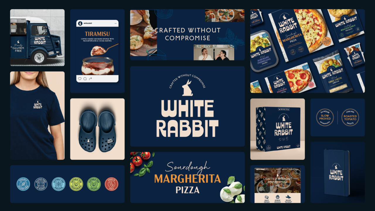
The logo was refined and set in confident all caps, giving it greater presence and authority on shelf. We replaced the darker, edgier colour palette with a premium yet approachable navy blue, a colour that signals quality while remaining warm and inclusive.
Typography played a crucial role. We introduced refined typefaces paired with handwritten details to balance craft with personality. These touches brought a sense of human warmth and artisanal credibility to the brand.
We also developed a clear system of icons and callouts. The gluten-free badge became bolder and more confident, signalling credentials instantly and unapologetically. Additional cues highlighted Italian provenance, sourdough fermentation and ingredient quality.
Making Quality Visible Through Packaging
Food photography was central to the redesign. In a category where consumers often expect compromise, we wanted the product to speak for itself.
We worked with rich, appetite-led imagery that showcased real ingredients and, critically, White Rabbit’s signature charred sourdough crust. This wasn’t styled to look perfect, but to look real, echoing the pizzas you’d expect from a great Italian pizzeria.
The packaging architecture was designed to balance clarity with impact. The logo and key messages lead, supported by photography and secondary information that rewards closer inspection. The result is a pack that works at a distance and up close, on busy supermarket shelves and in consumers’ homes.
Crucially, the system was built to flex. Whether launching new flavours, formats or channels, White Rabbit now has a brand world that can grow with them.
Designing for Retail Reality
In the UK grocery environment, packaging has to work fast. Shoppers are making decisions in seconds, often across crowded chillers and freezers.
For White Rabbit, we designed packs that could compete not only within gluten-free, but across the wider pizza category. The navy colour blocking, confident typography and strong photography ensure the brand stands out without shouting. It feels considered, premium and modern.
At the same time, clarity was essential. Gluten-free credentials needed to be instantly recognisable, while still inviting non-gluten-free shoppers in. The balance between reassurance and aspiration was key.
From Rebrand to Category Leader
The impact of the rebrand was immediate and measurable.
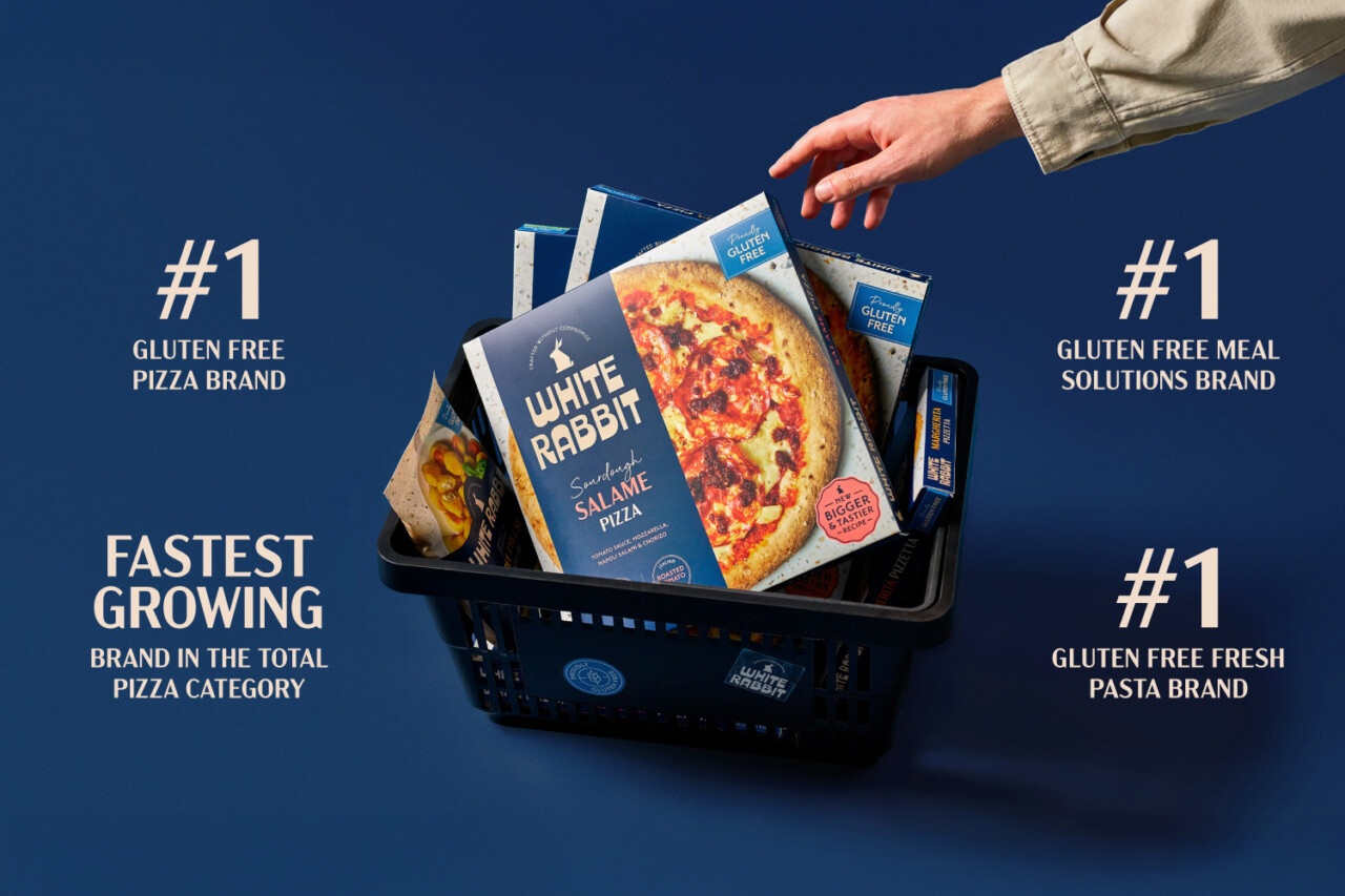
Since its relaunch, White Rabbit has achieved 25% growth, making it five times faster than the overall gluten-free category. The brand secured two major new stockists, Tesco and Morrisons, significantly widening national distribution.
Most impressively, White Rabbit has become the number one gluten-free pizza brand in the UK and the fastest-growing brand in the entire pizza category, not just gluten-free.
These results demonstrate the power of aligning brand strategy, packaging design and product quality. When consumers understand what makes a product special, and when that story is communicated clearly and confidently, growth follows.
White Rabbit’s success reflects broader shifts in consumer behaviour. Today’s shoppers want food that aligns with their values, delivers on quality, and feels inclusive. They are willing to pay more for products that are authentic, well-crafted and thoughtfully designed.
For gluten-free brands in particular, the opportunity is no longer about replacement; it’s about leadership. The brands that will win are those that move beyond functional messaging and embrace flavour, joy and shared experiences.
White Rabbit is now positioned not just as a gluten-free alternative, but as a premium pizza brand in its own right. The new identity gives them the confidence and flexibility to expand their range, enter new channels, and continue challenging perceptions of what gluten-free food can be.
For us at Deuce Studio, this project was a reminder of what great branding can do when it’s rooted in truth. We didn’t invent White Rabbit’s values; we clarified and amplified them.
Because when a brand is genuinely crafted without compromise, the design should be too.
Deuce Studio is an award winning London based branding and packaging design agency.
If you are looking for a branding project, then let’s talk.