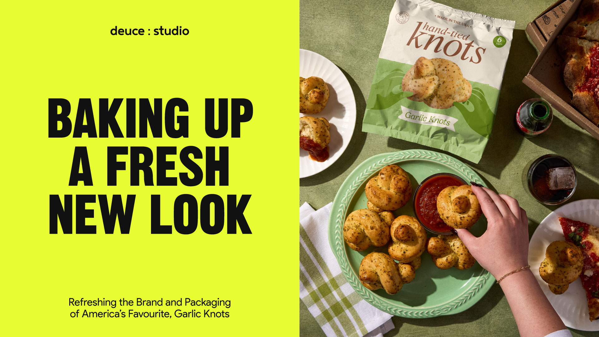
Garlic knots hold a special place in American food culture. Born in New York pizzerias in the 1970s as a clever way to repurpose leftover dough, they’ve since become a beloved staple of family dinners, pizza nights, and comfort-food rituals across the country. Today, more than 50% of Americans say they regularly serve garlic knots with weeknight meals, and the frozen garlic bread and bakery category continues to grow as families seek convenient ways to bring warm, fresh-baked comfort to the table. In other words: the garlic knot has become far more than a side dish, it’s a cultural touchstone.
So when Europastry approached us to refresh their brand of hand-tied knots, we knew we weren’t just designing packaging. We were stewarding an American baking icon.
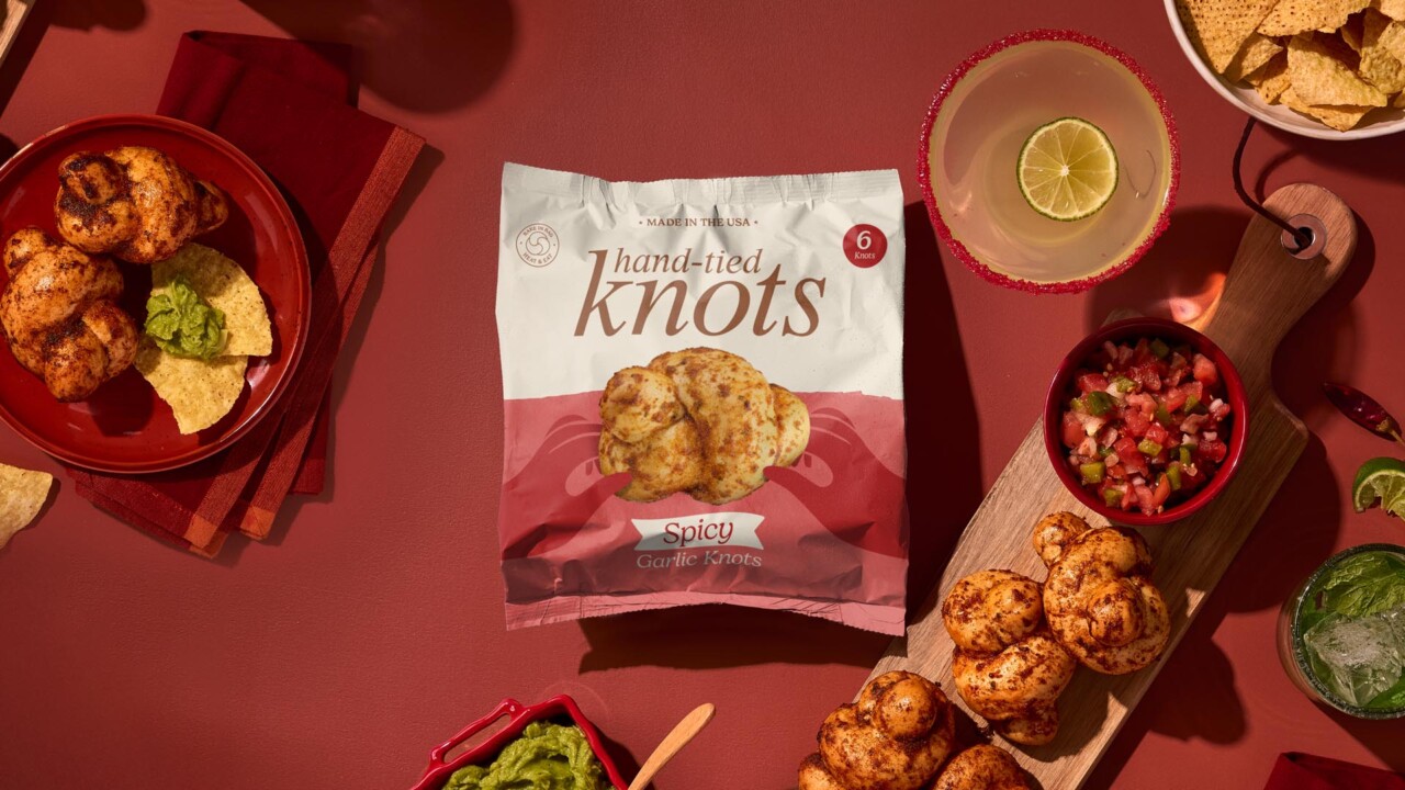
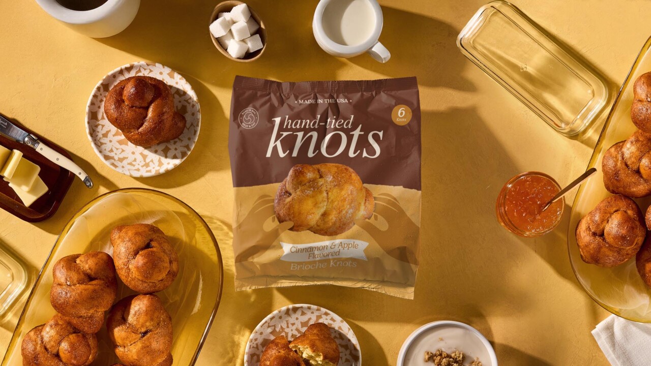
But Europastry’s knots aren’t your standard dough-and-garlic offering. Their collection goes further, introducing flavours that push the category into new territory: spicy tomato knots, sweet brioche knots, and other variations that stretch from savoury to sweet. The brand also has something many competitors don’t. True, time-earned authenticity. Their knots have been hand-made in the USA for more than 50 years, crafted using traditional techniques passed down from master artisan bakers from around the world. This depth of heritage, combined with a diverse and modern product range, gave us a rich foundation for a full brand transformation.
Our challenge was to build a visual and verbal identity that honoured the craft of the past while giving the brand a fresh twist, something warm, expressive and contemporary, designed to attract a broader, younger audience without losing the brand’s culinary soul.
A Brand Built on Hands, Heritage and Heart
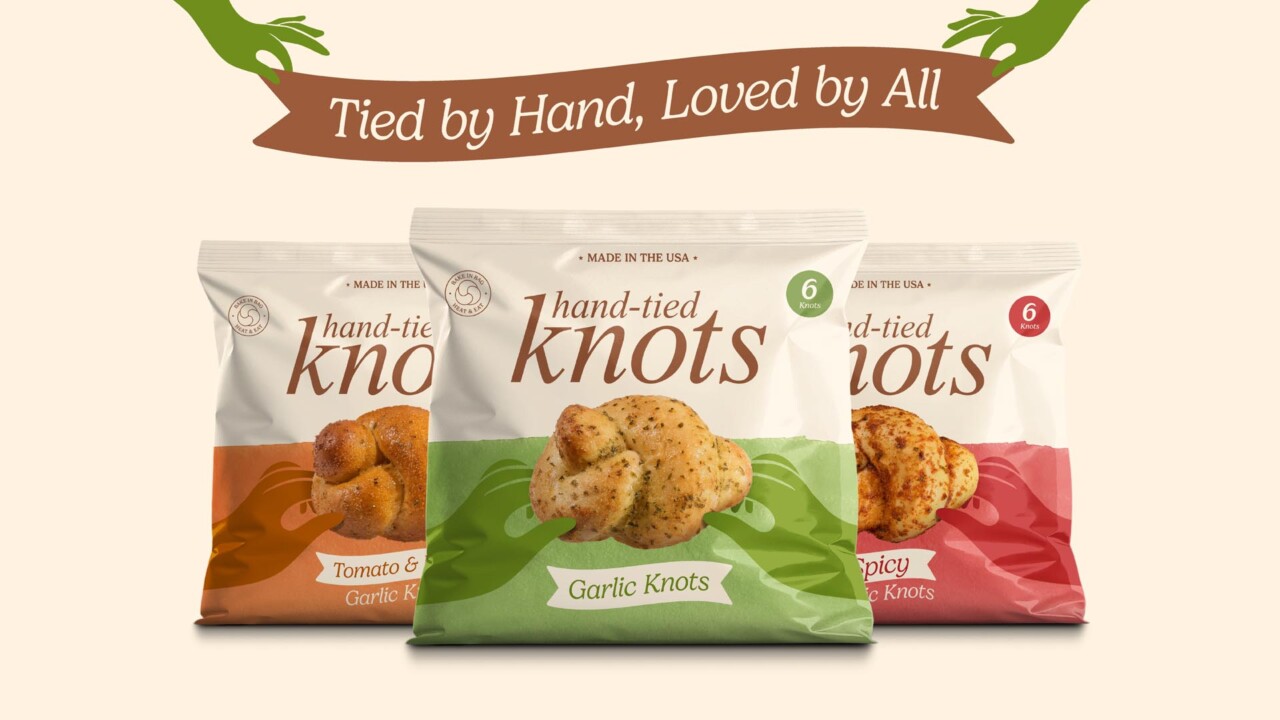
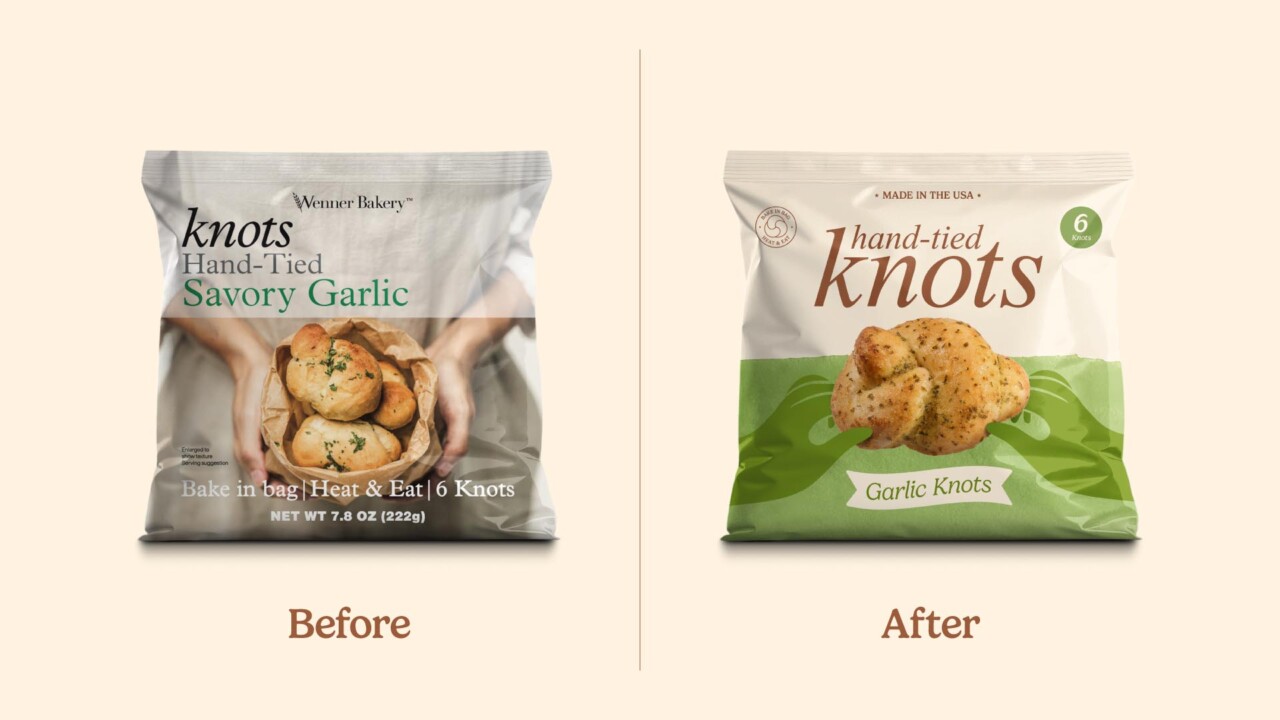
From the beginning, the name itself, Hand-tied Knots, pointed us toward the story we needed to tell. This was a rare product where the method wasn’t just a detail; it was the brand. The hand-tied nature of the knots, the all-American craftsmanship, the quietly obsessive attention to ingredients and technique, it all deserved to sit proudly at the front of the pack.
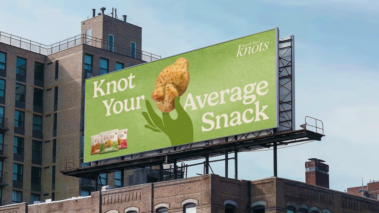
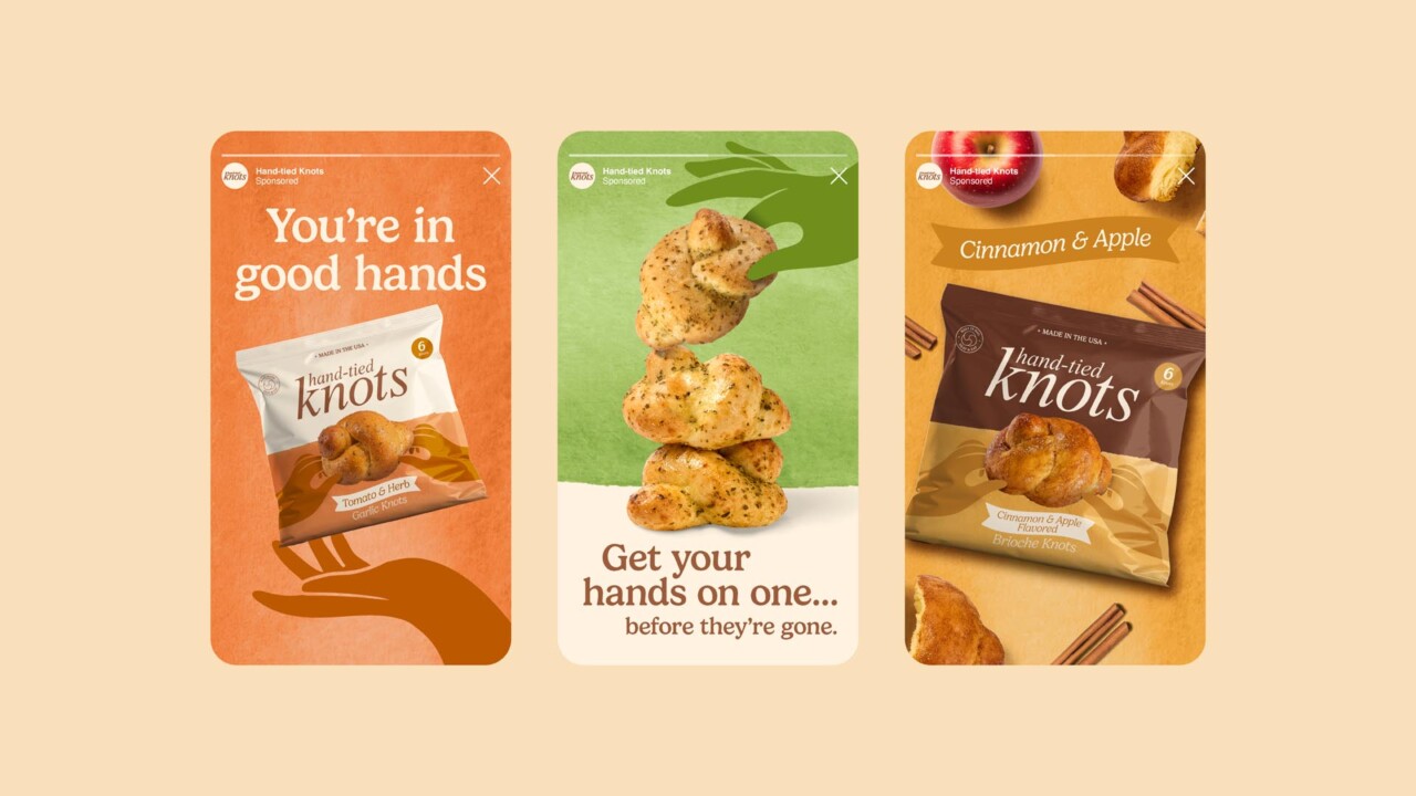
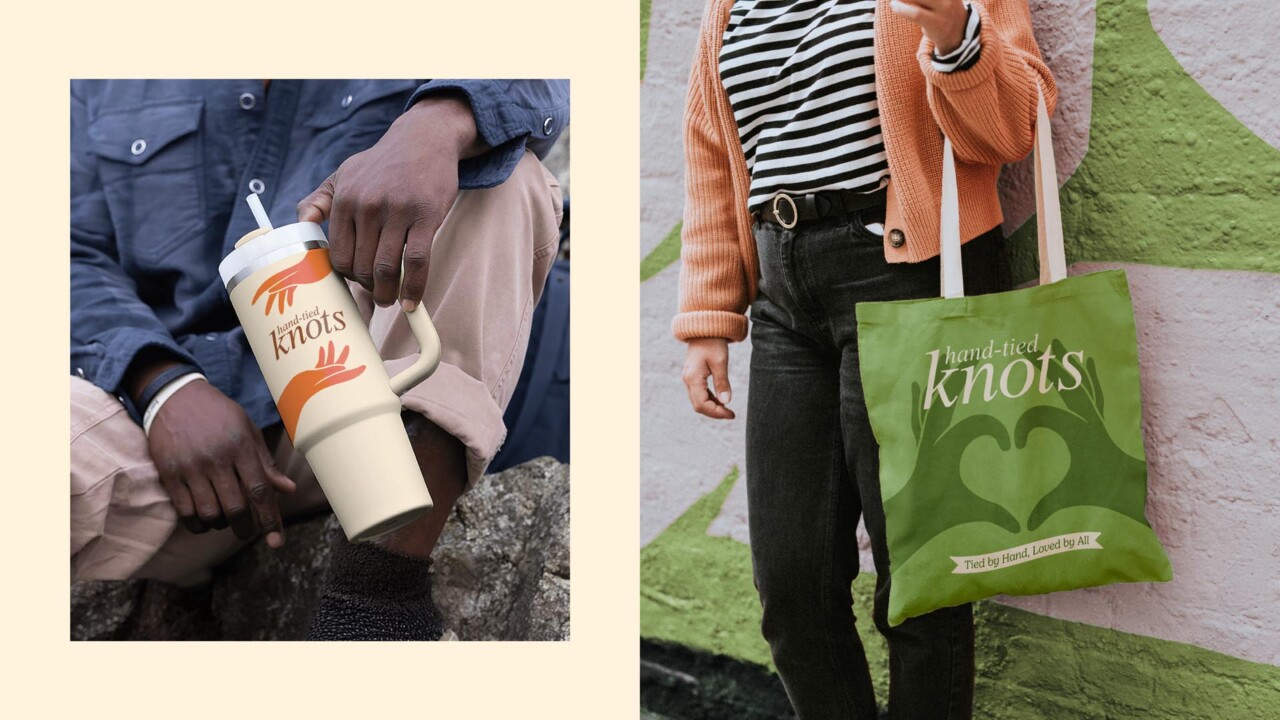
To express this, we created a series of distinctive illustrated hands, each one interacting directly with a hero image of the knot. The hands aren’t decorative; they serve as a bridge between product and maker, a moment of connection that instantly communicates craft, tradition and human involvement. By pairing illustrations with real photography, the pack gains a tactile duality: the precision of baking meets the warmth of personal touch.
The graphics surrounding the hands lean into texture and a slightly rustic quality, reinforcing the honest, home-baked spirit of the product. The colour palette feels familiar but elevated, wholesome and warm, with enough vibrancy to cue flavour variation across sweet and savoury. Typography plays a supportive yet expressive role, blending friendliness with clarity so that the packs feel approachable, family-oriented and rooted in comfort.
The interplay of illustration, photography and texture brings something fresh to the freezer aisle: a brand that feels both nostalgic and new.
Packaging Architecture: Familiar, Yet Freshly Tied Together
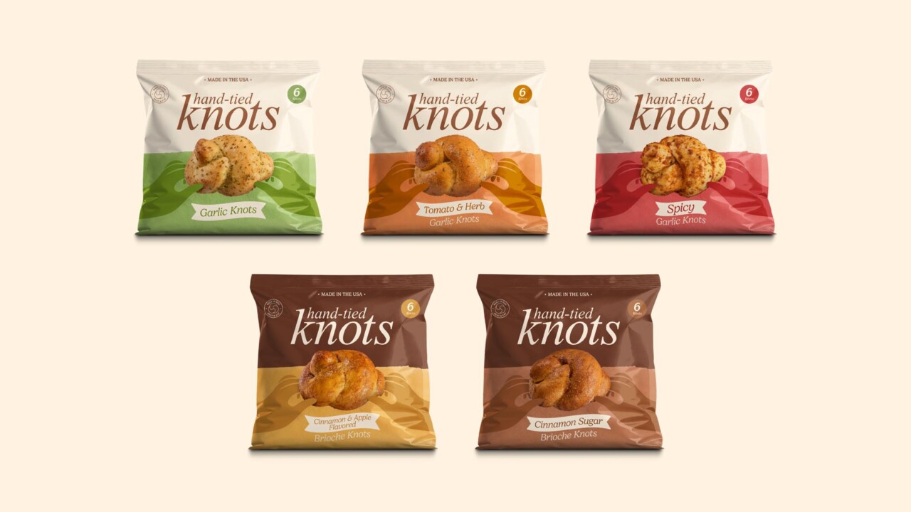
The packaging design needed to flex across dramatically different product types, from garlic and savoury herb-based knots to sweet brioche knots. Because flavour divides weren’t just about taste but category, the design system required clarity and versatility.
The product photography takes centre stage. A large, beautifully photographed knot sits at the heart of each pack, making the food feel irresistible without relying on overly styled or artificial presentation. Complementing the photography are the illustrated hands, which appear across the range, grounding the brand story in the craft of tying, shaping and baking each knot by hand.
Supporting elements, such as playful flag-shaped flavour names and small badges communicating key attributes like heat & eat, bake in the bag, and the Made in the USA callout, help organise information without clutter. These components act as friendly signposts that enhance the brand’s approachable tone without shouting.
The resulting architecture strikes a balance: expressive enough to stand out in a crowded freezer aisle, but clean enough to feel trustworthy and straightforward for busy families scanning the shelf.
Photography: Honest, Appetite-Led, and Emotionally Grounded
Photography plays a dual role in the new brand world. On front of pack, imagery focuses on the hero knot itself. This isn’t about trickery or complexity, it’s about showing the product in its purest, most crave-worthy form, with enough light and texture to communicate freshness and authenticity.
On the back of pack, the knots are shown pulled apart, revealing texture, flavour ingredients and the irresistible softness that families love. No hands appear here; instead, the product speaks for itself. The images are paired with ingredient cues that help communicate each flavour variation in a way that is both clear and appetising.
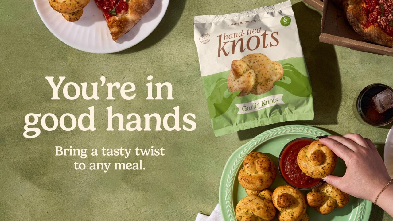
Lifestyle photography expands the world beyond the packaging. These shots focus on warm, inviting moments, family meals, shared bites, comforting spreads, providing emotional texture and reinforcing the product’s role in everyday American life. This imagery is used across multiple touchpoints including POS, website content and social storytelling.
Tone of Voice: Warm, Playful, and Proudly Knotty
Beyond the visuals, the brand refresh required an equally distinct verbal personality, one that matched the product’s tactile charm and its place in American mealtime culture. We leaned into a warm, fuzzy, light-hearted tone of voice that celebrates togetherness, family rituals and the simple joy of pulling a warm knot apart with your hands.
Puns and wordplay aren’t gimmicks here; they’re expressions of character. They help translate the physical shape of the product into a verbal style that feels natural, memorable and charming.
Phrases like:
- Tied by hand, loved by all
- Knot your average snack
- You’re in good hands
…all help communicate the brand’s personality while reinforcing product truths — the hand-tied process, the family appeal, and the inviting, comforting nature of each knot.
This tone works seamlessly across touchpoints, from packaging to social to OOH, where a line like Knot your average snack becomes a headline with real stopping power.
Building a Full Brand World
Our work didn’t stop at the pack. The brand needed a flexible system that could stretch confidently across digital and print environments while maintaining the same warmth and character. Between the expressive colour palette, the illustrated hands, the textured graphics and the inviting food photography, the brand world became a cohesive ecosystem that feels both playful and grounded.
The website extends this sensibility with an inviting mix of delicious food photography, layered textures, and a conversational tone that feels like a friend sharing a favourite family recipe. Out-of-home takes a bolder, more humorous angle, using large-scale visuals and confident lines like Knot your average snack to create standout in busy public spaces.
Every application circles back to the core idea: celebrating the craft, comfort and character of these uniquely hand-tied knots.
A Visual Evolution That Finally Tells the Full Story
The new identity brings the product’s real strengths, hand-made heritage, flavour variety, and emotional resonance to the forefront. Where the previous packaging understated the craft and uniqueness of the knots, the new system celebrates it, giving shoppers a clearer sense of what makes these products special.
It’s a brand world that respects the product’s past while energising its future. An identity tied together as carefully as the knots themselves.
Deuce Studio is an award winning London based branding and packaging design agency.
If you are looking for a branding project, then let’s talk.