Choosing the right colour for your brand is one of the most important decisions to get right both for new brands and existing brands considering a rebrand, we take a look at how best to go about this from all perspectives, from strategy to product and everything in between.
If you are keen to choose a colour for your brand, it either means you have a new brand or product, or that you are overhauling an already-recognised brand. Let’s consider each of these scenarios:
With new brands that are challenging the market:
Consistency, one core colour, will establish your brand and brand loyalty. Your logo may drive your choices here—but so should the colour’s trending emotional impact and positioning of your brand in the space with other brands.
You can start with thinking about the packaging needed to deliver the product into your consumer’s hand: what wrap, if any will carry the colour? Should paper stock be shiny or matte? How will the colour look on that surface and what associations will it have? How much more costly is a pink foil rather than a silver one?
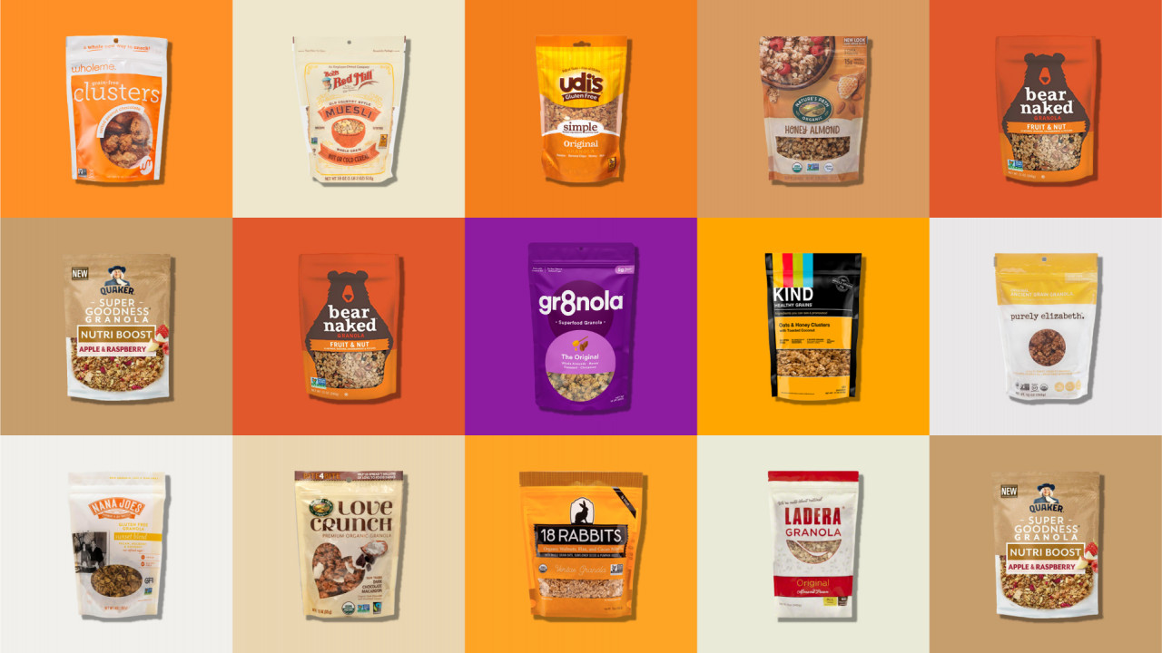
Consider the competition. Deuce Studio’s rebrand of gr8nola made its product pop on the shelf by choosing an unorthodox colour—purple—among dull rows of beige.
Managing Director and Co-founder Jonny Aldrich describes Deuce Studio’s gr8nola rebrand: “Nearly every competitor big or small was using white, beige or orange and so did gr8nola’s previous design, therefore we set upon the idea of a full purple bag with highlight colours for flavour differentiation…[and] brand blocking on shelf….”
How will this colour look in context? Pentagram identified a logo for MasterCard that would pop against a variety of backgrounds. Are your packaging surfaces shiny or matte? Will tints for packaging tend to fade in sunlight or if they are exposed to wet–important for purchases delivered to doorsteps.
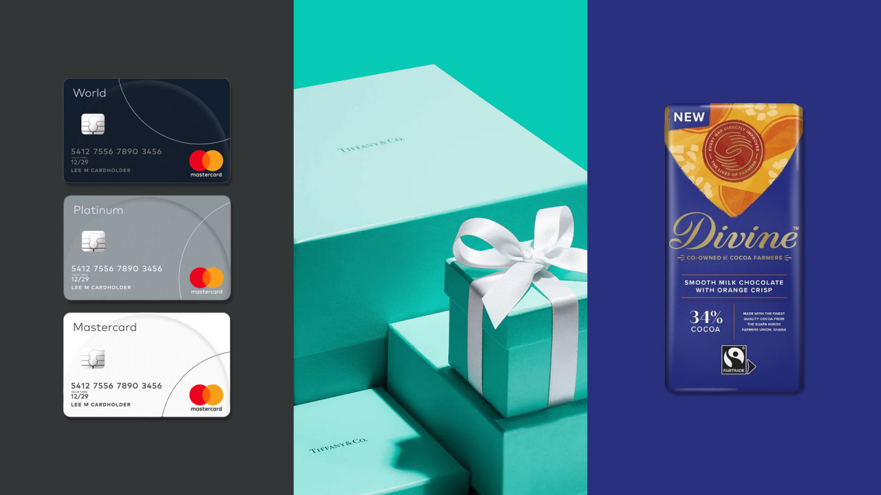
With colour, you are setting quality expectations. Black and gold say “premium” (think M&S Baked Beans) yet Divine Chocolate’s fall 2021 rebrand took a bold step away from the prevailing black to a navy, combining a rich tone with freshness. Tiffany’s iconic hue sets its own bar for quality.
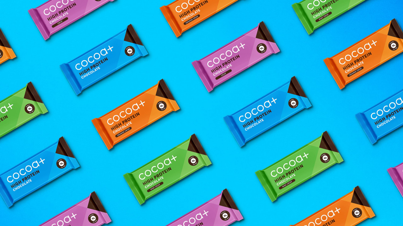
Colours are flavour indicators. If the product comes in a variety of flavours, a variety of colours may be needed. Cocoa Plus expanded its flavour range, prompting their agency to conceive a bolder, broader palette while maintaining coherence. Will you want photography that features your product—and thus its colour? Does the colour of the product show through its clear container?
If you are sorting a rebrand, then brand equity is important. But you might want to rethink:
Is the original colour choice still strategic for today? Maybe you had a raucous colour story before, but now you perceive your market as wanting soothing. Some disrupters are choosing pastels in industries where primary colours were the rule.
Do you want to feature certifications more prominently than before? 82% of consumers believe ethical brands outperform others. Non-GMO, recyclable, gluten-free certifications, etc. can usually be rendered in black or white, but will colour grab the attention of consumers?
The rainbow’s the limit—choose carefully!