At Deuce, we love an opportunity to help brands take the next step, and even more so when we can use our expertise and experience to not only develop them visually but also strategically, so when Phizz, the all-in-one drop-in drink tablet came knocking for a brand refresh, they wanted their packaging design and branding to reflect more than just its functional health benefits. Their old branding was scenario-based and medicinal, focusing less on the daily benefits it would bring to the customer’s lives.
This article is a behind-the-scenes look at the Phizz brand refresh: how our strategy shaped the story, creativity adapted the packaging, and how it all came together to spark real engagement with consumers.
The Evolution of the Phizz Brand
Phizz has always been about making supplements approachable, functional, and smart. Their original branding was focused more on specific scenarios such as work, play and travel, but the market evolved and so did consumer expectations. People didn’t want a product to help with jet lag or a hangover; they wanted a supplement that would help them get ready for the day, stay hydrated, or even run that park run 1 minute faster.
The goal wasn’t just to make the packaging communicate better; it was to create a brand system that could convey the Phizz story at a glance, maintaining their scientific focus but highlighting both the benefits and their broader lifestyle promise. This integrated strategy and design approach ensured that every aspect of the brand communicated the same message, reinforcing Phizz’s identity and promise.
Collaborate and Listen
No brand and packaging refresh is a solo journey. We believe collaboration is at the heart of any successful creative project. We started with a workshop where we were able to ask questions and gain insight into the business as a whole, its purpose, and future goals.
Then, by thoroughly examining consumer insights, we began to formulate a plan of action and direction. With Phizz, a key insight that emerged early on was that consumers wanted quick and clear information as to the key product benefits on the pack, identifying which information was most important to Phizz’s audience. This insight-driven approach ensured that our decisions were informed by the needs and preferences of Phizz’s audience, making them an integral part of the project.
The Low-Hanging Fruit
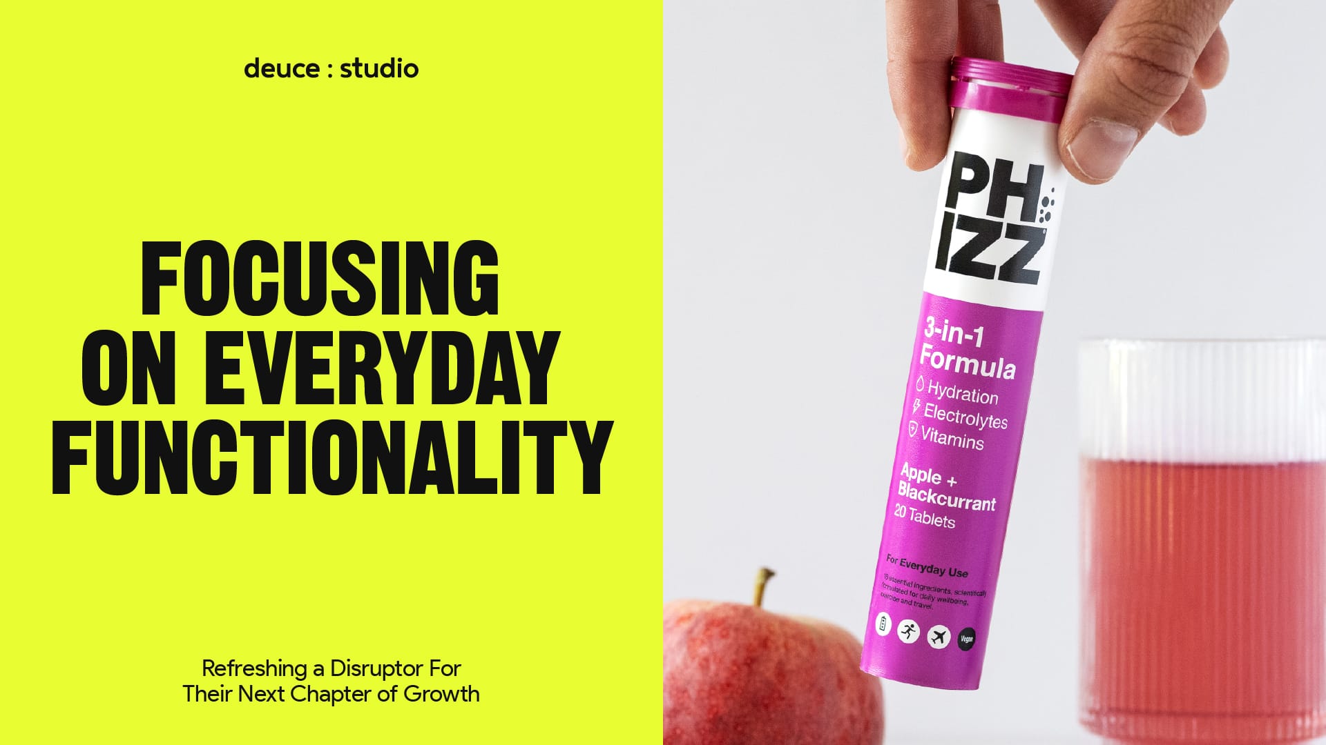
Once we had developed the strategy, the first task was to use our insights to create a packaging system that was not only clean, clear, and relevant but also adaptable to new product categories being introduced into the existing range.
Colour is often the most straightforward and best way to create clarity. We reworked the colours and developed a colour system that ensured consistency, assigning more accurate colours to their flavours. The colour system also allowed for newer flavours to be added to the range while maintaining the consistency. We tuned the hierarchy, developed the copy, and created icons to help communicate the benefits of the product. All of these areas significantly contribute to the visual cues, messaging, and consistency required for a successful, trustworthy brand.
In packaging design, an often overlooked part of the consumer experience is how the product looks on the shelf. We spent time considering how the POS & packaging would work together to help display the product and its benefits effectively. Supermarket shelves are busy places – while staff stock the shelves accurately and quickly, they don’t have the time to ensure that your brand’s packaging is positioned correctly. So developing a POS system that could operate in any direction and allow for some brand blocking was important.
Refreshing a brand and its packaging isn’t simply about updating the logo. For Phizz, the brand refresh focused on enhancing the clarity of the packaging, improving consumer education, and reinforcing customers’ trust. It is a competitive category where design trends shift rapidly, so staying visually and strategically relevant is critical.
Walking the walk. Time to talk the talk.
As we developed the packaging, we also began to develop how the brand would communicate across sales and marketing channels. We developed language around being your ‘best self’: Staying hydrated can be a chore (I personally think of myself as more camel than human when it comes to staying hydrated) and Phizz helps to alleviate some of those pain points of staying on top of your hydration, they have done the research and the tests and can show that their product really does help to keep those levels of hydration topped up.
The imagery further helped to show Phizz being something to use every day, from that first drink in the morning to post-workout electrolyte recovery. We wanted to show that Phizz is there to support you in getting the best and most out of your day. This comprehensive approach ensures that the brand’s message is consistent and resonates with consumers across all touchpoints.
Ready? Set? Go
The final designs retained some of the brand’s scientific and functional identity while introducing a fresh, modern hierarchy, more relevant messaging, improved colour coding and better customer communication. All allowing consumers to quickly understand the benefits of each product, better identify flavours, and see the potential of Phizz as a lifestyle essential.
And The Winner is!
The launch wasn’t just about putting products on shelves; it was a strategic moment to reinforce the new brand strategy, showcasing Phizz as a premium, smart, and empowering health companion.
The response from consumers has been overwhelmingly positive. Phizz has become the fastest growing nutritional brand in the UK, with its products being listed with some of the UK’s largest retailers: Tesco, Morrisons, ASDA, Co-op, Waitrose and Boots, all of whom join Sainsbury’s in stocking the newly rebranded product. This success has led to Phizz becoming the No.1 hydration brand and the No. 2 effervescent brand in the UK, narrowly beaten by Berocca. The success of Phizz underscores the potential of a well-executed brand refresh to transform a business and its market position.
Teamwork Makes The Dream Work.
The role of any design agency in a branding or packaging design project is both strategic and creative. Working with a specialist agency like Deuce Studio provides brands such as Phizz with access to our expertise and design insights that, when applied to consumer insights, can often result in truly fantastic outcomes.
Packaging is often the first point of contact between a brand and its audience (especially when it is FMCG packaging design), and it can communicate a brand’s story faster and more effectively than almost any other medium. We find our value in sitting at the intersection of being strategy-led, using creativity to interpret a brand’s essence into designs that are functional, emotionally engaging, and visually distinctive.
The Phizz project is a strong example of how closely strategy and design must align for a successful refresh. For any brand seeking to revitalise its identity, it demonstrates the power of a strategic, consumer-focused approach, one that not only improves engagement and keeps a brand focused and memorable but also elevates its presence and unlocks its full potential.
If you are looking for a branding and packaging project, then let’s talk.